CSS color and background tutorial
- Learning goals
- Understand CSS 2 and CSS color models
- Be able to user background and font colors
- Concurrent
- Moving on
- Level and target population
- Beginners
- Teaching materials
- http://tecfa.unige.ch/guides/css/ex/css-page-background.html (ugly background example page)
- http://tecfa.unige.ch/guides/css/ex/css-page-background-example.html (background example page)
- Remarks
- This tutorial is intended for students in educational technology or any other field that is technology intensive. For people who need less, there exist many easy CSS tutorials on the web. This text is intended for students who also must learn principles and who are willing to learn CSS by doing a project, looking at CSS code and online reference manuals.
- Ideally, a teacher also should assign a text formatting task, during or before assigning this tutorial for reading).
Introduction
CSS 2 colors
In CSS 2.1 (support by nearly all browsers on the market, i.e. also back two older generations), there exist several properties for which a color can be set.
Let's have a look at some example code that demonstrates two of the most popular color properties and the typical RGB hex notation for color values:
The following inline CSS code
  <p> <span style="background-color: #0000ff; color: #ffffff;">
      Blue background and white foreground</span> demo </p>
would show like this:
Blue background and white foreground demo
We shall explain more details below, but before we shall present an overview of CSS 2 color properties and then introduce the RGB color model used in CSS 2.
(1) Setting the font color
- color
- defines the foreground color for text content
- Example: color: #ff0000;
(2) Setting the background “Authors may specify the background of an element (i.e., its rendering surface) as either a color or an image. In terms of the box model, "background" refers to the background of the content, padding and border areas. Border colors and styles are set with the border properties. Margins are always transparent.” (CSS 2 spec.)
- background-color
- defines the background’s color of an element
- Example: background-color: red;
- background-image
- sets the background image for an element. An image is not really a color, but can be used for the same purpose
- Example: background-image: url ("flower.png");
- background-repeat
- defines the tiling (and tiling direction) of a background-image
- background-position
- defines the position of a background image
- background-attachment
- defines whether the background image scrolls with the containing block or stays fixed with respect to the viewport (i.e. what is displayed)
- background
- is a short hand notation that allows to define all background definitions
- Example:background: url("flower.png") gray 50% repeat fixed
The RGB color model
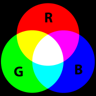
RGB colors are the most popular ones used in computing applications. A color is defined by the amount of Red - Green - Blue.
RGB is the way computer monitors work. E.g. to get a nice yellow you need 100% Red + 100% Green + 0% Blue. RGB is a so-called additive color mixing model. “Projection of primary color lights on a screen shows secondary colors where two overlap; the combination of all three of red, green, and blue in appropriate intensities makes white.” (Wikipedia). Now if you project each of these primary colors with different intensity, overlapping colors will change.
This model is not how colors work when you mix real paint. Then you'd rather work with a red-yellow-blue model. Color printers yet work with another model, i.e. magenta, cyan and yellow (or more).
RGB colors can be encoded in various ways. For Internet formats such as HTML, CSS or Flash, most often a hex triplet is used, i.e. a hexadecimal 6 digit number. With 2 hexadecimal digits you can represent numbers in the range of 0 to 255, i.e. only a reduced set of colors.
CSS 2 color values
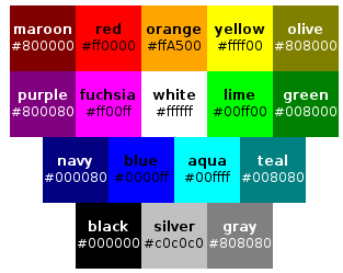
There are two way of defining CSS 2 colors. Either by their name (but this only works for 17 colors) or by a so-called RGB value. The latter can be specified in four different ways as we shall show in the example below. The 17 pre-defined color names in CSS 2.1 are the following, according to the CSS 2.1 specification from which we made a screen shot:
Otherwise, you may choose from several RGB numerical colors specifications as the following example shows. The following example will set the color of a text:
em { color: #f00 }              /* #rgb = Red-Green-Blue shortcut for rrggbb*/
em { color: #ff0000 }           /* #rrggbb */
em { color: rgb(255,0,0) }
em { color: rgb(100%, 0%, 0%) }
In order to set the background-color use something like:
em { background-color: #f00 }              /* #rgb = Red-Green-Blue shortcut for rrggbb*/
em { background-color: #ff0000 }           /* #rrggbb */
em { background-color: rgb(255,0,0) }
em { background-color: rgb(100%, 0%, 0%) }
CSS 3 colors
CSS 3 implements (of course) all CSS 2 features. In addition it implements a whole range of new color related properties and values.
RGB colors
Work like in CSS. The only difference is that there are more color names you could use. The following table was taken as is from Wikipedia:
|
|
| |||||||||||||||||||||||||||||||||||||||||||||||||||||||||||||||||||||||||||||||||||||||||||||||||||||||||||||||||||||||||||||||||||||||||||||||||||||||||||||||||||||||||||||||||||||||||||||||||||||||||||||||||||||||||||||||||||||||||||||||||||||||||||||||||||||||||||||||||||||||||||||||||||||||||||||||||||||||||||||||||||||||||||||||||||||||||||||||||||||||||||||||||||||||||||||||||||||||||||||||||||||||||||||||||||||||||||||||||||||||||||||||||||||||||||||||||
Links to official documents
- CSS Color Module Level 3 W3C Recommendation 07 June 2011
- SVG 1.1. Color keywords (From the Scalable Vector Graphics (SVG) 1.1 Specification, W3C Recommendation 14 January 2003, edited in place 30 April 2009
The HSL/HSI model
The HSL (Hue-saturation-lightness) model, also known as HSI (hue-saturation-intensity) defines colors with a different model.
- Hue, the color: Represented as a position in the 360 degrees of a color circle.
- Saturation, the intensity or "purity" of the color: Ranges from 0-100%. 0 means no color, 100% means full color.
- Lightness or Intensity. You could think of 100% as "full white", and of 0% as "no white or full black". 50% is normal (no white, no black).
The Hue scale from 0 to 360 degrees is the following:

The following picture shows the same color space as a circle
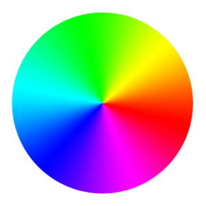
Sometimes the HSL is represented as wheel with a triangle inside, but often you will find either a cylinder or circles that represent cross sections of the cylinder since you can't represent all colors in a single flat picture.
Wikipedia's article on HSL and HSV includes a HSL-HSV comparison picture from which we extracted the HSL part:
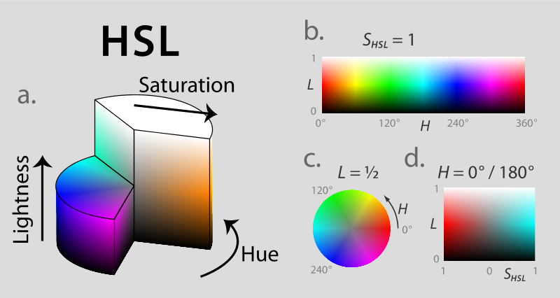
Notice: HSV is a similar model, but it's a bit more difficult to grasp. Below we just show a figure that compares HSL with HSV.
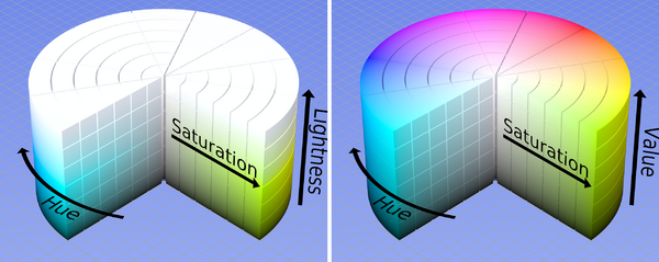
According to the CSS specification, retrieved 17:38, 11 September 2009 (UTC)
CSS3 adds numerical hue-saturation-lightness (HSL) colors as a complement to numerical RGB colors. It has been observed that RGB colors have the following limitations:
- RGB is hardware-oriented: it reflects the use of CRTs.
- RGB is non-intuitive. People can learn how to use RGB, but actually by internalizing how to translate hue, saturation and lightness, or something similar, to RGB.
CSS 3 and SVG implement the HSL model. Color (hue) is defined by the position in the color wheel, e.g. red = 0, red = 360, blue=240. Saturation and lightness are represented by percentages from 0 to 100%. Important: "normal" lightness is 50%.
Below is table of the main colors (at 30i intervals). We present three situations:
- Saturation is set to 100% and lightness to 50% (normal)
- Saturation of 50% and lightness of 25% (dark)
- Saturation of 75% and lightness of 75% (pastel)
Warning: You need a somewhat CSS 3 capable browser like Firefox 3+ or IE 9 ( IE 8 will not work)
| Hue | Color name | Sat=100% / Light=50% | Sat=50% / Light=25% | Sat=75% / light=75% |
|---|---|---|---|---|
| 0 | red | 0 - red | 0 - red | 0 - red |
| 30 | orange | 30 - orange | 30 - orange | 30 - orange |
| 60 | yellow | 60 - yellow | 60 - yellow | 60 - yellow |
| 90 | yellow-green | 90 - yellow-green | 90 - yellow-green | 90 - yellow-green |
| 120 | green | 120 - green | 120 - green | 120 - green |
| 150 | green-cyan | 150 - green-cyan | 150 - green-cyan | 150 - green-cyan |
| 180 | cyan | 180 - cyan | 180 - cyan | 180 - cyan |
| 210 | cyan-blue | 210 - cyan-blue | 210 - cyan-blue | 210 - cyan-blue |
| 240 | blue | 240 - blue | 240 - blue | 240 - blue |
| 270 | blue-magenta | 270 - blue-magenta | 270 - blue-magenta | 270 - blue-magenta |
| 300 | magenta | 300 - magenta | 300 - magenta | 300 - magenta |
| 330 | magenta-red | 330 - magenta-red | 330 - magenta-red | 330 - magenta-red |
| 360 | red | 360 - red | 360 - red | 360 - red |
Now, where is white an black ?
- Any hue that is 100% saturated and 100% lightness is white
- Any hue that is 0% saturated and/or lightness is black
So basically, an HSL color goes
- From colorful to colorless in terms of saturation
- From black to normal to white in terms of lightness (50% is normal)
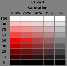
Below is screen capture from the CSS Color Module Level 3 (Working draft, retrieved 17:38, 11 September 2009 (UTC)) that shows on the X axis the saturation (100%, 75%, 50%, 25%, 0%) and on the Y axis the lightness.
Finally, here are some CSS code examples:
 { color: hsl(0, 100%, 50%) }   /* red */
 { color: hsl(120, 100%, 50%) } /* green */
 { color: hsl(120, 100%, 25%) } /* dark green */
 { color: hsl(120, 100%, 75%) } /* light green */
 { color: hsl(120, 75%, 75%) }  /* pastel green, and so on */
E.g. The following HSL CSS code
<p style="color: hsl(240,75%,75%);"> Kind of not so blue</p>
would show like this (your browser may not support this):
Kind of not so blue
For more information about HSL (and HSV), we point again to Wikipedia's HSL and HSV article.
HSL colors with CSS3
In CSS, the hsl value is defined by the position in the color wheel, e.g. red = 0, red = 360, blue=240. Saturation and lightness are represented by percentages. Here are a few examples:
 { color: hsl(0, 100%, 50%) }   /* red */
 { color: hsl(120, 100%, 75%) } /* light green */
 { color: hsl(120, 75%, 75%) }  /* pastel green, and so on */
E.g. The following HSL CSS code
<p style="color: hsl(240,75%,75%);"> Kind of not so blue</p>
would show like this (your browser may not support this):
Kind of not so blue
Alpha channel
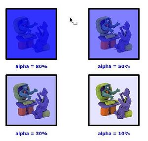
In computer graphics, alpha compositing is the process of combining an image with a background to create the appearance of partial transparency (Wikipedia)
In more simple terms, you can set the alpha to some percentage:
- 100% can't see through
- 80% bad see trough
- 50% in between
- 30% good see through
- 10% good see through, but very little color
- 0% no color left
Hint: With the alpha channel you can create other effects than see-through "windows". E.g. you can overlay textures with color or the other way round.
In CSS3 (if your browser supports it), you also can define the alpha channel. You may use so-called RGBA values using the rgba () notation for RGB values. a in rgba stands for alpha. Some examples:
p { background-color: rgba(0,0,255,0.5) } /* semi-transparent solid blue */
The following RGBA CSS inline code
<p style="float:right; background-color: rgba(0,0,255,0.3);"> Kind of blue</p>
would show like the "Kind of blue" box to the right (your browser may not support this):
Kind of blue
Alternatively you can use the opacity property that does the same, e.g.
background: rgb(255, 0, 0) ; opacity: 0.2;">
Finally, in CSS 3, you also may use HSL with an alpha channel, i.e. define an hsla value:
/* HSL model with alpha channel */
p { color: hsla(120, 100%, 50%, 1) }  /* green */
p { color: hsla(120, 100%, 50%, 0.5) } /* semi-transparent green */
p { color: hsla(120, 100%, 50%, 0.1) } /* very transparent green */
CSS 2 Background properties
When you use a background image within an element it is by default tiled vertically and horizentally, under the condition that its x/y dimensions are smaller than the styled element.
The background-repeat property allows to change default settings. E.g. to inhibit repetition, use:
background-image: url(flower.png);
background-repeat: no-repeat;
html vs. body vs. universal background
Example file:
Using background images is more difficult than it may seem. In particular there are a few principles and issues that you should be aware of:
- Pictures will shine through all elements, unless these elements explicitly define a background. In other words, if an element is transparent (this is the default), the picture underneath will show through empty spaces in the "box", i.e. the rectangle define by the element's boundaries.
- Watch out for interactions between using the universal rule, the body and the html for setting a background. E.g. if you define a background picture in the universal rule, bits can shine through in various HTML elements, even if you defined a other background in the body element. This, because backgrounds are not inherited.
- Various other properties also may have effects that may need some tuning. E.g. an none repeated background will display the picture as a whole.
If you set a background image like this, i.e. as default for all elements:
    * {
      background-image: url(tournesol.png);
      }
the pictures will fill the whole web browser window in the background. Images will not repeat again at each element level.
If you set a background image as "html" background like this:
 html {
       background-image: url(tournesol.png);
       }
then the whole visible window area will be filled with the picture.
If you set a background image as "body" background like this:
 body {
       background-image: url(tournesol.png);
       }
and if neither body nor the "*" has a background image it will fill the whole window as above.
However, if there is a background imageor color for the html tag or the universal selector, then only the the space taken up by the body will be filled. In particular, margins will not be filled and space left from the end of your content down to the end of the browser window will not be filled with this image.
Background image repetition
- Repeat in the x direction
background-repeat: repeat-x;
Positioning background images
Background pictures can be positioned with respect to the boundaries of the element.
E.g. if you insert a picture in the body you could put it at bottom right like this:
background-image: url(flower.png);
background-repeat: no-repeat;
background-position: bottom right;
background-position takes two values that represent both the y and the x offset, i.e. how much it will go down and to the right. If only one value is specified it refers to the horizontal x position.
Examples:
 background-position: 75px 150px;
 background-position: 60% 20px;
In order to center a picture, you could use:
background-image: url(flower.png);
background-repeat: no-repeat;
background-position: bottom right;
Fixing background images
You also can fix a background image with respect to the so-called viewport (what the users sees in the browser window), so that it stays when a user will scroll. More precisely: “If a background image is specified, this property specifies whether it is fixed with regard to the viewport ('fixed') or scrolls along with the containing block ('scroll').” (CSS 2 spec).
Example:
background-image: url(flower.png);
background-repeat: no-repeat;
background-attachment: fixed;
The background-attachment property will take the following values:
- scrolll (this is the default)
- fixed: Will scroll up-down/left-right when the user (or a script) uses scrolling.
- inherit
Note: An image is only visible if it sits in the content, padding or border area of the element.
The background shorthand
The CSS3 syntax is the following (see some examples later):
- background: background-color-value background-image-value background-repeat-value background-attachment-value background-position-value
Property values have to be presented in this order, but you can omit any you like:
Simple background examples:
 body {
  background:#ffffff url('flower.png') no-repeat right top;
  }
 body {
  background:#url('flower.png') no-repeat 50% top;
 }
CSS3 background properties
This is not complete, we only show some properties of the CSS Backgrounds and Borders Module Level 3 (draft standard, 15 feb 2011).
Multiple images
In CSS3 (only), one also can define multiple background images in two different ways. For now, just a simple example:
p {
background:
url(one.jpg) top center no-repeat,
url(two.png) 40% 20px no-repeat,
url(three.png) 60% 20px no-repeat,
url(four.png) 3em 3em repeat-x,
url(car.gif) center no-repeat;
}
Notice how these background image definitions are separated by commas !
CSS 3 background size and background origin
The CSS3 (only!) property background-size allows specify the size of background images using length, percentages, or contain, cover or auto.
This property is defined in the CSS Backgrounds and Borders Module Level 3 W3C Candidate Recommendation 15 February 2011. As of nov 2001 this should be implement in most recent browsers.
The most interesting value is cover since it allows to deal with "fluid" designs, i.e. web pages that adapt to the size of the screen.
Examples:
background-size: 300px;       /* 300 px wide and height is auto*/
background-size: 300px 200px; /* 300px width and 200px height */
background-size: 50% 50%;     /* set size = 50% of the parent element */
background-size: auto;
background-size: contain;     /* largest image size that makes it fit inside */
background-size: cover;       /* smallest image size that makes it fit inside */
If it doesn't work in your (older) browser, you could try:
 -moz-background-size:
 -o-background-size:
 -webkit-background-size:
In addition, you may have to use the background-origin property that specifies the background positioning area. The example lines should be self-explaining.
Examples:
 background-origin: padding-box /* default value */
 background-origin: border-box
 background-origin: content-box
Examples:
- See: The ‘background-size’ property section in the specification.
CSS 3 gradients
<div height="100px"
     style="background: linear-gradient(top, #eff484 0%,#1e5799 100%);">
Hello
</div>
The following example shows the kind of code that you now have to insert for dealing with current and last generation browsers.
background: #eff484; /* Old browsers */
background: -moz-linear-gradient(top,  #eff484 0%, #1e5799 100%); /* FF3.6+ */
background: -webkit-gradient(linear, left top, left bottom, color-stop(0%,#eff484), color-stop(100%,#1e5799)); /* Chrome,Safari4+ */
background: -webkit-linear-gradient(top,  #eff484 0%,#1e5799 100%); /* Chrome10+,Safari5.1+ */
background: -o-linear-gradient(top,  #eff484 0%,#1e5799 100%); /* Opera 11.10+ */
background: -ms-linear-gradient(top,  #eff484 0%,#1e5799 100%); /* IE10+ */
background: linear-gradient(top,  #eff484 0%,#1e5799 100%); /* W3C */
filter: progid:DXImageTransform.Microsoft.gradient( startColorstr='#eff484', endColorstr='#1e5799',GradientType=0 ); /* IE6-9 using ActiveX */
Border images
- Firstly, you need to set the with of the border, i.e. rather large
- The border-image property then will reuse these values
- The stretch keyword means that the image should be stretched to match the sizes above.
Example:
 border-style: solid;
 border-color: #930;
 border-width: 20px 40px 40px 40px;
 border-image: url(frame.png) 20 40 40 40 stretch stretch;
 -webkit-border-image: url(frame.png) 20 40 40 40 stretch stretch;
 -moz-border-image: url(frame.png) 20 40 40 40 stretch round;
Tools and links
Tools
- Firefox color picker
- ColorZilla includes an Eyedropper, ColorPicker, Page Zoomer and other colorful goodies.
- Gradient Generator
- CSS3 gradient generator is on-line tool (free) for creating CSS 3 gradients. It generates both CSS3 code and four vendor-specific codes that one could use before CSS is fully implemented.
Introductions
- Color
- Computer colors tutorial
- Web colors (Wikipedia)
- RGB color model (Wikipedia)
- HSL and HSV (Wikipedia)
- background size (CSS3.info)
Reference
CSS specification pages at W3C:
- http://www.w3.org/TR/CSS2/colors.html (stable)
- http://www.w3.org/TR/css3-background/ (W3C Candidate Recommendation 15 February 2011)
- http://www.w3.org/TR/css3-color/ (W3C Recommendation 07 June 2011)
Color tables:
- Web colors (Wikipedia)
- X11 color names (same as CSS3) at Wikipedia
