Stitch Era - adjusting stitch sections
Introduction
This is a beginner's tutorial for the Stitch Era embroidery software. It explains how to adjust auto-digitized embroidery objects that you may have produced as explained in Stitch Era - simple digitizing. In almost any tutorial we will address this issue again. We therefore only explain some general principles and operations here.
- Tutorial home page
- Stitch Era embroidery software
- Learning goals
- Understand the function and structure of stitch objects, i.e. so-called stitch sections
- Be able to change shape, size, position of stitch objects
- Be able to adjust various stitch parameters of stich objects
- Prerequisites
- Stitch Era embroidery software (in particular be able to create a new design).
- Stitch Era - simple digitizing
- Related pages
- none
- Materials
- You can reuse the pictures. In the wiki, click on picture to make it larger, then click again and save it.
- Quality and level
- This text should technical people get going with Stitch Era. I use it an optional master degree course in educational technology.
- Concurrent reading
- Next steps
- Stitch Era - vector graphics. You don't necessarily need to learn how to draw vector graphics that you then can convert to embroidery (stitch sections). However, you will be able to speed up your work and you also could reuse principles (e.g. Bezier drawing) for manipulating stitch sections as well as in other multi-media programs.
- Any other tutorial
This tutorial will demonstrate how to adjust so-called stitch sections. Let's recall that stitch sections are stitch paths (lines) or areas (shapes) that are almost directly stitchable. A stitch section defines an object in terms of how it should translate to stitches. In addition to defining a stitchable shape, stitch sections include many settable parameters including thread color (called "needle"), stitch density, stitch types (there are many kinds), entry and exit points.
Concepts
Stitch sections, paths and areas
There exist two major families of of stitch sections: paths and areas. Paths are dots connected by straight lines and curves (polylines), areas are surfaces defined by lines (borders) and fills (what is inside). Depending on the kind and the size of stitch sections, different sorts of stitches are recommended:
- Paths with a small width (less than 1mm) are usually embroidered with running stitches, i.e. some kind of line.
- Larger paths (1-2mm) are embroidered as columns using some kind of ZigZag or satin stitch.
- Small and/or narrow areas (up to 4mm) are also treated as columns and stitched as above
- Medium sized areas are usually filled with so-called patterns, i.e. compact fill stitches using various simple or complex designs.
- Large areas are difficult to render and are frequently filled with various kinds of textures, e.g. radial or so-called programmable stitches. Basically, one uses patterns with holes.
The following screen capture shows a simple design that uses the following kinds of stitch sections as shown in the object manager.
- Areas filled with patterns (all the blue, yellow, red green stuff)
- Areas filled with Zig-zags (the grey letters)
- Path filled with Zig-zags (the grey borders)

This screen capture also demonstrates the usefulness of the object manager. Have it on all the time and read more about it in Stitch Era - interface features for working with a design
In this tutorial we shall primairly focus on fills, i.e. anything that is neither a line nor a so-called column. Stitch Era, when using an auto-digitizing procedure, by default creates certain kinds of fill patterns that you may want to change for some stitch sections. You also can define a default pattern. In addition, we will talk about stitch density, length of running stitches and width of zigzag stitches, and pull/push compensation.
We shall discuss problems like the following:
- Some zig-zag stitches are too long (over 5mm) and you have to deal with this or else your embroidery might become a bit fragile
- Some areas shouldn't be filled with patterns since they are too big
- Stitch Era, by default, uses a very high stitch density, i.e. 5 lines/mm. In many cases, you may want to go with a lower density in order to avoid "stiff" bullet-proof embroidery.
- Some areas may need pull compensation, i.e. you will have to take into account that tissue can stretch and distort a design. Stitch Era does automatically add such compensation, but you should know what that means.
- You may decide to use borders since borders give a professional touch to freestanding sections. Stitch Era allows to add borders to stitch areas with two simple mouse clicks
Note: Professional digitizers seem to prefer converting manually each vector to a stitch section or even individual stitches. We show an example of how to do this when we discuss pull/push compensation.
Changing properties of a stitch section is really easy and we shall often do it in other tutorials.
- Select a stitch object either by clicking on it in the workspace or by selecting it in the object manager.
- Use the object inspector to make a change. Alternatively, you also can use the ribbon menu on top.

Again, the Interface may be slightly different in other versions of Stitch Era. The following screen capture was made in 2011, but as you can see, the overall logic is very similar: Select an object in the workspace, then change any parameter you like

Types of fills
Stitch Era allows to fill stitch sections in different ways. The following screen capture shows four fill types (there are more):
- Zigzag stitches (line 1)
- Fill patterns (lines 2, 3 and 4)
- Fill textures (line 5)
- Radial fills (last line)
In each line we modified stitch parameters a bit
- For the Zigzag and the patterns (four first lines), density changes from 5 lines/mm (bullet proof) to 2 lines/mm (transparent). We also used the ZigZag auto-split feature, else we'd have a single stitch going from one end of the square to the other.
- For the texture (programmable stitches), we changed vertical and horizontal density
- For the radial fills, we changed both offset (distance between radials) and stitch length
Common parameters:
- We took the default underlay stitches, they are (we believe) the same for all fill patterns
- No borders used. For the low density fills, one should create borders in most cases, e.g. with running stitches
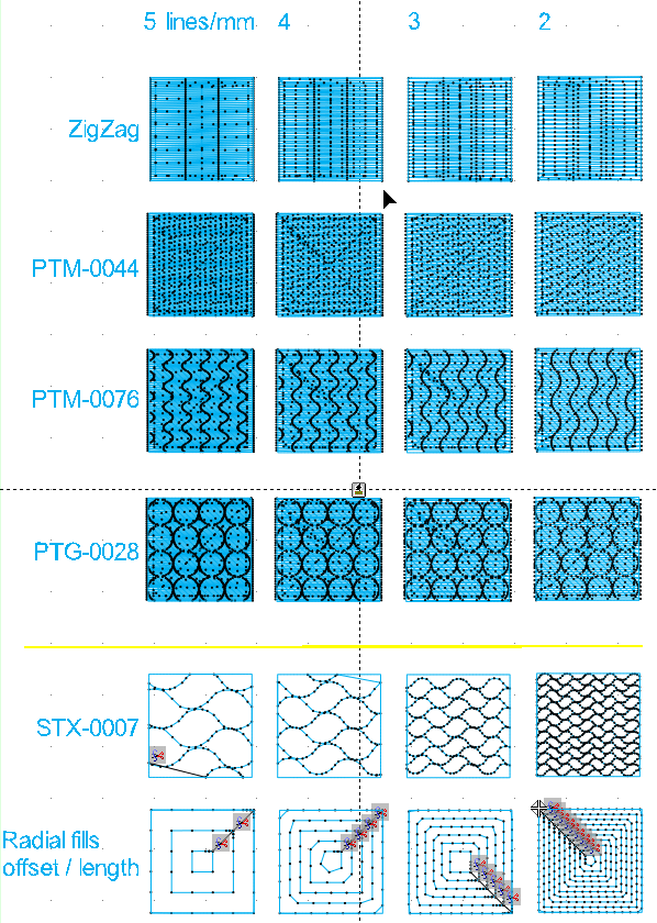
With respect to auto-split of zigzag columns, there are several options:
- proportional (divides the area by x %)
- fixed (creates columns according to length of stitches defined)
- random
In the picture below you can see the stitched design. Some squares are not very well rendered since we had to change threads and we also interrupted to make a few changes ...

Summary: Areas can be filled in many ways. Basically you will have to select a type of fill (e.g. a fill pattern or a radial fill). For each fill type, there are between a few and several dozens of subtypes. Once you decided to use a fill type, you then also can change its parameters, e.g. fill density, stitch length, color, border. You can either decide fill types and their parameters before digitizing ("to embroidery") or change the results for each stitch area later, as you will learn.
Dealing with stitch directions
After auto-digitizing some vector graphics art, e.g. through Art to Stitch (Intelligent) or Art to Stitch (Area only) you often would like to change direction of stitches, in particular if you use a fancy area fill pattern. As we shall explain below in some detail, grab the yellow controls of the so-called direction lines and turn. Press down the ALT key before selecting (this will help grabbing the controls). In addition, you can add new direction lines to areas.
Adjusting direction lines
In the following example, we auto-digitize a simple flower found on Openclipart.org ([football 5 petal flower)
- Open the SVG to Illustrator
- In SE: Artwork->Get from Application->Get from Illustrator
The flower is a clean a simple vector graphic that we will digitize with all the default values, except for the area pattern:
- Convert->To Embroidery
- Select Art to Stitch (Intelligent)
- Stitch settings tab: Select Pattern type = PTM-0014
- Click OK
The provisional result looks like this:

The selected green leave area shows a single horizontal direction line (yellow dots at both ends). You also can see faint lines in other petals, but won't see the yellow controls of course, since you only can edit one object at one time...
Now let's change direction of this wave pattern:
- Turn each of the five direction lines by ALT-dragging around one both of the the ends (yellow controls)
- If you turn off automatic stitch generation (what I recommend) hit the lighting button again (or press F9)

The much better result is below:

Notice: It can be difficult to grab the yellow direction line controls, i.e. if it sits on top of curve control. By pressing the ALT key you easily can select these.
Adding direction lines
Firstly, make sure that your object is an area. E.g. if you want to add a direction line to a column, transform into a turning area (select the object, then right-click, select "turning area")
Now, in the ribbon menu, you can see a direction button.

Dealing with push/pull distortion
In this section, we will introduce two things: 1) how to deal with "pull", a kind of distortion that is inherent in embroidery. 2) that you should be aware of the object manager and the section inspector. These tools provide an easy way to manage already digitized stitch sections.
Under normal condition, a fabric will be pull inwards, because (solid) stitches will create tension. This may be reinforced by the fact that most fabrics are elastic in the horizontal direction. Typically, a circle that looks perfect on the screen will print as a kind of egg.
Push means that columns are slightly longer than expected because of the mass of stitches that will push outwards.
The following figure shows push/pull directions for a horizontal stitching pattern:

Pull absolutely must be compensated and for at least two reasons:
- Areas will not look as intended, e.g. a circle becomes an ellipse
- When you use running stitches for the borders, these borders will be offset, i.e. one will be able to see fabric between the fill and the border.
There are several strategies which can be combined:
- Increase stitching in the direction of pull. E.g. make a circle stretch. This is required if you wish to keep the right proportions
- Use larger stitches, since each stitch will pull, i.e. less stitches = less pull
- Use a wide border stitch, e.g. a 2mm satin stitch. This will insure that the border is ok.
- Use an appropriate underlay pattern. This is very important if the fabric is somewhat elastic.
Stitch Era adds default compensation when you digitize into area fill patterns through both auto-digitizing and stitch to vector procedures.

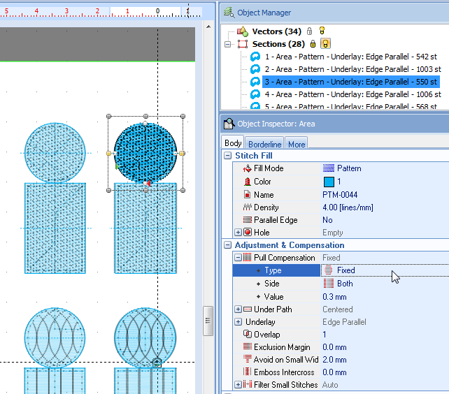
As you can see, by default, Stitch Era added 2mm pull compensation on both sides. It probably would be better to add a percentage or a higher value since the area (yellow butterfly wing from a child's drawing) is rather large.
We did some tests. The following screen capture shows the test design file where we wanted to know the following:
- Line 1: How does pull compensation for simple areas using a built-in fill pattern work with various settings ?
- Line 2: How do split zig-zag columns behave with various pull compensation settings ?
- Line 3: How do different kinds of borders render ? Borders are part of pull-compensation strategy.
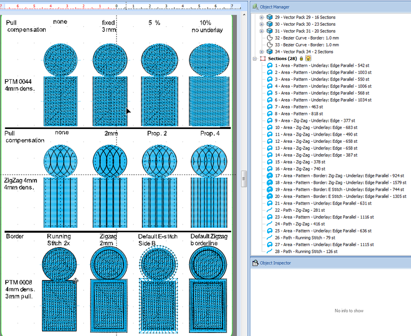
Each of the figures has the exact same size in terms of the initial vector graphics:
- The head is 20mm
- The body is 20x30mm
Btw. we created the vector design by first drawing a circle, then a rectangle. Both were body (fill) only. The precise size was defined with the Layout tool and we also use the latter to align the two. The two shapes were grouped and we then used the Matrix tool to create the three line/ four column layout. Finally, on line 3, we added on top of figures 1 and 2 an border-only figure on top.
The printed result looks like this. It was printed without stabilizer tissue on a non-elastic tissue, i.e. a napkin. None of the stitched figures is stiff and none seemed to have produced major puckering.

Below is an picture of the backside. To our uninformed opinion it seems to look clean enough. As you can see, the Stitch Area built-in pattern seems to deal in different ways with border areas (column 1). We were not aware of this and that may be a reason why our own added borders on line 3 look rather 3D.

Let's discuss line by line.
1) Line one - testing pull compensation
Line includes fill-only areas (i.e. no explicit borders that we added at the vector drawing or the stitch area level) and that were defined with the following parameters:
- We used a built-in area pattern named PTM-0044, i.e. some some kind of displaced horizontal Zigzag pattern.
- Stitch density was 4 lines/mm. Stitch Era default is 5 lines/mm, but we found that 4 is usually enough and produces softer results.
- Each of the four figures uses different pull compensations.
Results (see the "Pull compensation and border tests" picture above):
- The first figure isn't good, i.e. the circle became an vertical ellipse. No surprise since we didn't use any pull compensation.
- The second (3mm) and the third (5% of the width) are fine.
- The forth figure is over compensated (10% of the width), i.e. the circle became an horizontal ellipse.
What these results mean in practical terms is that the Stitch Era default compensation (figure 2) adding 3mm just does fine, at least for that kind of tissue and thread.
As you can see in the figure below, the object inspector displays all necessary information and also will allow you to change parameters. Displaying this information is simple: Click on the object manager tab to the right of the workspace. Then select a stitch object either on the workspace or the object manager. Make sure to hide vectors and to display the stitch sections (little buttons on top right).

2) Line two - testing pull compensation for ZigZag columns
Using several ZigZag columns to fill an larger is probably not the smartest thing to. You can see that the fabric shines through in the first two figures. Also it seems that some bobbin thread shows in all of them and we don't know why.
However the rectangles of figure 3 and 4 look in line 2 are fine. Pull compensation worked here.
Anyhow, in a real design, we probably would add a double running stitch in between the columns. Another solution would be to add smaller in-between columns as a first layer, but then result might become a bit stiff. A better alternative solution is to create slightly overlapping columns, but then the visual "column effect" would be diminished.
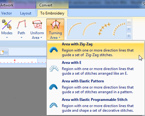
A note on its creation: As you can see in the figure to the right, we used a simple Zig-zag stitch. To get this stitch, select Turning Area->Area with Zig-Zag on top or use the pull-down Fill Mode menu in the object inspector. You then should split the area (both rectangle and circle) with an auto-split using something like Fixed 4mm, i.e. we told it to split the area into 4mm stitches. This gave us 5 columns for a total width of 20mm.
As you also can see in the screen capture of the Object Manger panel that we used the simple default underlay pattern, i.e. some kind of vertical lines.
3) Line three - playing with borders
The line three figures were digitized to the PTM 0008 simple horizontal pattern using the Stitch Era defaults for pull compensation, i.e. 3mm added. However we lowered the 5 lines/mm density to 4.
We manually added a running stitch to figure 1. I.e. we used a second identical vector on top that was stroke/border only and then digitized it to a Path -> Path with running stitch.
Figure 2 was made in a similar way, but we used a 2mm Zigzag
Figures 3 and 4 borders were made with through parametrization which is actually much faster and probably also leads to better results. In the Object Inspect, click on the Borderline tab and then select the kind of border you would like. In the screen shot to the right we show how we configured the E-Stitch that goes inwards (Side B).

Line three shows two things:
- Borders are interesting to have, certainly for free standing objects
- You will have to adjust layout. In our case, the circles and the rectangles overlap which is rather ugly. But that could be easily fixed ....
Overall conclusion
We retain some lessons from this test:
- Stitch Era pull compensation and default underlay worked fine for these smaller areas and the kind of tissue we used
- Vector shapes with borders should be slightly pulled apart in the design. I.e. the embroidered object will be larger than a borderless vector design.
- Multiple ZigZag columns work ok with rectangles if strong pull compensation is added
Converting Zigzag areas to fills
In this section, we show how to convert one type of stitch section into another. We shall show how to change a Zigzag area to a fill. The same procedure applies to any kind of major conversion.
The following example shows are rather large Mediawiki logo. Both the "M" and the "W" had to long stitches, i.e. would produce a somewhat fragile design. The easiest (not the prettiest) way to deal with this is to convert these areas to fill patterns.
There are two ways of doing a convert: Either quickly through the object inspector or slower with the menus on top.
(1) By selecting the area (either by clicking on the area) or by selecting it in the object manager (sometimes this is the only way to get the right section) you then can click on the Area Fill pull down menu (underneath the kind of pattern you use) and change the fill mode.
(2) Alternatively, you could use the menus on top. Select the object first. Then, in the Area Fill ribbon panel, click on the large rectangle representing the fill, e.g. a ZigZag icon. Then click on Convert as shown in the following screen captures. A similar third method is the following: Select the object, right click (context menu) and select convert.

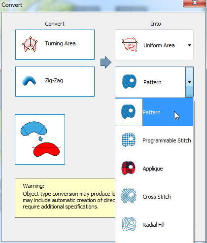
We strongly suggest learning how to use the object inspector. Operations are much quicker. In addition you could quickly changer other parameters.
Reducing fill density
For larger areas or if you want to insure comfortable wear, we suggest to reduce fill density.
- By default, Stitch Era uses about 5 lines/mm which is a dense setting.
- 3 lines/mm may not be as pretty since there will be some holes, but it will produce a more wearable design.
- A good compromise are 4 lines/mm (this is the default in some other embroidery software we believe)
In addition:
- density also should be adjusted to thread thickness. By default, we are using Rayon 40, a medium standard weight.
- density has a different effect on different stitch patterns.
The following picture shows a design that uses 5 lines/mm to the left. In addition the tips of the sun flower petals are stitched double. The design to the right uses mostly 3 lines/mm, except for sun flower zig zag that uses 4.

In order to change density in selected areas, it is best to use the Object manager (to the right) as the following picture shows:
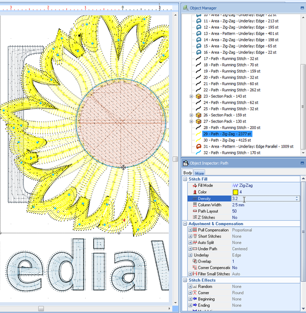
Finally, if you print something on top of another area, make sure to remove the underlay. I don't see any reason to have one.
Jump stitches
If you own a multi-needle machine then you might want to eliminate jump stitches, i.e. those longer lines that you will have to cut away after stitching.
Already when digitizing with "Art to Stitch" you should add trims to stitch sections.
- Open the "Stitch Settings" tab, i.e. tick
use cut after sections
Using programmable stitches and radial fills
After printing a larger design you may find that despite using underlay, there is pull effect. Or you may not like the heaviness of a larger design. There are several options for dealing with this:
- Skip some parts (just delete the areas or paths) ... may produces interesting effects on some designs. Note that you also may have unintentionally several layers of stitches on top of each other. Your machine will make noise and the thread may break if that happens. In that case, you certainly should remove areas or better redesign at the vector drawing level for example.
- Change the fill pattern to programmable stitches or radial fills that have big holes. We will look at this situation.
- In addition or alternatively you could change the density, e.g. use only 3 lines/mm instead of 5 (see just above)
Radial fill example
Below is a picture of a digitized design that probably would be difficult to print since it's fairly large.
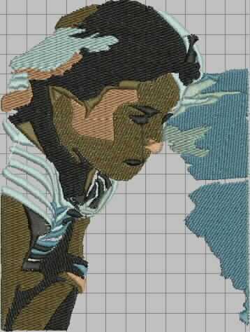
By removing both areas and by changing most remaining areas into radial fills, we sort of get an interesting result that (almost) can be printed on a T-shirt without underlay.
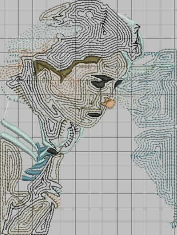
Below is the result, it was stitched without underlay, just paying attention to proper hooping.

Programmable stitches example
We got a vector drawing of the peace symbol (probable from openclipart.org).
The imported vector file was then used to create two stitch sections
- an outline
- a fill with a programmable stitch
Procedure:
- Make the vector (i.e. the peace logo) fill-only. Select the vectors only body icon in the format panel.

- Select the vector
- Convert to Area with texture

- Then go back to the vector and make it border only (vectors only outline in the format panel)
- Select the vector
- Convert (digitize) to Path.
You now will have two stich sections. One that has just a fill and one that only has a border. This way you will get a nice border.
The result should look like this, i.e. one vector (used in two different ways) and two stitch sections: A area with texture and a pack of running stitches. A pack is just a group of stitch sections that should be stitched together. You could "exploid it".
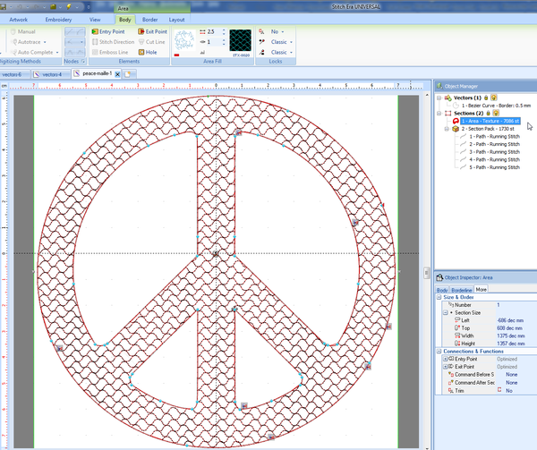
Alternatively, you also could have a added a border to a fill-only stitch area with the help of the object inspector. To do so, click on the Borderline tab.
The printed result (without stabilizer on a T-Shirt):
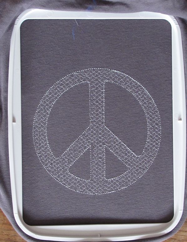

Of course, one should use a stabilizer on a T-Shirt, but this is still testing and actually the result isn't that bad. Some misalignment was rather due to the fact that tissue got stuck under the hoop...