Methodology tutorial - descriptive statistics and scales
This is part of the methodology tutorial (see its table of contents).
Introduction
This tutorial is a short introduction to simple descriptive statistics for beginners.
- Learning goals
- Understand the concept of a statistical variable as compared to a theoretical variable
- Be able to distinguish between the three major data types
- Identify, interpret and use simple measures of centrality and dispersion
- Understand some principles of data preparation
- Be able to create simple additive scales
- Prerequisites
- Methodology tutorial - theory-driven research designs
- Methodology tutorial - empirical research principles, in particular operationalization of theoretical variables
- Moving on
- Level and target population
- Quality
- under construction !!
Variables and data types
Quantitative data analysis concerns numbers, i.e. variable quantities that we collect through various measures, e.g. survey questionnaires, tests, experimental conditions or more qualitative observations that have been transformed to numbers. Statistical variables are:
- what we measure with various methods (e.g. survey questions, test items, observations, elements of logfiles)
- what we manipulate, e.g. two experimental conditions.
Most research uses quite a mass of data and one of the main goals of statistical analysis is to summarize the structure (or rather some structures) that can be found in the data. A first step in statistical data analysis is to summarize the distribution of the variables and a second one to compute indices from several variables and that measure a single theoretical concept.
Variables
Let's first recall the distinction between independent and dependent variables:
- Independent variables are measures or conditions that we will used to explain (i.e. predict) other variables
- Dependant variables are the ones that are explained
Descriptive statistics don't make a difference of these variables. It's up to you to decide which variables should explain something and what they should explain. The purpose of descriptive statistics is simply to summarize data distributions.
Finally, descriptive statics (in particular the mean and standard deviation) are the basis of most statistical analysis techniques.
Types of quantitative variables
Quantitative data come in different types or forms . Depending on the data type you can or cannot do certain kinds of analysis. There exist three basic data types and the literature uses various names for these. E.g.
|
Types of measures |
Description |
Examples |
|---|---|---|
|
nominal or category |
enumeration of categories |
male, female district A, district B, software widget A, widget B |
|
ordinal |
ordered scales |
1st, 2nd, 3rd |
|
interval or quantitative or "scale" (in SPSS) |
measure with an interval |
1, 10, 5, 6 (on a scale from 1-10) 180cm, 160cm, 170cm |
In quantitative research designs, it is not very interesting to present descriptive statistics. But they play an important role in early stages of data analysis, e.g. you can check data distributions and make more informed decisions about data analysis techniques. Simple data distributions are most often uninteresting, you should aim to explain these...
On the other hand, descriptive statistics are often used to compare different cases in comparative systems designs or they are used to summarize qualitative data in more qualitative studies.
In any case, avoid filling up pages of your thesis with tons of Excel diagrams. !!
Descriptive statistics
Descriptive statistics can have several roles in data analysis, e.g.
- to summarize a set of variables in order be able to compare them across systems, e.g. compare the performance in science literacy of a country with an OECD average.
- to summarize a set of data in order to help the research select appropriate techniques for analyzing relations between variables (inferential statistics)
In addition, coefficients (numbers that summarize information) of descriptive statistics are the basis for most more advanced statistics, e.g. models of causal relationships or multi-variate data reduction techniques.
Overview
We could distinguish three kinds of descriptive statistical summaries:
- (1) Coefficients that measure the centrality of variable
These coefficients measure some idea of the "most typical" or "most representative" data point. E.g. on a grading scale of 0-100, the average student might have 80 points.
- Mean also called average is the most popular measure. It only makes sense with interval variables.
- Median the data point that is in the middle of "low" and "high" values. It can be used with both interval and ordinal variables
- Mode is the most frequent value encountered, i.e. the highest point in a histogram or the biggest slice in a pie). To be used with ordinal or nominal variables.
Means are only meaningful for interval data, the median both for interval and ordinal data.
- (2) Charts
- Histograms can be used with all types of datatypes (provided that you have a good statistics programs)
- Pie Charts can be used as alternative to histograms, but they include less information.
- (3) Coefficients that measure the dispersion of a variable
- The Standard deviation is the mean deviation from the mean, i.e. how far the average of all differences is away from the mean.
- High and Low values are the extremes a both end of an interval or ordinal scale
- Quartiles use the same principles as the median. They define points for 1/4 intervals (25%, 50% and 75% of the population)
- (4) Measures of "normality"
- A so-called normal distribution is required by many statistical procedures. As we shall explain below, normal distributions are symmetric and have a a bell-shaped curve. About 70% of the data should lie withing 1 standard deviation (SD) of the mean and 95% within 2 SDs.
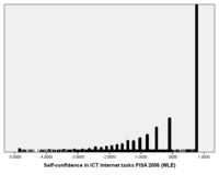
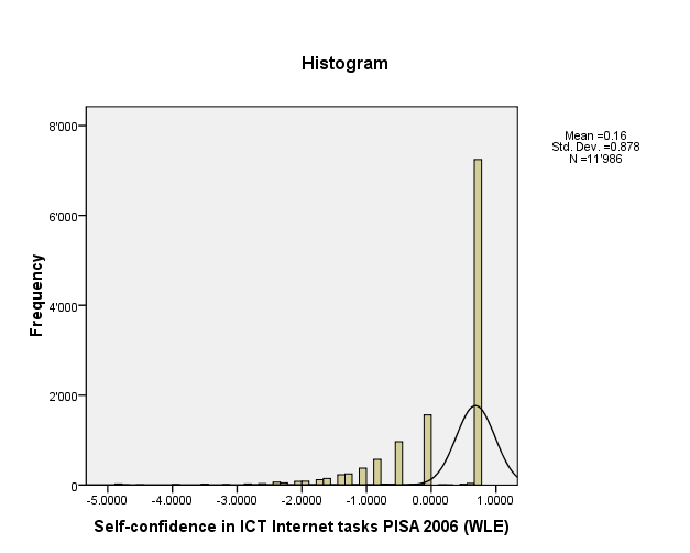
- Skew or skewness is a tilt to the left or to the right. The skewed part is also called tail. According to Garson, Skew should be within the +2 to -2 range when the data are normally distributed. Some authors use +1 to -1 as a more stringent criterion when normality is critical. To the right is an example of an very skewed distribution with a left tail of theSelf-confidence in ICT Internet tasks index from the PISA 2006 study. Skewness is -1.2. What this means is that a lot of pupils feel confident about simple Internet tasks in participating countries.
- Kurtosis measures how "peaked" a distribution is. Usually one uses the Fisher kurtosis where normality means 0. According to Garson, “common rule-of-thumb test for normality is to run descriptive statistics to get skewness and kurtosis, then use the criterion that kurtosis should be within the +2 to -2 range when the data are normally distributed (a few authors use the more lenient +3 to -3, while other authors use +1 to -1 as a more stringent criterion when normality is critical). Negative kurtosis indicates too many cases in the tails of the distribution. Positive kurtosis indicates too few cases in the tails.”. In our example, kurtosis is 1.3.
In the PISA example 2006 examples that follow below you will see other distributions with various kinds of skews and kurtosis.
- Outliers are often defined as cases that are further away from the mean than 3 standard deviations, but there exist other definitions. If you have small datasets (e.g. members that participate in a training course), such outliers can alter dramatically the outcomes and you should watch out for them. In huge samples that have designed test scores like the PISA studies, only 1.3% of students are at proficiency level 6 (708 points) in the literacy tests, i.e. about 2 standard definitions apart, and only very few are above 800 points. In other words you don't have to worry about outliers in such studies because (a) test have been designed to have a "normal" distribution and the sample size is huge, eliminating the relative importance of extremes.
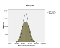
To the right you will find the frequencies of one the science scales for all students. The black curve represents the "normal distribution".
- (4) Combined data and charts
A popular chart is the boxplot. It displays various information like the quartiles. See Methodology tutorial - exploratory data analysis for more details.
In addition it will display outliers, i.e. extreme values.
An example from the PISA 2006 study
We shall illustrate descriptive statistical summaries with a variable from the PISA 2006 study. We extracted the Swiss students (still about 12'000 individuals which is a huge sample compared to typical studies in educational technology).
We had at look at the following survey question from the ICT Familiarity Component For The Student Questionnaire.
- Q4 How often do you use computers for the following reasons?
- (e) Use spreadsheets (e.g. <Lotus 1 2 3 ® or Microsoft Excel ®>)
Possible response items were:
- Almost every day
- A few times each week
- Between once a week and once a month
- Less than once a month
- Never
In the SPSS dataset this variable is called IC04Q05 Use spreadsheets IC4e and the data distribution goes likes this:
| 1 Almost every day | 571
|
4.7
|
4.8
|
4.8
| |
| 2 Once or twice a week | 1806
|
14.8
|
15.1
|
19.9
| |
| 3 Few times a month | 3024
|
24.8
|
25.3
|
45.2
| |
| 4 Once a month or less | 3181
|
26.1
|
26.6
|
71.8
| |
| 5 Never | 3377
|
27.7
|
28.2
|
100.0
| |
| Total | 11959
|
98.1
|
100.0
|
||
| Missing | 7 N/A
|
10
|
.1
|
||
| 8 Invalid | 24
|
.2
|
|||
| 9 Missing | 199
|
1.6
|
|||
| Total | 233
|
1.9
|
|||
| Total | 12192
|
100.0
|
|||
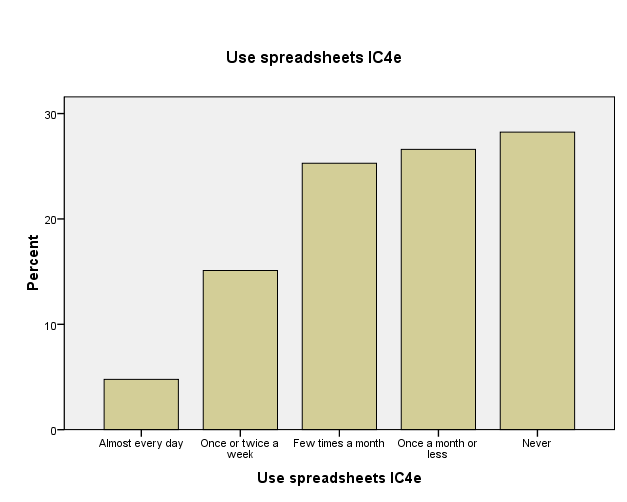
Out of 12192 pupils, 11959 answers are valid. The largest category are pupils who never used an spreadsheet (28.2%). Only very few use it often, i.e. almost every day (4.7%).
Some of the statistics you can get are:
| IC04Q05 Use spreadsheets IC4e | ||
| Valid N | 11959
| |
| Missing | 233
| |
| Mean | 3.58
| |
| Median | 4.00
| |
| Mode | 5
| |
| Std. Deviation | 1.182
| |
| Skewness | -.397
| |
| Std. Error of Skewness | .022
| |
| Kurtosis | -.818
| |
| Std. Error of Kurtosis | .045
| |
| Range | 4
| |
| Minimum | 1
| |
| Maximum | 5
| |
| Sum | 42864
| |
| Percentiles | 25 | 3.00
|
| 50 | 4.00
| |
| 75 | 5.00
| |
The most typical pupil (media) is 4, i.e. he/she uses a spreasheet once per month or less.
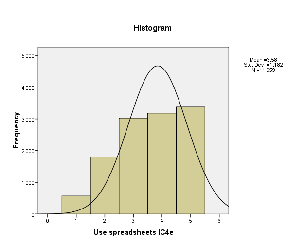
Below are two kinds of histograms. A bar chart that shows response items and a frequency chart that shows some statistical information plus the expected normal distribution curve.
It can be argued that some statistics like the mean, standard definition, kurtosis and swewness should not be used for ordinal variables in analysis. However, in description statistics these coefficients provide information that is useful to have. You only have to be careful when you interpret. E.g. a mean or 3.58 in using spreadsheets, means that the average user is between "few times a month" and "once per month or less", i.e. regularly but really not often. The median (4) is safer to interpret: The typical student uses a spreadsheet once a month or less.
It is always safer to interpret true interval data, e.g. sophisticated predictive indices that have been built from several questionnaire items and that we shall introduce below.
Data preparation
Before you start any interesting analysis work, you'll have to do some preparation work:
- Find a statistics program
- Import the data and clean them
- Do the documentation (inside the program), .e.g create variable names and labels, response item names and labels, missing values and selection of data type. If you don't get this right you will be very very sorry later on ...
Statistics programs and data preparation
Firstly you should select a good statistics program.
- If available, plan to use a commercial statistics program like SPSS or Statistica. This way you get local support and access to a huge range of analysis methods.
There also exists good freeware (but it's slightly more difficult to use):
- IDAMS Statistical Software, which is sponsored by UNESCO
Some freeware can even do things that you can't do with commercial software, e.g. advanced data visualization. But these systems are rather meant for experts. E.g.
- R is a freely available language and environment for statistical computing and graphics which provides a wide variety of statistical and graphical techniques: linear and nonlinear modelling, statistical tests, time series analysis, classification, clustering, etc.
Do not use programs like Excel. You will not only loose your time, but you can't even do the most simple statistics that are required for any serious work. Of course there are exceptions:
- Use such programs for simple descriptive statistics if you think that you can get away with these or if the main thrust of your thesis does not involve any kind of serious data analysis.
Data documentation
These are the minimal steps:
- Enter the data
- Assign a number to each response item (planned when you design the questionnaire)
- We also suggest to enter a clear code for missing values (no response), e.g. -1, but a blank can also do.
- Make sure that your data set is complete and free of errors
- Some simple descriptive statistics (minima, maxima, missing values, etc.) can help to detect really bad coding errors (e.g. 55 instead of '5').
- Learn how to document the data in your statistics program
- Enter labels for variables, labels for responses items, display instructions (e.g. decimal points to show)
- Define data-types (interval, ordinal or nominal)
Creation of composite scales (indices)
Composite scales measure one theoretical concept, e.g. the feeling of being there (social presence) or confidence in ICT skills or use of computers in the classroom. Such a concept can not be measured directly and this is why they are also called latent variable. To measure such "soft" implicit variables with questionnaires, several questions are asked. They then can be combined into a single composite variable, also called index, indice or scale.
We can distinguish between two kinds of composite scales
- Indices that summarize not necessarily strongly correlated measures. E.g. global computer skills.
- Indices that are unidimensional, i.e. they measure the same theoretical concept.
There exist many forms of scales and we will just discuss the most simple forms here. See Scales and Standard Measures for more information.
Basic scales based on averages
Most scales are made by simply by computing the means of the different questions and that use the same range of response items, e.g. a five point scale. These are sometimes called "Likert scales".
Use the following procedure:
- Eliminate items that have a high number of non responses
- Make sure to take into account missing values (non responses) when you add up the responses from the different items. A real statistics program (SPSS) does that for you.
Make sure when you create your questionnaire or when you use survey data from someone else, that all items use the same range of response items, else you will need to standardize (see below). It does not make sense to compute the means from five-point scales with items from ten-point scales !
Standardized z-score scales
Sometimes you will have to use standardized scales. One popular standardization formula is the "Z-transformation" and that will produce the so-called standard score, also called z-values, z-scores, normal scores, and standardized variables. The formula to compute a standard score for an individual is the following:
standard score = deviation score of individual / standard deviation
standard score = ( Xi - mean ) / standard deviation
Standard scores can be easily compared, because the standard score indicates how far from an average a particular score is in terms of standard deviation.
- The mean (average) is always 0
- The standard deviation is always 1.
In other words, standard scores shows how much an individual is different in terms of the global distribution. This deviation or or difference is expressed in terms of N standard deviations. E.g. a score of 2 means that a given individual is 2 standard deviations above the average individual in the sample.
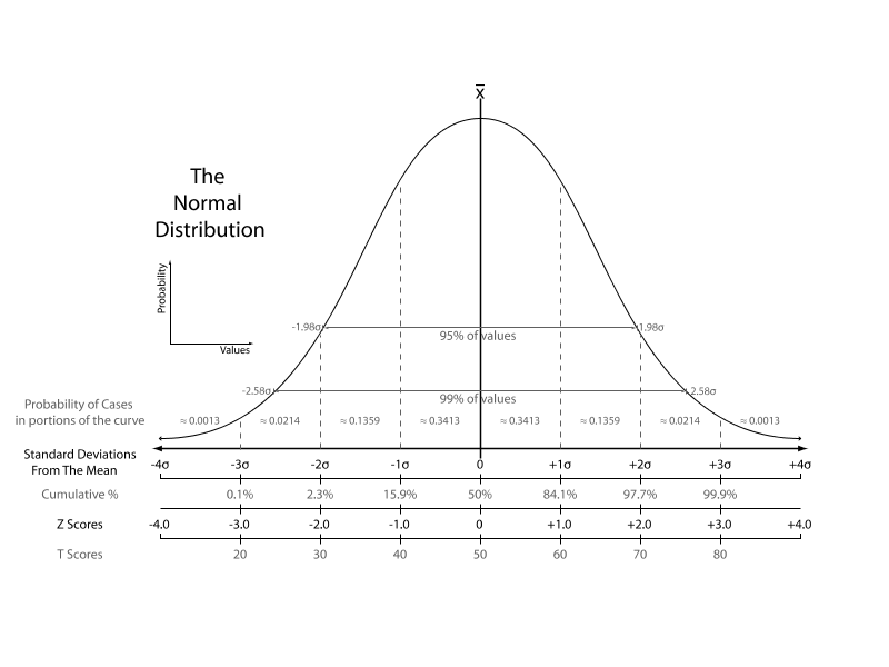
Below is picture from wikipedia that shows a comparison of various measures of the normal distribution. This figure tells that 70% of the population is found within the the range of the standard deviation. Above +1 SD an individual is in the top 15% and that below -1 sd she/he is in the lowest 15%. Z-scores should typically range from -3 to 3.
People may find it difficult to think in terms of means = 0 and standard deviation = 1 and there exist esthetic variations like T scores. T scores are computed with the following formula and are used with the hope that people will understand it better with reference to the familiar "percent" schema.
T=z*10+50
The mean is 50 and the standard deviation is 10. PISA 2006 used a test score schema with a mean = 500 and a standard deviation = 100.
On a side note:
- It is important to understand that many statistical methods assume that data is normally distributed. These are called parametric. Non-parametric statistics do not require assumptions about the data distribution.
- Standard scores keep kurtosis and skewness, i.e. parametric statistical analysis will lead to the same results whether you standardize or not. Standardization of variables with different scales however is a must, if you build composite scales or do cluster analysis.
- In the US, standard scores are used to compare students from different schools because in some there is grade inflation (typical scores vary between B and A) and in others it's not the case.
- When distributions are very different from normal (e.g. a J-shaped curve), other standardization methods might be used, since the z-transformation assumes that the mean and standard deviation correctly describes centrality (the typical individual) and dispersion (the typical deviation of individuals).
The quality of a scale
Again: use a published set of items to measure a variable (if available). If you do, you can avoid making long justifications !
A first criteria is sensitivity: questionnaire scores discriminate. For example, if exploratory research has shown higher degree of presence in one kind of learning environment than in an other one, results of a presence questionnaire should demonstrate this.
A second criteria is unidimensionality (a kind of scale reliability): Internal consistency between items used to build a scale that measures the same latent variable (theoretical concept) must be high. There exist several methods to test this. The most popular is Cronbach's alpha. It measures the extent to which item responses correlate with each other. According to Garson, “If alpha is greater than or equal to .6, then the items are considered unidimensional and may be combined in an index or scale. Some researchers use the more stringent cutoff of .7”.
A third criterion is some kind of construct validity: results obtained with the questionnaire can be tied to other measures
- e.g. were similar to results obtained by other tools (e.g. in depth interviews),
- e.g. results are correlated with similar variables.
Example: The Constructivist On-Line Learning Environment Surveys
The Constructivist On-Line Learning Environment Surveys include one to measure preferred (or ideal) experience in a teaching unit. It includes 24 statements measuring 6 dimensions.
- We only show the first two (4 questions concerning relevance and 4 questions concerning reflection).
- Note that in the real questionnaire you do not show labels like "Items concerning relevance" or "response codes".
|
Statements |
Almost Never |
Seldom |
Some-times |
Often |
Almost Always |
|---|---|---|---|---|---|
|
response codes |
1 |
2 |
3 |
4 |
5 |
|
Items concerning relevance | |||||
|
a. my learning focuses on issues that interest me. |
O |
O |
O |
O |
O |
|
b. what I learn is important for my prof. practice as a trainer. |
O |
O |
O |
O |
O |
|
c. I learn how to improve my professional practice as a trainer. |
O |
O |
O |
O |
O |
|
d. what I learn connects well with my prof. practice as a trainer. |
O |
O |
O |
O |
O |
|
Items concerning Reflection | |||||
|
... I think critically about how I learn. |
O |
O |
O |
O |
O |
|
... I think critically about my own ideas. |
O |
O |
O |
O |
O |
|
... I think critically about other students' ideas. |
O |
O |
O |
O |
O |
|
... I think critically about ideas in the readings. |
O |
O |
O |
O |
O |
- Algorithm to compute each scale
For each individual add the response codes and divide by number of items you have. Make sure that you do not add "missing values"
Therefore, a better method is to use a "means" function in your software package since it automatically will take into account the fact that you may have missing values:
relevance = mean (a, b, c, d)
Example - Individual A who answered a=sometimes, b=often, c=almost always, d= often gives:
(3 + 4 + 5 + 4 ) / 4 = 4
Example - Individual B who answered a=sometimes, b=often, c=almost always, d=missing gives:
(3 + 4 + 5) / 3 = 4
and certainly NOT:
(3 + 4 + 5 + 0) / 4 or (3 + 4 + 5 -1) / 4 !!
Scales construction is easy if you know how to use your statistics program. E.g. in SPSS you find the variable computing tool in menu: Transform -> Compute Variable ...
Weighted maximum likelyhood scales
There exist much more complex models to construct scales, and in particular the ones used in item response theory. A typical example are the so-called Programme for International Student Assessment (PISA) studies. They take place every three years and collect information about 15-year-old students in participating countries. It's main purpose is to find out {{how well students are prepared to meet the challenges of the future, rather than how well they master particular curricula.}} (OECD 2009, foreword).
PISA assessment produces two kinds of data:
- Assessment of literacy in various domains (cognitive items), e.g. PISA 2006 covered reading, mathematics and science. The main study also included attitudinal questions.
- Contextual data (student background questionnaire, school questionnaire and optional parents questionnaire)
“The PISA 2006 context questionnaires included numerous items on student characteristics, student family background, student perceptions, school characteristics and perceptions of school principals. In 16 countries (optional) parent questionnaires were administered to the parents of the tested students. Some of the items were designed to be used in analyses as single items (for example, gender). However, most questionnaire items were designed to be combined in some way so as to measure latent constructs that cannot be observed directly. For these items, transformations or scaling procedures are needed to construct meaningful indices” (OECD 2009: 304).
The PISA studies use more complex models to compute indices. PISA employs scaling models based on item response theory (IRT) methodologies. This item response modelling is based on so-called weighted likelihood estimates which are fairly difficult to understand. We shall just report the general principle here.
“The relative ability of students taking a particular test can be estimated by considering the proportion of test items they get correct. The relative difficulty of items in a test can be estimated by considering the proportion of test takers getting each item correct. The mathematical model employed to analyse PISA data, generated from a rotated test design in which students take different but overlapping tasks, is implemented through test analysis software that uses iterative procedures to simultaneously estimate the likelihood that a particular person will respond correctly to a given test item, and the likelihood that a particular test item will be answered correctly by a given student. The result of these procedures is a set of estimates that enables a continuum to be defined, which is a realisation of the variable of interest. On that continuum it is possible to estimate the location of individual students, thereby seeing how much of the literacy variable they demonstrate, and it is possible to estimate the location of individual test items, thereby seeing how much of the literacy variable each item embodies. This continuum is referred to as the overall PISA literacy scale in the relevant test domain of reading, mathematics or science. [...]
For each of these literacy variables, one or more scales are defined, which stretch from very low levels of literacy through to very high levels. When thinking about what such a scale means in terms of student proficiency, it can be observed that a student whose ability estimate places them at a certain point on the PISA literacy scale would most likely be able to successfully complete tasks at or below that location, and increasingly more likely to complete tasks located at progressively lower points on the scale, but would be less likely to be able to complete tasks above that point, and increasingly less likely to complete tasks located at progressively higher points on the scale.” ([OECD 2009:284])
PISA 2006 then used two kinds of scales.
(1) PISA test scales are normalized with a mean of 500 and a standard deviation of 100, e.g. some kind of variant of the T score scale. These are also called PISA scales'. For example, the Scientific literacy performance measures some kind of overal science performance, but not just that. It also encapsulates a model of a multi-factor model of domain-related cognitive competences. The scale takes into account:
- the degree to which the transfer and application of knowledge is required
- the degree of cognitive demand required to analyse the presented situation and synthesise an appropriate
answer:
- the degree of analysis needed to answer the question
- the degree of complexity needed to solve the problem presented:
- the degree of complexity needed to solve the problem presented
- the degree of synthesis needed to answer the question
For each of these factors exist test items that measure various levels of difficulty. e.g. the difficult 717 points S485Q05(2) Acid Rain test requires that “he reason for a control in an investigation is understood and explicitly recognised. An ability to understand the modelling in the investigation is a pre-requisite.” (OECD 2009: 291). At the other end, the low level 399 points S213Q02 Clothes test requires that “Can select the correct apparatus to measure an electric current.”. These PISA scales then are divided into 6 bands (levels) to help with standardized interpretation of national scores for example.
- Scientific literacy performance band definitions on the PISA scale
Level     Score points on the PISA scale
6         Above 707.9
5         633.3 to 707.9
4         558.7 to 633.3
3         484.1 to 558.7
2         409.5 to 484.1
1         334.9 to 409.5
The distribution of sujects follows a bell-shaped normal curve, e.g. only 1.3% reach level 6 (above 707.9) points. See the PISA article for a summary.
(2) Some contextual indices were built through simple arithmentical transformations (e.g. averages).
(3) Most contextual indices were computed again trhough IRT scaling technology using weighted likelihood estimates (logits). Questionnaire items were either dichotomous or Likert-type (typically with 4 or five response items). These indices were normalized around the mean of 0 of all OECD countries with a standard deviation of 1. Again, we shall not explain how these scales were computed, but we just will present an example below that concern familiarity with ICT.
Example - PISA 2006 ICT familiarity
“The ICT familiarity questionnaire was an optional instrument administered which was administered in 40 of the participating countries in PISA 2006, for which four scaled indices were computed.” ( PISA 2006 Technical Report, OECD 2009)
These scales were made with logit (weighted maxium likelihood estimations, WLE). They were standardized as standard scale with the OECD mean = 0 and OECD SD = 1.
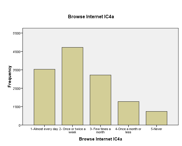
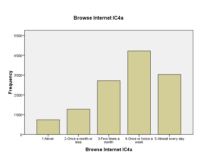
Values from the questionnaire have been inverted, so that higher values are "better". Inverting means that lowest value of a scale becomes the highest and the other way round as shown in the following example, a questionnaire item about "browsing Internet". Usually one would design a questionnaire so that response are in the "right" order, i.e. "high scores" are associated with "high values".
Four these inverted response itmes, four indices have been computed:
- ICT Internet/entertainment use (INTUSE).
- ICT program/software use (PRGUSE)
- Self-confidence in ICT Internet tasks (INTCONF)
- self-confidence in high-level ICT tasks (HIGHCONF)
These indices can be used to compare countries or other subpopulations. We shall shortly present the four indices below and point out some interesting differencies in the distribution.
ICT Internet/entertainment use
One of the indexes (composite scale) computed was the ICT Internet/entertainment use (INTUSE). It includes six question items with the following wording:
- IC04Q01 a) Browse the Internet for information about people, things, or ideas
- IC04Q02 b) Play games
- IC04Q04 d) Use the Internet to collaborate with a group or team
- IC04Q06 f) Download software from the Internet to (including games) 0.43
- IC04Q09 i) Download music from the Internet
- IC04Q11 k) For communication (e.g. e-mail or chat rooms)
Each item was measured with a five-point scale:
- Almost every day
- Once or twice a week
- A few times a month
- Once a month or less
- Never
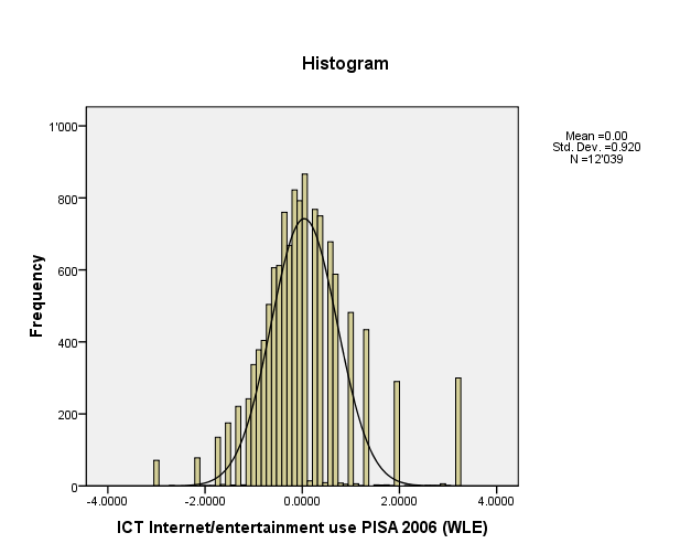
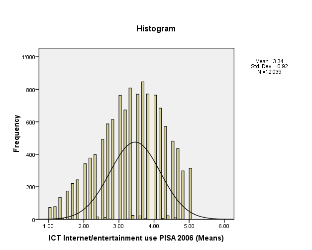
The frequency distribution looks like this. As you can see, the distribution is fairly "bell shaped", but there are some extremes to the left (almost never) and the right (very often). From this type of indice, it is not possible to know how exactly how the various questions items contributed. Also the data points from -4/+4 can not be translated to individual question scores. They represent OECD standard deviations. E.g. a value of 3.5 means that a student is 3.5 x the OECD standard deviation higher than the mean.
| INTUSE ICT Internet/entertainment use PISA 2006 (WLE) | ||
| N | Valid | 12039
|
| N | Missing | 153
|
| Mean | -.001633
| |
| Median | -.143800
| |
| Mode | .0889
| |
| Std. Deviation | .9198212
| |
| Skewness | .841
| |
| Std. Error of Skewness | .022
| |
| Kurtosis | 2.712
| |
| Std. Error of Kurtosis | .045
| |
| Range | 6.2201
| |
| Minimum | -3.0404
| |
| Maximum | 3.1797
| |
| Sum | -19.6627
| |
| Percentiles | 25 | -.555500
|
| 50 | -.143800
| |
| 75 | .363400
| |
In many studies the simpler method of computing the mean between of the questionnaire items is used. Statistically speaking this is a less good solution, since the response items (Almost every day, Once or twice a week, A few times a month, Once a month or less, never) form a typical ordinal scale. It therefore is argued that the mean is not an optional descriptor of the centrality of an individual's responses. On the other hand, computing a simple mean is much easier and understanding the procedure also. In this case, the difference between the two indices is not too important and they are highly correlated (r=.933). However, taking the simple mean creates a "flatter" curve,.
| INTUSE ICT Internet/entertainment use PISA 2006 (WLE) | Pearson Correlation | 1
|
.933
|
| Sig. (2-tailed) | .000
| ||
| N | 12039
|
12039
| |
| INTUSE_MEANS ICT Internet/entertainment use PISA 2006 (Means) | Pearson Correlation | .933
|
1
|
Sig. (2-tailed)
|
.000
|
||
| N | 12039
|
12039
| |
Below you can find the summary statistics and the histogram for the INTUSE_MEANS ICT Internet/entertainment use PISA 2006 (Means) indice variable
| INTUSE_MEANS ICT Internet/entertainment use PISA 2006 (Means) | ||
| N | Valid | 12039
|
| N | Missing | 153
|
| Mean | 3.3448
| |
| Median | 3.4000
| |
| Mode | 3.67
| |
| Std. Deviation | .92046
| |
| Variance | .847
| |
| Skewness | -.309
| |
| Std. Error of Skewness | .022
| |
| Kurtosis | -.549
| |
| Std. Error of Kurtosis | .045
| |
| Range | 4.00
| |
| Minimum | 1.00
| |
| Maximum | 5.00
| |
| Percentiles | 25 | 2.6667
|
| 50 | 3.4000
| |
| 75 | 4.0000
| |
The typical student has a score of 3.4 (median) and the average student of 3.3 (mean. This translates roughly by "several times per week" a student user internet for entertainment use. There were 6 questions from "Browse the Internet about people etc" to "For communication". If a respondent answers for each something like Once or twice a week or A few times a month he/she will get that kind of average, but we don't know for sure. The same student do some things almost every day and others much less.
In order to make sure that a battery of question items measure the same theoretical construct (i.e. Internet use for entertainment purposes), one can compute a coefficient that is called Cronbach's alpha. In our case the alpha is 0.725 which is sufficient but not great.
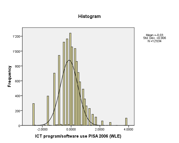
ICT program/software use
Items for the ICT program/software use (PRGUSE) indice, used the same response items as INTUSE and include five question:
- IC04Q03 c) Write documents (e.g. with <Word or WordPerfect>
- IC04Q05 e) Use spreadsheets (e.g. <Lotus 1 2 3 or Microsoft Excel®>)
- IC04Q07 g) Drawing, painting or using graphics programs
- IC04Q08 h) Use educational software such as Mathematics programs
- IC04Q10 j) Writing computer programs
| PRGUSE ICT program/software use PISA 2006 (WLE) | ||
| N | Valid | 12034
|
| N | Missing | 158
|
| Mean | -.025253
| |
| Median | .077700
| |
| Mode | -.0969
| |
| Std. Deviation | .9063436
| |
| Skewness | .220
| |
| Std. Error of Skewness | .022
| |
| Kurtosis | 2.788
| |
| Std. Error of Kurtosis | .045
| |
| Range | 6.4050
| |
| Minimum | -2.5771
| |
| Maximum | 3.8279
| |
| Sum | -303.8948
| |
| Percentiles | 25 | -.526100
|
| 50 | .077700
| |
| 75 | .521700
| |
Self-confidence in ICT Internet tasks
A third index was computed for self-confidence in ICT Internet tasks (INTCONF). The items were measured with a four point scale again
- I can do this very well by myself
- I can do this with help from someone
- I know what this means but I cannot do it
- I don't know what this means
- IC05Q01 a) Chat online
- IC05Q07 g) Search the Internet for information
- IC05Q08 h) Download files or programs from the Internet
- IC05Q09 i) Attach a file to an e-mail message
- IC05Q13 m) Download music from the Internet
- IC05Q15 o) Write and send e-mails
| INTCONF Self-confidence in ICT Internet tasks PISA 2006 (WLE) | ||
| N | Valid | 11986
|
| N | Missing | 206
|
| Mean | .164309
| |
| Median | .763800
| |
| Mode | .7638
| |
| Std. Deviation | .8781368
| |
| Skewness | -1.569
| |
| Std. Error of Skewness | .022
| |
| Kurtosis | 2.809
| |
| Std. Error of Kurtosis | .045
| |
| Range | 5.6179
| |
| Minimum | -4.8541
| |
| Maximum | .7638
| |
| Sum | 1969.4109
| |
| Percentiles | 25 | -.510500
|
| 50 | .763800
| |
| 75 | .763800
| |
These data suggest that most of the population has a similar level. The median (.76) is much higher than the mean (.16). This also suggest that some part of the population has real trouble compared to the "typical" population. This INTCONF indice, however doesn't tell much about how to interpret absolute values. A simple additive scale like the one we computer above would be more useful. Since the INTCONF is scaled with respect to the OECD mean, we can however compare contries both in terms of centrality and distribution patterns.
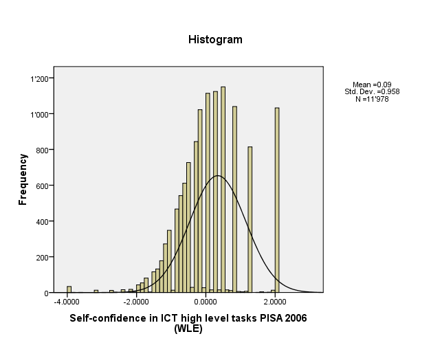
self-confidence in high-level ICT tasks
Finally self-confidence in high-level ICT tasks (HIGHCONF) was measured with the following questions using the same response items as INTCONF.
- IC05Q02 b) Use software to find and get rid of computer viruses
- IC05Q03 c) Edit digital photographs or other graphic images 1.01
- IC05Q04 d) Create a database (e.g. using <Microsoft Access>)
- IC05Q10 j) Use a word processor (e.g. to write an essay for school)
- IC05Q11 k) Use a spreadsheet to plot a graph
- IC05Q12 l) Create a presentation (e.g. using <Microsoft PowerPoint>)
- IC05Q14 n) Create a multi-media presentation (with sound, pictures, video)
- IC05Q16 p) Construct a web page
| HIGHCONF Self-confidence in ICT high level tasks PISA 2006 (WLE) | ||
| N | Valid | 11978
|
| N | Missing | 214
|
| Mean | .094825
| |
| Median | .039400
| |
| Mode | .4864
| |
| Std. Deviation | .9579116
| |
| Skewness | .156
| |
| Std. Error of Skewness | .022
| |
| Kurtosis | .793
| |
| Std. Error of Kurtosis | .045
| |
| Range | 6.0901
| |
| Minimum | -3.9905
| |
| Maximum | 2.0996
| |
| Sum | 1135.8184
| |
| Percentiles | 25 | -.457000
|
| 50 | .039400
| |
| 75 | .486400
| |
These scales are fairly well correlated as we shall discuss in the article on exploratory data analysis.
Bibliography
- OECED (Organisation for Economic Co-Operation and Development) (2009), PISA 2006 TECHNICAL REPORT. ISBN 978-92-64-04808-9. Also available as PDF from the PISA website.
- Elementary Concepts in Statistics (Statsoft), retrieved 18:24, 12 March 2009 (UTC).
- Reliability and Item Analysis (Statsoft), retrieved 18:24, 12 March 2009 (UTC).
- Garson, G. David (n.d.) Scales and Standard Measures, from Statnotes: Topics in Multivariate Analysis, Retrived 18:24, 12 March 2009 (UTC) from http://www2.chass.ncsu.edu/garson/pa765/statnote.htm.
- Garson, G. David (n.d.) Testing of Assumptions, from Statnotes: Topics in Multivariate Analysis, Retrived 18:24, 12 March 2009 (UTC) from http://www2.chass.ncsu.edu/garson/pa765/statnote.htm.
