Flash CS4 desktop tutorial: Difference between revisions
m (using an external editor) |
m (Text replacement - "<pageby nominor="false" comments="false"/>" to "<!-- <pageby nominor="false" comments="false"/> -->") |
||
| (8 intermediate revisions by 2 users not shown) | |||
| Line 1: | Line 1: | ||
{{Incomplete}}{{Flash tutorial|CS4|beginner|}} | |||
<!-- <pageby nominor="false" comments="false"/> --> | |||
{{Incomplete}}{{Flash tutorial|CS4}} | |||
<pageby nominor="false" comments="false"/> | |||
== Definition == | == Definition == | ||
| Line 22: | Line 17: | ||
'''Alternative:''' | '''Alternative:''' | ||
* [[Flash CS3 desktop tutorial]] | * [[Flash CS3 desktop tutorial]] | ||
* [[Flash CS6 desktop tutorial]] | |||
</div> | </div> | ||
| Line 46: | Line 42: | ||
'''Definition:''' By ''Flash Desktop'' (Desktop in short) we mean the whole CS3 authoring environment that you can see when you work on some Flash animation. | '''Definition:''' By ''Flash Desktop'' (Desktop in short) we mean the whole CS3 authoring environment that you can see when you work on some Flash animation. | ||
=== The default desktop === | === The default desktop(s) === | ||
When you first open a the Flash Desktop you will not see all the tools you later will use nor will it be necessarly adapted to the task you will engage in. You can arrange the Flash Desktop in various ways (see below) | When you first open a the Flash Desktop you will not see all the tools you later will use nor will it be necessarly adapted to the task you will engage in. You can arrange the Flash Desktop in various ways (see below). | ||
The desktop is arranged in as many columns of panels as you like, but usually about three. We usually keep the following organization | |||
* the main tool panel and the properties panel to the left, | |||
* the timeline and the drawing area (stage) in the middle column | |||
* some tools panels and libarires in the right column | |||
'''Play with the provided desktop layouts''' | |||
On top right, there is pull-down menu that allows you select from several preset configurations. The same menu is also available through the ''Window->Workspace'' menu. | On top right, there is pull-down menu that allows you select from several preset configurations. The same menu is also available through the ''Window->Workspace'' menu. | ||
| Line 68: | Line 63: | ||
Notice to people used to Flash CS3: The properties panel has been redesigned to fit into a side panel. As you shall see, this new layout will help you gain a little bit of space. If you feel lost, just select the "classic" layout. You will get the narrow, long tool panel to the left, however the properties panel will appear to the right ... | Notice to people used to Flash CS3: The properties panel has been redesigned to fit into a side panel. As you shall see, this new layout will help you gain a little bit of space. If you feel lost, just select the "classic" layout. You will get the narrow, long tool panel to the left, however the properties panel will appear to the right ... | ||
=== Configuring the desktop layout === | |||
Before we introduce the menu items, we suggest that you learn how to arrange your Desktop. | |||
Firstly, we'd like to show how to display additional panels (tools and libraries). Having most tools and resource libraries at your fingertip is in our opinion always a good idea if your screen is big enough. If you can afford to buy CS4, it maybe is also possible to invest in a monitor that can display 1900x1200 pixels or more. | |||
Panels are tools providing various editing and object mangement functionalities. Since some of these functionalities can't be found through the menus (and the other way round), you have to learn what kind of panels exist. All existing panels can be opened through the ''Window''' menu on top. | |||
CS4 lets you arrange such panels in various ways: | |||
* They can be '''floating''' (undocked | * They can be '''floating''' (undocked). Usually you would move them outside the Flash Desktop. This is very practical if you have a large screen or dual monitor setup. | ||
* They can be '''docked''' to the panel areas to the right, | * They can be '''docked''' to the panel areas to the right, the middle or the left. In each of these areas you can dock a new panel below or above an existing one. | ||
* They can be '''docked in groups''' of panels (each one will show as a tab) | * They can be '''docked in groups''' of panels (each one will show as a tab) | ||
If at some point all the panels you put on the desktop did disappear, just hit '''F4''' (or ''Window->Show Panels''). F4 toggles between more space for drawing and more tools. | |||
[[image:flash-cs4-docking-swatches-panel.png|frame|right|Docking a swatches panel to the right (creating a new column)]] | |||
To dock a panel, simply grab it with the mouse (press the left-mouse button in a empty area in its top bar) and then drag it to a "place" that will "light up" in some light blue color. | To dock a panel, simply grab it with the mouse (press the left-mouse button in a empty area in its top bar) and then drag it to a "place" that will "light up" in some light blue color. | ||
* If you see a blue line (vertical or horizontal) and then release the mouse the panel will dock below or to the right of the line as a "lone" panel | * If you see a blue line (vertical or horizontal) and then release the mouse the panel will dock below or to the right of the line as a "lone" panel | ||
* If a rectancle will light (i.e. the borders of a panel), you will dock your panel next to the other panel(s), i.e. it will appear in a tab. | * If a rectancle will light (i.e. the borders of a panel), you will dock your panel next to the other panel(s), i.e. it will appear in a tab. | ||
The | If this is not clear, just play moving around panels and pay attention to lines or rectangles that light up. Don't worry about "breaking the desktop". You always can re-start with a standard layout as we described above. | ||
The following three screenshots should illustrate the general principle. | |||
; Docking | ; Docking in an empty panel area to the right | ||
If you want to reproduce this example, close all panels (see below) or select the "Debug" configuration. Then open the swatches panel: Menu ''Window->Swatches'' or hit CTRL-F9. Now try to dock this panel. | |||
In the sceenshot to the right, the Swatches panel (shown in transparent color) is being dragged to the very right. You should see a faint blue vertical line on your flash desktop if you move the panel close to the right border. | |||
; | ; Panel groups - docking together with an other panel example | ||
Panels can be organized in groups. We usally lump together panels with similar functionality, but professional Flash designers also probably keep visible the tools they use most. In addition, they might know how to open a panel with a shortcut and keep some on a second monitor. | |||
Anyhow, in the next example, the (transparent) Color panel is in the process of being docked together with the swatches panel. The borders of the swatches panel ''area'' is blue, i.e. ready for docking | |||
[[image:flash-cs4-docking-color-panel.png|frame|none|Docking the color panel as a tab]] | |||
Now the color panel is firmly docked as a "tab" grouped together with the swatches panel. You could add another panel below this panel group, e.g. the libary panel. | |||
; To undock a panel | [[image:flash-cs4-docking-library-panel.png|frame|none|Docking the library panel below the color/swatches panels]] | ||
=== Other panel operations === | |||
Frankly, we never use these features, but they may come handy if you want to maximize the drawing area and/or if you have a small monitor. Also you may accidently do one of these things, so don't be surprised if panel minimizes as an icon or as a simple bar... | |||
; To undock a panel | |||
Drag it to some place that doesn't light blue. | Drag it to some place that doesn't light blue. | ||
; Closing a panel | |||
* On top-right of each panel is a pulldown menu. Click on "close" or "close group". You also can undock a panel and the click top-right on the "x" icon. | |||
; Minimizing | |||
Panel areas (left and right) can be minimized by double-clicking on its top bar (don't forget this if a panel seems to be empty) | |||
; Iconizing a panel group | |||
Click on the little double arrow (top-left) to iconize, click again to open | |||
; Adjusting panel size | |||
You can adjust panel width to a certain extent: Just drag the right or bottom borders. Each panel has a minimal size (width and height) and you can't reduce below it. E.g. if you want a classic vertical main tools panel you can, but you need to put it into its own column (else the other panels will impose a minimal size). | |||
=== Saving an environment === | === Saving an environment === | ||
To make sure that you can find a configuration again you may save it under a given name. If you do different kind of work with Flash, you may save several kinds of working environments. | To make sure that you can find a configuration again, you may save it under a given name. If you do different kind of work with Flash, you may save several kinds of working environments. | ||
* ''Window->Workspace->Save Current ...'' | * ''Window->Workspace->Save Current ...'' | ||
| Line 117: | Line 143: | ||
[[image:flash-cs4-dks-workspace.png|thumb|800px|none|Example configuration of a CS3 Flash desktop]] | [[image:flash-cs4-dks-workspace.png|thumb|800px|none|Example configuration of a CS3 Flash desktop]] | ||
Explanations about various panels will come later, but roughly, the tools are arranged in the following layout: | Explanations about various panels will come later, but roughly, the tools are arranged in the following three-column layout: | ||
Drawing tools Time-line Color + Alignment + Transformation | Drawing tools Time-line Color + Alignment + Transformation | ||
Object properties Drawing area Library + Components + Info | Object properties Drawing area Library + Components + Info | ||
== Built-in and online Help == | == Built-in and online Help == | ||
| Line 130: | Line 154: | ||
* Help from Adobe's website | * Help from Adobe's website | ||
Built-in | Built-in help is quite good, although contextual help could be better (like being a systematic option on the right-click menu). | ||
For some stuff you can get '''context-dependent''' help, i.e. learn something about certain objects, an item, etc. It will open a more or less appropriate section in the help tree. Select an item first (e.g. in the Workspace or in a panel), then either get Help from the Menu / hit F1 / or click on the little help icon in the properties panel. | For some stuff you can get '''context-dependent''' help, i.e. learn something about certain objects, an item, etc. It will open a more or less appropriate section in the help tree. Select an item first (e.g. in the Workspace or in a panel), then either get Help from the Menu / hit F1 / or click on the little help icon in the properties panel. | ||
| Line 156: | Line 180: | ||
; Setting up the size of the stage and other parameters | ; Setting up the size of the stage and other parameters | ||
With ''Modify->Document'' menu you can make several modifications: | With the ''Modify->Document'' menu you can make several modifications: | ||
* You can redefine the size of the stage. Stage size is the size your final Flash application will have. Therefore, think twice about the size '''before''' you start composing... | * You can redefine the size of the stage. Stage size is the size your final Flash application will have. Therefore, think twice about the size '''before''' you start composing... | ||
* You may change the background color (per default it is white and it will display as white in your animation). | * You may change the background color (per default it is white and it will display as white in your animation). | ||
* In the same ''Document menu'', you also should give your work a title and a short description | * In the same ''Document menu'', you also should give your work a title and a short description | ||
You also can change size and background color by clicking on an empty spot in the workspace and then modify its parameters the properties panel. | |||
=== The Menu Bar === | === The Menu Bar === | ||
| Line 213: | Line 239: | ||
Now you should be ready to start learning how to create drawings with Flash. Move on to the [[Flash drawing tutorial]]. | Now you should be ready to start learning how to create drawings with Flash. Move on to the [[Flash drawing tutorial]]. | ||
[[Category: | [[Category:Flash tutorials]] | ||
[[Category: Authoring tools]] | [[Category: Authoring tools]] | ||
[[Category: Flash]] | [[Category: Flash]] | ||
Latest revision as of 17:38, 22 August 2016
Definition
Learning goals:
- Learn about various components of the Flash CS4 Desktop
- Learn how to configure and how to save configurations
Prerequisites:
- none
Next steps:
Alternative:
Opening the desktop from the Flash welcome screen
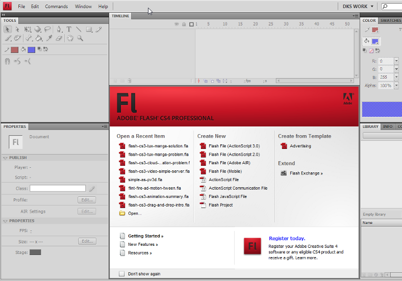
After launching Flash, you will see a welcome panel in the middle of the tool. Most of the CS4 functionalities are disabled at this stage. The welcome panel offers a few options for creating a Flash file.
To start working with a Flash file, you may either use the File Menu or select an item within the welcome panel. E.g.
- Use File->Open to open a *.fla file you are working on
- Open a "recent" item either through the File Menu or the button
- Create a new Flash file
- ...
If you tick Don't show again you won't see this panel anymore, but the same options are available through the File Menu. If you want it back: Edit->Preferences; On launch: (select welcome screen).
To start learning the Flash desktop, we now suggest to click on Flash File (ActionScript 3.0) since ActionScript 3 (aka AS3) is the most recent Flash scripting standard and works fine since Flash 9, i.e. since summer 2006.
Now click on Flash File (ActionScript 3.0) and enter the tool for real ...
Layout and configuration of the Flash Desktop
Definition: By Flash Desktop (Desktop in short) we mean the whole CS3 authoring environment that you can see when you work on some Flash animation.
The default desktop(s)
When you first open a the Flash Desktop you will not see all the tools you later will use nor will it be necessarly adapted to the task you will engage in. You can arrange the Flash Desktop in various ways (see below).
The desktop is arranged in as many columns of panels as you like, but usually about three. We usually keep the following organization
- the main tool panel and the properties panel to the left,
- the timeline and the drawing area (stage) in the middle column
- some tools panels and libarires in the right column
Play with the provided desktop layouts
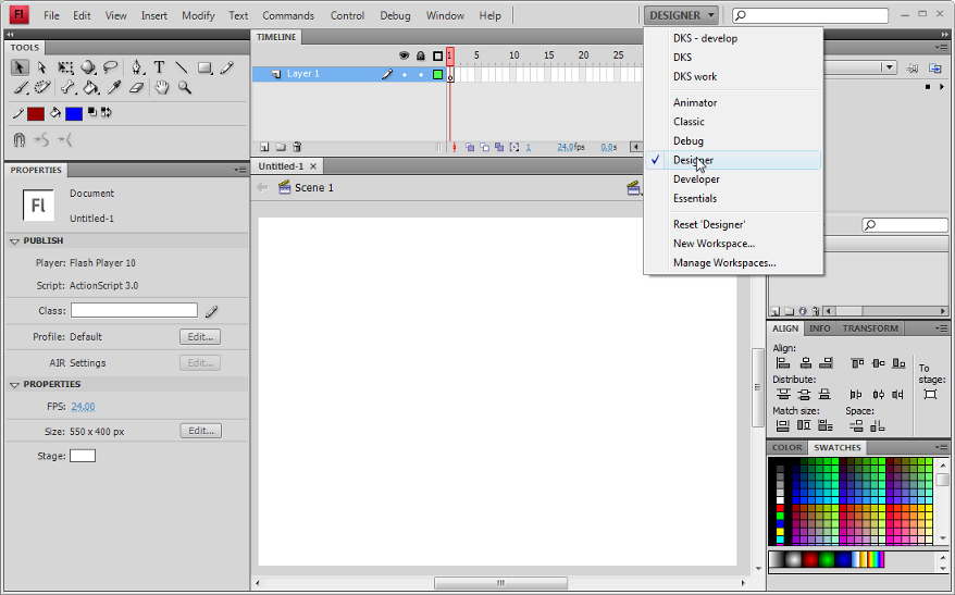
On top right, there is pull-down menu that allows you select from several preset configurations. The same menu is also available through the Window->Workspace menu.
After you added your own configurations, the pulldown menu might look like this:
For the kind of stuff you will learn in our Flash tutorials series, the best initial bet is to use the designer layout.
Notice to people used to Flash CS3: The properties panel has been redesigned to fit into a side panel. As you shall see, this new layout will help you gain a little bit of space. If you feel lost, just select the "classic" layout. You will get the narrow, long tool panel to the left, however the properties panel will appear to the right ...
Configuring the desktop layout
Before we introduce the menu items, we suggest that you learn how to arrange your Desktop.
Firstly, we'd like to show how to display additional panels (tools and libraries). Having most tools and resource libraries at your fingertip is in our opinion always a good idea if your screen is big enough. If you can afford to buy CS4, it maybe is also possible to invest in a monitor that can display 1900x1200 pixels or more.
Panels are tools providing various editing and object mangement functionalities. Since some of these functionalities can't be found through the menus (and the other way round), you have to learn what kind of panels exist. All existing panels can be opened through the Window' menu on top.
CS4 lets you arrange such panels in various ways:
- They can be floating (undocked). Usually you would move them outside the Flash Desktop. This is very practical if you have a large screen or dual monitor setup.
- They can be docked to the panel areas to the right, the middle or the left. In each of these areas you can dock a new panel below or above an existing one.
- They can be docked in groups of panels (each one will show as a tab)
If at some point all the panels you put on the desktop did disappear, just hit F4 (or Window->Show Panels). F4 toggles between more space for drawing and more tools.
To dock a panel, simply grab it with the mouse (press the left-mouse button in a empty area in its top bar) and then drag it to a "place" that will "light up" in some light blue color.
- If you see a blue line (vertical or horizontal) and then release the mouse the panel will dock below or to the right of the line as a "lone" panel
- If a rectancle will light (i.e. the borders of a panel), you will dock your panel next to the other panel(s), i.e. it will appear in a tab.
If this is not clear, just play moving around panels and pay attention to lines or rectangles that light up. Don't worry about "breaking the desktop". You always can re-start with a standard layout as we described above.
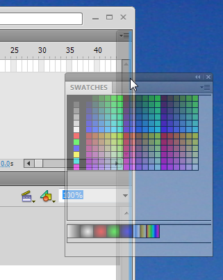
The following three screenshots should illustrate the general principle.
- Docking in an empty panel area to the right
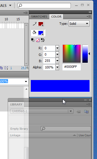
If you want to reproduce this example, close all panels (see below) or select the "Debug" configuration. Then open the swatches panel: Menu Window->Swatches or hit CTRL-F9. Now try to dock this panel.
In the sceenshot to the right, the Swatches panel (shown in transparent color) is being dragged to the very right. You should see a faint blue vertical line on your flash desktop if you move the panel close to the right border.
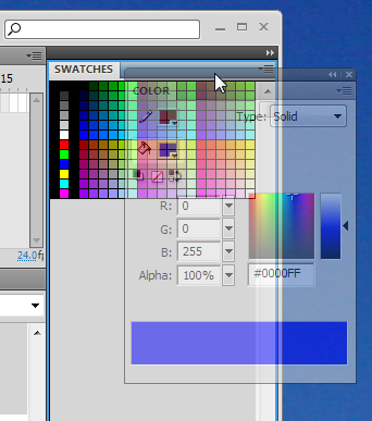
- Panel groups - docking together with an other panel example
Panels can be organized in groups. We usally lump together panels with similar functionality, but professional Flash designers also probably keep visible the tools they use most. In addition, they might know how to open a panel with a shortcut and keep some on a second monitor.
Anyhow, in the next example, the (transparent) Color panel is in the process of being docked together with the swatches panel. The borders of the swatches panel area is blue, i.e. ready for docking
Now the color panel is firmly docked as a "tab" grouped together with the swatches panel. You could add another panel below this panel group, e.g. the libary panel.
Other panel operations
Frankly, we never use these features, but they may come handy if you want to maximize the drawing area and/or if you have a small monitor. Also you may accidently do one of these things, so don't be surprised if panel minimizes as an icon or as a simple bar...
- To undock a panel
Drag it to some place that doesn't light blue.
- Closing a panel
- On top-right of each panel is a pulldown menu. Click on "close" or "close group". You also can undock a panel and the click top-right on the "x" icon.
- Minimizing
Panel areas (left and right) can be minimized by double-clicking on its top bar (don't forget this if a panel seems to be empty)
- Iconizing a panel group
Click on the little double arrow (top-left) to iconize, click again to open
- Adjusting panel size
You can adjust panel width to a certain extent: Just drag the right or bottom borders. Each panel has a minimal size (width and height) and you can't reduce below it. E.g. if you want a classic vertical main tools panel you can, but you need to put it into its own column (else the other panels will impose a minimal size).
Saving an environment
To make sure that you can find a configuration again, you may save it under a given name. If you do different kind of work with Flash, you may save several kinds of working environments.
- Window->Workspace->Save Current ...
If you are happy with what you did, save your configuration now ...
An example configuration
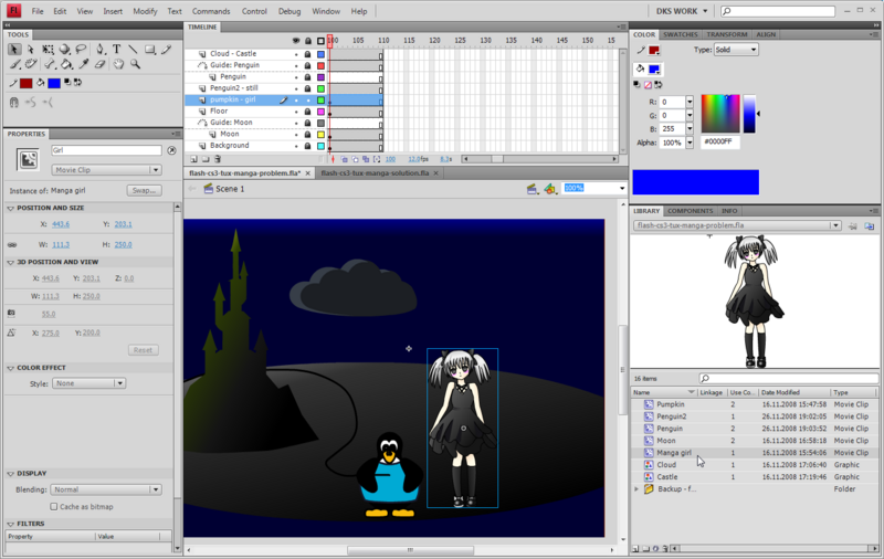
Here is an example configuration Daniel K. Schneider is using. I like to have most tools at my fingertips and I have a big enough monitor to allow for this. My real workspace is bigger than the one shown in the screen capture, which I made smaller in order to fit into this text.
Explanations about various panels will come later, but roughly, the tools are arranged in the following three-column layout:
Drawing tools       Time-line      Color + Alignment + Transformation
Object properties   Drawing area   Library + Components + Info
Built-in and online Help
There are two sorts of support:
- Built-in help
- Help from Adobe's website
Built-in help is quite good, although contextual help could be better (like being a systematic option on the right-click menu).
For some stuff you can get context-dependent help, i.e. learn something about certain objects, an item, etc. It will open a more or less appropriate section in the help tree. Select an item first (e.g. in the Workspace or in a panel), then either get Help from the Menu / hit F1 / or click on the little help icon in the properties panel.
In addition, in the built-in help menu you can find links to external sites. It doesn't work for me, maybe because my default browser is Firefox.
Within the built-in help texts there are also links to Adobe's on-line resources, but they do not necessarily work as they should (e.g. the link www.adobe.com/go/learn_fl_tutorials doesn't lead to a text tutorial as advertised.
However there is good stuff on Adobe's website, e.g.
- the video tutorials are truly useful to beginners:
- Video tutorials at Adobe
- The overall Flash Help page
- Flash resources
- In particular, you can find HTML and PDF versions of the built-in help. You may find online HTML pages more practical than the internal help window since the built-in window can not be detached from the Flash workspace and will hide your workspace area while your are reading. An good trick is to dock the built-in help against the Main tool panel (as shown in the screen capture above). Finally, PDF versions of the on-line site can printed, consider printing in some cases.
- Consult Flash and AS3 links - documentation for some navigation aids to Adobe's online documentation.
Getting ready to work with CS4
In this section we will summarize functionalities of some Flash components. We will introduce more functionalities in other tutorials. This is just a short overview.
The Work area and the stage
The stage in the middle (white by default) is the area where you work on your Flash contents. It is part of the work area. The gray part of the work area (also called backstage) can contain graphic elements on which you are working and that you plan to integrate into the stage sometimes, i.e. make them visible to the user. In deployed Flash "movies" this area will hold motion animation objects that later will "walk" into the scene.
- Setting up the size of the stage and other parameters
With the Modify->Document menu you can make several modifications:
- You can redefine the size of the stage. Stage size is the size your final Flash application will have. Therefore, think twice about the size before you start composing...
- You may change the background color (per default it is white and it will display as white in your animation).
- In the same Document menu, you also should give your work a title and a short description
You also can change size and background color by clicking on an empty spot in the workspace and then modify its parameters the properties panel.
The Menu Bar
On top of the desktop is the menubar (on the Mac it will be on top of the screen). Flash lets you use tools and manipulate objects in three different ways:
- Interact through menus
- Use shortcuts
- Interact through panels
Available operations in menus and panels are context dependent, i.e. they differ in function of what you are working on in the workspace. They also adapt to the Flash "Publish Setting" (e.g. ActionScript 2 vs. ActionScript 3).
Here is a short and incomplete summary of the menu groups' functionalities:
- File
- Opening and creating new files
- Definition of Publication Settings (you may change settings you initially defined)
- Edit
- Editing the scene
- Editing elements that are active
- View
- Define zoom level, grids, snapping (i.e. how the workspace displays)
- Note: Other important "view" items are in the Windows menu
- Insert
- Add new layers, frames, symbols etc. into the timeline
- Add a new scene
- Modify
- Modify elements on the workspace, e.g. convert a graphic to a symbol (make it a reusable object) or change the shape of a drawing
- Modify timeline elements
- Text
- Change text properties
- Spell checking
- Commands
- Run macros
- XML export / import
- Control
- Test animation in various ways (including just sub-elements)
- Debug
- Tools to find errors in your scripts
- Window
- Configure the workspace (add/remove panels)
- Help
- Built-in help and links to useful on-line resources
Now you should be ready to start learning how to create drawings with Flash. Move on to the Flash drawing tutorial.
