Methodology tutorial - quantitative data analysis
This article or section is currently under construction
In principle, someone is working on it and there should be a better version in a not so distant future.
If you want to modify this page, please discuss it with the person working on it (see the "history")
<pageby nominor="false" comments="false"/>
Quantitative data analysis
This is part of the methodology tutorial (see its table of contents).
Scales and "data assumptions"
Types of quantitative measures (scales)
Quantitative data come in different forms (measures). Depending on the data type you can or cannot do certain kinds of analysis. There exists three basic data types and the literature uses various names for these...
|
Types of measures |
Description |
Examples |
|---|---|---|
|
nominal or category |
enumeration of categories |
male, female district A, district B, software widget A, widget B |
|
ordinal |
ordered scales |
1st, 2nd, 3rd |
|
interval or quantitative or "scale" (in SPSS) |
measure with an interval |
1, 10, 5, 6 (on a scale from 1-10) 180cm, 160cm, 170cm |
For each type of measure or combinations of types of measure you will have to use different analysis techniques.
For interval variables you have a bigger choice of statistical techniques.
- Therefore scales like (1) strongly agree, (2) agree, (3) somewhat agree, etc. usually are treated as interval variables, although it's not totally correct to do so.
Data assumptions
In addition to their data types, many statistical analysis types only work for given sets of data distributions and relations between variables.
In practical terms this means that not only you have to adapt your analysis techniques to types of measures but you also (roughly) should respect other data assumptions.
- Linearity
The most frequent assumption about relations between variables is that the relationships are linear.
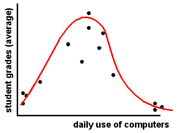
In the following example the relationship is non-linear: students that show weak daily computer use have bad grades, but so do they ones that show very strong use.
Popular measures like the Pearson’s r correlation will "not work", i.e. you will have a very weak correlation and therefore miss this non-linear relationship.
- Normal distribution
Most methods for interval data also require a so-called normal distribution
If you have data with "extreme cases" and/or data that is skewed, some individuals will have much more "weight" than the others.
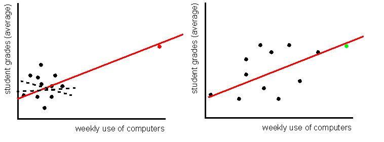
Hypothetical example:
- The "red" student who uses the computer for very long hours will lead to a positive correlation and positive regression rate, whereas the "black" ones alone in the data suggest an inexistent correlation. Mean use of computers does not represent "typical" usage in this case, since the "red" one "pulls the mean upwards".
- The "green" student however, will not have a major impact on the result, since the other data are well distributed along the 2 axis. In this second case the "mean" represents a "typical" student.
In addition you also should understand that extreme values already have more weight with variance-based analysis methods (i.e. regression analysis, Anova, factor analysis, etc.) since since distances are computed as squares.
The principle of statistical analysis
The goal of statistical analysis is quite simple: find structure in the data. We can express this principle with two synonymous formulas:
DATA = STRUCTURE + NON-STRUCTURE
DATA = EXPLAINED VARIANCE + NOT EXPLAINED VARIANCE
Example: Simple regression analysis
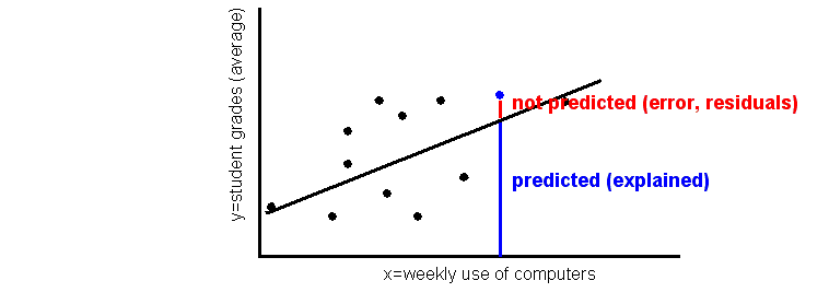
- DATA = predicted regression line + residuals (unexplained noise)
In other words: regression analysis tries to find a line that will maximize prediction and minimize residuals.
Stages of statistical analysis
Let's have look of what we mean be statistical analysis and what your typically have to do. We shall come back to most stages throughout this tutorial page:
- Clean your data
- Make very sure that your data are correct (e.g. check data transcription)
- Make very sure that missing values (e.g. not answered questions in a survey) are clearly identified as missing data
- Gain knowledge about your data
- Make lists of data (for small data sets only !)
- Produce descriptive statistics, e.g. means, standard-deviations, minima, maxima for each variable
- Produce graphics, e.g. histograms or box plot that show the distribution
- Produce composed scales
- E.g. create a single variable from a set of questions
- Make graphics or tables that show relationships
- E.g. Scatter plots for interval data (as in our previous examples) or cross-tabulations
- Calculate coefficients that measure the strength and the structure of a relation
- Strength examples: Cramer’s V for cross-tabulations, or Pearson’s R for interval data
- Structure examples: regression coefficient, tables of means in analysis of variance
- Calculate coefficients that describe the percentage of variance explained
- E.g. R2 in a regression analysis
- Compute significance level, i.e. find out if you have to right to interpret the relation
- E.g. Chi-2 for crosstabs, Fisher’s F in regression analysis
Note: With statistical data analysis programs you easily can do several steps in one operation.
Data preparation and composite scale making
Before you start any interesting analysis work, you'll have to do some preparation work:
- Find a statistics program
- Import the data and clean them
- Do the documentation (inside the program), .e.g create variable names and labels, response item names and labels, missing values and selection of data type. If you don't get this right you will be very very sorry later on ...
Statistics programs and data preparation
Firstly you should select a good statistics program.
- If available, plan to use a commercial statistics program like SPSS or Statistica. This way you get local support and access to a huge range of analysis methods.
There also exists good freeware (but it's slightly more difficult to use):
- IDAMS Statistical Software, which is sponsored by UNESCO
Some freeware can even do things that you can't do with commercial software, e.g. advanced data visualization. But these systems are rather meant for experts
- R is `GNU S', a freely available language and environment for statistical computing and graphics which provides a wide variety of statistical and graphical techniques: linear and nonlinear modelling, statistical tests, time series analysis, classification, clustering, etc.
![]() Do not use programs like Excel. You will not only loose your time, but you can't even do the most simple statistics that are required for any serious work. Of course there are exceptions:
Do not use programs like Excel. You will not only loose your time, but you can't even do the most simple statistics that are required for any serious work. Of course there are exceptions:
- Use such programs for simple descriptive statistics if you think that you can get away with these or if the main thrust of your thesis does not involve any kind of serious data analysis.
- Data preparation
These are the minimal steps:
- Enter the data
- Assign a number to each response item (planned when you design the questionnaire)
- We also suggest to enter a clear code for missing values (no response), e.g. -1, but a blank can also do.
- Make sure that your data set is complete and free of errors
- Some simple descriptive statistics (minima, maxima, missing values, etc.) can help to detect really bad coding errors (e.g. 55 instead of '5').
- Learn how to document the data in your statistics program
- Enter labels for variables, labels for responses items, display instructions (e.g.
decimal points to show)
- Define data-types (interval, ordinal or nominal)
Composite scales (indicators)
Composite scales measure one concept, e.g. "the feeling of being there" (social presence). Typically to measure such "soft" variables with questionnaires, several questions are asked. They then can be combined into a single variable.
- Basics
- Most scales are made by simply adding the values from different items (sometimes called "Lickert scales")
- Eliminate items that have a high number of non responses
- Make sure to take into account missing values (non responses) when you add up the responses from the different items
- A real statistics program (SPSS) does that for you
- Make sure when you create your questionnaire that all items use the same range of response item, else you will need to standardize !!
- Quality of a scale
- Again: use a published set of items to measure a variable (if available)
- if you do, you can avoid making long justifications !
- Sensitivity: questionnaire scores discriminate
- e.g. if exploratory research has shown higher degree of presence in one kind of learning environment than in an other one, results of presence questionnaire should demonstrate this.
- Reliability: internal consistency is high
- Inter-correlation between items (alpha) is high
- Validity: results obtained with the questionnaire can be tied to other measures
- e.g. were similar to results obtained by other tools (e.g. in depth interviews),
- e.g. results are correlated with similar variables.
- Example - The COLLES surveys
The Constructivist On-Line Learning Environment Surveys include one to measure preferred (or ideal) experience in a teaching unit. It includes 24 statements measuring 6 dimensions.
- We only show the first two (4 questions concerning relevance and 4 questions concerning reflection).
- Note that in the real questionnaire you do not show labels like "Items concerning relevance" or "response codes".
|
Statements |
Almost Never |
Seldom |
Some-times |
Often |
Almost Always |
|---|---|---|---|---|---|
|
response codes |
1 |
2 |
3 |
4 |
5 |
|
Items concerning relevance | |||||
|
a. my learning focuses on issues that interest me. |
O |
O |
O |
O |
O |
|
b. what I learn is important for my prof. practice as a trainer. |
O |
O |
O |
O |
O |
|
c. I learn how to improve my professional practice as a trainer. |
O |
O |
O |
O |
O |
|
d. what I learn connects well with my prof. practice as a trainer. |
O |
O |
O |
O |
O |
|
Items concerning Reflection | |||||
|
... I think critically about how I learn. |
O |
O |
O |
O |
O |
|
... I think critically about my own ideas. |
O |
O |
O |
O |
O |
|
... I think critically about other students' ideas. |
O |
O |
O |
O |
O |
|
... I think critically about ideas in the readings. |
O |
O |
O |
O |
O |
- Algorithm to compute each scale
For each individual add the response codes and divide by number of items you have. Make sure that you do not add "missing values"
Therefore, a better method is to use a "means" function in your software package since it automatically will take into account the fact that you may have missing values:
relevance = mean (a, b, c, d)
Example - Individual A who answered a=sometimes, b=often, c=almost always, d= often gives:
(3 + 4 + 5 + 4 ) / 4 = 4
Example - Individual B who answered a=sometimes, b=often, c=almost always, d=missing gives:
(3 + 4 + 5) / 3 = 4
and certainly NOT:
(3 + 4 + 5 + 0) / 4 or (3 + 4 + 5 -1) / 4 !!
Scales construction is easy if you know how to use your statistics program. E.g. in SPSS you find the variable computing tool in menu: Transform -> Compute Variable ...
Ok, now you should be ready to read about statistical analysis ...
Overview of statistical methods and coefficients
Descriptive statistics
- Descriptive statistics are not very interesting in most cases (unless they are used to compare different cases in comparative systems designs)
- Therefore, do not fill up pages of your thesis with tons of Excel diagrams !!
Some popular summary statistics for interval variables
- Mean
- Median: the data point that is in the middle of "low" and "high" values
- Standard deviation: the mean deviation from the mean, i.e. how far a typical data point
is away from the mean.
- High and Low value: extremes a both end
- Quartiles: same thing as median for 1/4 intervals
In most cases, you simply should not bother trying to include descriptive statistics in a thesis work or a conference paper. In particular avoid cakes. Simple data distributions are most often uninteresting, you should aim to explain these...
Which data analysis for which data types?
Statistical data analysis methods can be categorized according to data types we introduced in the beginning of this tutorial module.
The following table shows a few popular simple bi-variate analysis methods for a given independent (explaining) variable X and a dependent (to be explained) variable Y.
|
Dependant variable Y | |||
|---|---|---|---|
|
Quantitative (interval) |
Qualitative (nominal or ordinal) | ||
|
Independent (explaining) |
Quantitative |
Correlation and Regression |
Loglinear analysis |
|
Qualitative |
Analysis of variance |
Crosstabulations | |
Popular multi-variate analysis
|
Dependant variable Y | |||
|---|---|---|---|
|
Quantitative (interval) |
Qualitative (nominal or ordinal) | ||
|
Independent(explaining) |
Quantitative |
Factor Analysis, multiple regression, SEM, Cluster Analysis, |
Transform X into a qualitative variable and see below |
|
Qualitative |
Anova |
Multidimensional scaling etc. | |
Types of statistical coefficients
All statistical analysis produce various kinds (lots) of coefficients, i.e. numbers that will summarize certain kinds of informations.
Always make sure to use only coefficients that are appropriate for your data
There are four big kinds of coefficients and you find these in most analysis methods:
- Strength of a relation
- Coefficients usually range from -1 (total negative relationship) to +1 (total
positive relationship). 0 means no relationship.
- Structure (tendency) of a relation
- Summarizes a trend
- Percentage of variance explained
- Tells how much structure is in your model
- Signification level of your model
- Gives that chance that you are in fact gambling
- Typically in the social sciences a sig. level lower than 5% (0.05) is acceptable. Do not interpret data that is above !
These four types are mathematically connected: E.g. the signification level is not just dependent on the size of your sample, but also on the strength of a relation.
Crosstabulation
Crosstabulation is a popular technique to study relationships between normal (categorical) or ordinal variables.
The principle of cross tabulation analysis
Crosstabulation is simple, but beginner nevertheless get it often wrong. You do have to remember the basic objective of simple data analysis: Explain variable Y with variable X.
- Computing the percentages (probabilities)
Since you want to know the probability (percentage) that a value of X leads to a value of Y, you will have to compute percentages in order to able to "talk about probabilities".
In a tabulation, the X variable is usually put on top (i.e. its values show in columns) but you can do it the other way round. Just make sure that you get the percentages right !
- Steps
- Compute percentages across each item of X (i.e. "what is the probability that a value of X leads to a value of Y")
- Then compare (interpret) percentages across each item of the dependant (to be explained) variable
Let's recall the simple experimentation paradigm in which most statistical analysis is grounded since research is basically about comparison. Note: X is put to the left (not on top):
| Treatment | effect (O) | non-effect (O) | Total effect for a group |
|---|---|---|---|
| treatment: (group X) | bigger | smaller | 100 % |
| non-treatment: (group non-X) | smaller | bigger | 100 % |
You have to interpret this table in the following way: The chance that a treatment (X) leads to a given effect (Y) is higher than the chance that a non-treatment will have this effect.
Anyhow, a "real" statistical crosstabulation example will be presented below. Let's first discuss a few coefficients that can summarize some important information.
- Statistical association coefficients (there are many!)
- Phi is a chi-square based measure of association and is usually used for 2x2 tables
- The Contingency Coefficient (Pearson's C). The contingency coefficient is an adjustment to phi, intended to adapt it to tables larger than 2-by-2.
- Somers' d is a popular coefficient for ordinal measures (both X and Y). There exist two variants: "Symmetric" and "Y dependant on X".
- Statistical significance tests
Pearson's chi-square is by far the most common. If simply "chi-square" is mentioned, it is probably Pearson's chi-square. This statistic is used to text the hypothesis of no association of columns and rows in tabular data. It can be used with nominal data.
- In SPSS
- You fill find crosstabs under menu: Analyze->Descriptive statistics->Crosstabs
- You then can must select percentages in "Cells" and coefficients in "statistics". This will make it "inferential", not just "descriptive".
Crosstabulation - Example 1
We want to know if ICT training will explain use of presentation software in the classroom.
There are two survey questions:
- Did you receive some formal ICT training ?
- Do you use a computer to prepare slides for classroom presentations ?
Now let's examine the results
| X= Did you receive some formal ICT training ? | Total | ||||
| No | Yes | ||||
| Y= Do you you use a computer to prepare slides for classroom presentations ? |
Regularly | Count | 4 | 45 | 49 |
| % within X | 44.4% | 58.4% | 57.0% | ||
|---|---|---|---|---|---|
| Occasionally | Count | 4 | 21 | 25 | |
| % within X | 44.4% | 27.3% | 29.1% | ||
| 2 Never | Count | 1 | 11 | 12 | |
| % within X | 11.1% | 14.3% | 14.0% | ||
| Total | Count | 9 | 77 | 86 | |
| % within X | 100.0% | 100.0% | 100.0% | ||
The probability that computer training ("Yes") leads to superior usage of the computer to prepare documents is very weak (you can see this by comparing the % line by line.
The statistics tell the same story:
- Pearson Chi-Square = 1.15 with a signification= .562
- This means that the likelihood of results being random is > 50% and you have to reject relationship
- Contingency coefficient = 0.115, significance = .562. (same result)
Therefore: Not only is the relationship very weak, but it can not be interpreted. In other words: There is absolutely no way to assert that ICT training leads to more frequent use of presentation software in our case.
Crosstabulation - Example 2
(translation needed)
X = Teachers belief: Pour l'élève, le recours aux ressources de réseau favorise l'autonomie dans l'apprentissage Y = Classroom activities: Rechercher des informations sur Internet
|
X= Pour l'élève, le recours aux ressources de réseau favorise l'autonomie dans l'apprentissage |
|||||||
|
0 Tout à fait en désaccord |
1 Plutôt en désaccord |
2 Plutôt en accord |
3 Tout à fait en accord |
Total | |||
|
Y= Rechercher des informations sur Internet |
0 Regularly |
Count |
0 |
2 |
9 |
11 |
22 |
|
% within X |
.0% |
18.2% |
19.6% |
42.3% |
25.6% | ||
|
1 Occasionnally |
Count |
1 |
7 |
23 |
11 |
42 | |
|
% within X |
33.3% |
63.6% |
50.0% |
42.3% |
48.8% | ||
|
2 Never |
Count |
2 |
2 |
14 |
4 |
22 | |
|
% within X |
66.7% |
18.2% |
30.4% |
15.4% |
25.6% | ||
|
Total |
Count |
3 |
11 |
46 |
26 |
86 | |
|
% within X |
100.0% |
100.0% |
100.0% |
100.0% |
100.0% | ||
- We have a weak significant relationship: the more teachers agree that students will increase learning autonomy from using Internet resources, the more is it likely that they will let students do so.
The statistical coefficients we use is "Directional Ordinal by Ordinal Measures with Somer’s D":
|
Values |
Somer’s D |
Significance |
|---|---|---|
|
Symmetric |
-.210 |
.025 |
|
Y = Rechercher des informations sur Internet Dependent |
-.215 |
.025 |
Therefore, teacher's belief explain things ....
Simple analysis of variance
Analysis of variance (and it’s multi-variate variant Anova) are the favorite tools of the experimentalists. It is also popular in quasi-experimental research and survey research as the following example shows.
The principle of analysis of variance
X is an experimental condition (therefore a nominal variable) and Y usually is an interval variable.
Example: Does presence or absence of ICT usage influence grades ?
- You can show that X has an influence on Y if means achieved by different groups (e.g. ICT vs. non-ICT users) are significantly different.
Significance improves when:
- Means of the X groups are different (the further apart the better)
- Variance inside X groups is low (certainly lower than the overall variance)
- Coefficients
- Standard deviation is a measure of variance. It means "the mean deviation from the mean". I.e. how far from the central point is the "typical" individual.
- Eta is a correlation coefficient
- Eta square measures the explained variance
Differences between teachers and teacher students
(translation needed)
| Population | COP1 Frequency of different kinds of learner activities | COP2 Frequency of exploratory activities outside the classroom | COP3 Frequency of individual student work | |
|---|---|---|---|---|
| 1 Teacher trainee | Mean | 1.528 | 1.042 | .885 |
| N | 48 | 48 | 48 | |
| Std. Deviation | .6258 | .6260 | .5765 | |
| 2 Regular teacher | Mean | 1.816 | 1.224 | 1.224 |
| N | 38 | 38 | 38 | |
| Std. Deviation | .3440 | .4302 | .5893 | |
| Total | Mean | 1.655 | 1.122 | 1.035 |
| N | 86 | 86 | 86 | |
| Std. Deviation | .5374 | .5527 | .6029 |
- COP1, COP2, COP3 sont des indicateurs composé allant de 0 (peu) et 2 (beaucoup)
- The difference for COP2 is not significant (see next slide)
- Standard deviations within groups are rather high (in particular for students), which is a bad thing: it means that among students they are highly different.
Anova Table and measures of associations
At this stage, all you will have to do is look at the sig. level which should be below 0.5. You only accept 4.99% chance that the relationship is random.
| Sum of Squares | df | Mean Square | F | Sig. | ||
|---|---|---|---|---|---|---|
| Var_COP1 Frequency of different kinds of learner activities * Population |
Between Groups | 1.759 | 1 | 1.759 | 6.486 | .013 |
| Within Groups | 22.785 | 84 | .271 | |||
| Total | 24.544 | 85 | ||||
| Var_COP2 Frequency of exploratory activities outside the classroom * Population |
Between Groups | .703 | 1 | .703 | 2.336 | .130 |
| Within Groups | 25.265 | 84 | .301 | |||
| Total | 25.968 | 85 | ||||
| Var_COP3 Frequency of individual student work * Population |
Between Groups | 2.427 | 1 | 2.427 | 7.161 | .009 |
| Within Groups | 28.468 | 84 | 339 | |||
| Total | 30.895 | 85 |
Measures of Association
|
Eta |
Eta Squared | |
|---|---|---|
|
Var_COP1 Frequency of different kinds of learner activities * Population |
.268 |
.072 |
|
Var_COP2 Frequency of exploratory activities outside the classroom * Population |
.164 |
.027 |
|
Var_COP3 Frequency of individual student work * Population |
.280 |
.079 |
- associations are week and explained variance very weak
Regression Analysis and Pearson Correlations
We already introduced the principle of linear regression above. It is use to compute a trend between an explaining variable X and explained variable Y. Both must be quantitative variables.
The principle of regression analysis
Let's recall the principle: Regression analysis tries to find a line that will maximize prediction and minimize residuals.
- DATA = predicted regression line + residuals (unexplained noise)
- Regression coefficients
We have to parameters that summarize the model: B = the slope of the line A (constant) = offset from 0
The Pearson correlation (r) summarizes the strength of the relation
R square represents the variance explained.
Linear bi-variate regression example
The question: Does teacher age explain exploratory activities outside the classroom ?
- Independent variable X: Age of the teacher
- Dependent variable Y: Frequency of exploratory activities organized in the classroom
- Regression Model Summary
| R | R Square | Adjusted R Square | Std. Error of the Estimate | Pearson Correlation | Sig. (1-tailed) | N |
|---|---|---|---|---|---|---|
| .316 | .100 | .075 | .4138 | .316 | .027 | 38 |
- Model Coefficients
| Coefficients | Stand. coeff. | t | Sig. | Correlations | ||
|---|---|---|---|---|---|---|
| B | Std. Error | Beta | Zero-order | |||
| (Constant) | .706 | .268 | 2.639 | .012 | ||
| AGE Age | .013 | .006 | .316 | 1.999 | .053 | .316 |
| Dependent Variable: Var_COP2 Fréquence des activités d'exploration à l'extérieur de la classe | ||||||
All this means:
- We have a week relation (.316) between age and exploratory activities. It is significant (.027)
Formally speaking, the relation is:
exploration scale = .705 + 0.013 * AGE
It also can be interpreted as: "only people over 99 are predicted a top score of 2" :)
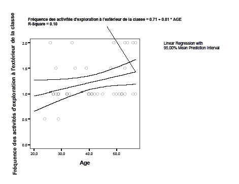
Here is a scatter plot of this relation:
There is no need for statistical coefficients to see that the relation is rather week and why the prediction states that it takes a 100 years to get there... :)
Exploratory Multi-variate Analysis
There many techniques, here we just introduce cluster analysis, e.g. Factor Analysis (principal components) or Discriminant analysis are missing here
Cluster Analysis
- Cluster analysis or classification refers to a set of multivariate methods for grouping elements (subjects or variables) from some finite set into clusters of similar elements (subjects or variables).
- There different kinds of cluster analysis. The most popular are : hierarchical cluster analysis and K-means cluster.
Typical use case examples: Classify teachers into 4 to 6 different groups regarding ICT usage
- Hierarchical cluster analysis
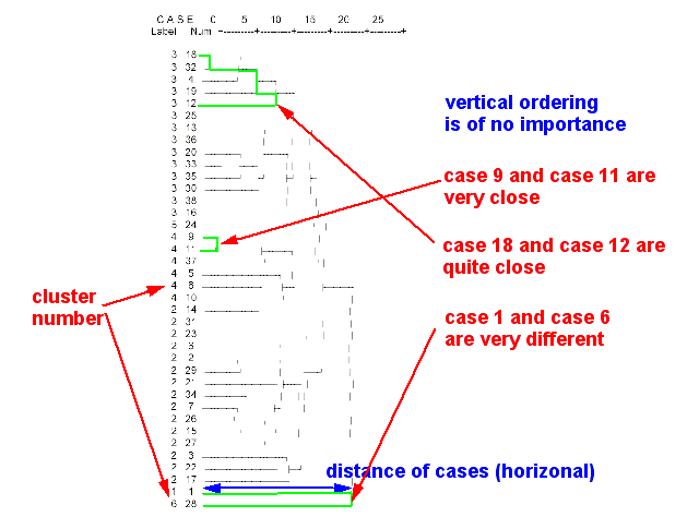
Tries to identify similar cases in progressive steps. This procedure allows to produce a dendogram (tree diagram of the population)
- Example
- classification of teachers
- A hierarchical analysis of 36 survey variables allowed to identify 6 major types of teachers with respect to ICT use:
- Type 1 : The "convinced teacher" (l’enseignant convaincu)
- Type 2 : The "active teacher" (les enseignants actifs)
- Type 3 : The "motivated teacher working within a bad environment" (les enseignants motivés ne disposant pas d’un environnement favorable)
- Type 4 : The "willing but not ICT-compentent teacher" (les enseignants volontaires, mais faibles dans le domaine des technologies(
- Type 5 : The "ICT-competent teacher unwilling to use ICT in the class" (l’enseignant techniquement fort mais peu actif en TIC)
- Type 6 : The "Willing and relatively weak in ICT teacher" (l’enseignant à l’aise malgré un niveau moyen de maîtrise)
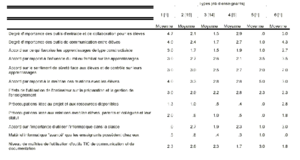
In order to come up with such labels like "convinced teacher" you have to list the means of all cluster variables and use your imagination.
(sorry this is hardly readable)
To do
- Translate examples
- Explain cluster analysis (some)
- Simple factor analysis
- Some very short discussion of confirmatory multivariate analysis (e.g. structural equation modelling)
