InkStitch - design letters
Introduction
This article describes how to digitize letters and other glyphs (e.g. numbers or dingbats) starting from fonts.
If you plan to create your own font for reuse (1) Check if there are instructions on how to do this at the InkStitch website and (2) look at the next article.
Find and download fonts
Most computers are already filled with many interesting fonts. However, you also can add additional fonts:
E.g. try Google fonts
- Select a font (red cross on top right) or several ones
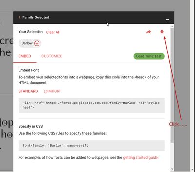
- At the bottom of Google's font page there is a pull up menu, click on it
- Click on the download arrow (top right)
Install fonts
Installing TTF fonts is easy in most operating systems. However, be aware that fonts that run on your computer may not show on other computers. That being said, to stitch a font we have to convert it to a path, so this doesn't matter much.
- Unzip the zip file
- Ubuntu: Either select each file and double click, then install in the font manager, or copy to ~/.local/share/fonts
- Windows: Select all the files and right-click. Select install.
Simple example with fills
We shortly shall explain how to create a simple font using fill stitches. The result will be fairly ugly unless the letters are really huge, fonts made with satin stitches look nicer (see below)
Let's write a text using the official Ink/Stitch Barlow font.
- Firstly install it on your computer. Download from Google, i.e. open the pull-up menu at the bottom of this page and click the download button on top right
- We suggest to use bold or extra bold fonts. The following example shows:
- Two text lines that are separate objects.
- Barlow, Ultra-Bold, 48 with (reduced) 100% line spacing
- The dimensions of both together are 65 X 30mm, e.g. could fit on a 8cm patch.
Now transform the text fonts to path
- Select All
- Menu Path-> Object to Path
- We also stretched out the "BLOODY"
Stitch with fills
- Select All
- Menu Object -> Fill and Strokes
- Click on the Stroke paint tab and remove the stroke paint
- In the fill tab, select a color (you can have a different one for each word or letter ....)
Parametrize for the fill
- Menu Extensions -> Ink/Stitch -> English -> Params
- Augment the density to 0.2mm and add an underlay
Result:
Notice that the original SVG may not display well since you may not have the Barlow font in your browser and we did not install it as web font on our webserver either. That does not matter for the exercise here, as we explained above. As you also can see, the "bloody" word is more readable since we spaced out the letters a bit. Most lettering software does so, by default.
Stitch with satin stitches
Lettering should be done with satin stitches and no fills.
In order to do this, you must understand topics explained in InkStitch - satin columns. It can take a long time to create letters with satin stitches, but it is necessary. Although, as of Sept 2019, a lettering module including four (or more) fonts exists. Try this first !
Start over from bloody-awsome-2.svg
- Remove the fills
- Define strokes, and make them small, e.g. 0.2mm
In order to create sating stitches, each letter must have exactly two subpath that are lines. If that is not possible, e.g. with the letters "B" and "A" we have to break down the letters into two or more objects.
Dealing with O and D
- Make sure that the two sub-path follow the same direction.
- To see directions: Menu Edit -> Preferences -> Tools -> Node. Tick "Always show outline" and "Show path direction on outlines"
- If not aligned, select a segment and Menu Path -> Reverse
- Either make the amounts of nodes even for each subpath or add rungs
Dealing with L, W, S, M and E
- Click on the Node Edit tool or hit
F2 - Select segments (click between two nodes) at two ends,
- Remove the segment
Now each of these letters should be composed of two line (subpath)
- Add rungs
Dealing with the others
The other letters, e.g. B and Y are more difficult. You will have to split these into separate objects. It maybe would be easier to do this in some earlier stage.
- Hit CTRL-L (i.e. simplify)
- Break paths at opposite points.
- Break apart
- Recreate objects with two sub-path (CTRL-K)
- Only after creating separate objects, do add rungs.
Result (could be improved by splitting into more sub-objects and by adding more rungs)
The file without the stitch layer looks like this. As you can see, the drawing could be still improved, in particular the "B".
Underlays
You can experience with various underlays, e.g. the default zigzag. Professional fonts do often have custom underlays.
Digitized fonts
(this section needs some more explanation)
As of July 2018) InkStitch did not include a lettering module that makes use of digitized fonts. Since 2019 a digitized font is included and is available through the lettering menu. You can enter text through a popup menu that will then generate satin objects. You can use InkScape tools to adjust the size of the whole group or of individual letters.
In addition, you can copy/paste fonts that other people made, e.g. read InkStitch - Geneva-simple typefaces and use Geneva-simple typefaces.
Copyright modification
Contents of this page including pictures and SVG files are also available under the GNU Free Documentation License and the Attribution 4.0 International (CC BY 4.0) license.
The Inkstitch project can use any element (text fragments, SVG files, pictures) for the project's official docs without giving attribution (just copy and paste).


