InkStitch - embroidery patch
Introduction
This little tutorial explains how to design embroidery patches with the free and open source Ink/Stitch software Creating a patch with only an embroidery machine requires a little bit of precision work.
Creating patches is explained in general terms in the Embroidery patch article. Here, we just summarize the method we like best.
Prepare the fabric
Cut out some appropriate stable fabric of the size of the badge. You can print out a paper version of the design and use it as model.
Ideally, you could cut the patches with a laser cutter. We use our Trotec Speedy 100R 50Mw with settings: power=23, speed=1.9 and Hz=1000. Since the fabric may warp consider weighting down the borders, e.g. with pieces of lead. Scissors will also do, but try to be as precise as possible.
Hooping
- Hoop a self-adhesive tear-away stabilizer, sticky side up.
- Consider using two layers to add some extra stability
Yes. Do not attach the stabilizer to the fabric (your pre-cut patch), wait !
Alternatively, for better results, you could use a heavy water-soluble or heat-soluble stabilizer. But then you'd have to rehoop after each patch...
Place the fabric
- Stitch a placement stitch (cut line) that has the size of the patch.
- Remove the hoop
- Stick the pre-cut fabric inside/on top of the cut line. (If you don't have a sticky stabilizer, glue the fabric)
- Put the hoop back
Tack down and stitch the border
- Stitch an optional tack down stitch followed by a zig-zag border first. The zig-zag's underlay will do as tack down.
Stitch the rest
Then stitch the rest of the embroidery.
Reuse the stabilizer in the hoop
Carefully remove the patch. It should "come off" very easily since the sating border will have perforated the stabilizer.
You now can just stick a piece of stabilizer on top of the round hole (sticky side up!) and start again without re-hooping.
If this is well done this will last for at least 10 patches.
It is probably best not to stitch a background color. Otherwise you will have to manage a pull/push effect and also make sure that the overlap between border and background looks good. The zigzag stitch should come first in order to make sure that it is correctly placed along the borders. Instead, use specialized fabrics for batches that look good, e.g. Twilly or Step from Gunold.
Glue the patch onto some cloth
In our very limited experience, the easiest way of gluing a patch to some cloth is to us some thermo film made of glue. Again, Gunold does have several products. We have HeatnBond Lite.
(1) Cut a piece of thermofilm, a bit bigger than the size of the patch
(2) Infuse the patch with glue
- Put the patch upside down in a heat press or on a table
- Put thermofilm on top, cooking paper on top. If it doesn't have its own cooking paper add your own.
- Heat with a heat press or an iron for about 3 seconds
- Remove the cooking paper
The patch now has glue on the down side. Alternatively, you can cut a larger piece of thermo film glue. Apply it is as shortly as possible (about 2 seconds) to the backside of the patch, then cut it.
(3) Apply the patch to the cloth
- Put the patch on top of the fabric.
- Again, put some cooking paper on top
- Heat for 5-10 seconds
(4) Sew the borders. Otherwise the patch might come off during washing.
Templates
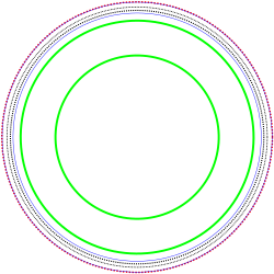
Below is our standard 6.2mm template that we designed for outreach activities. Positioning, tackdown line, a heavy zig-zag and a line inside the zig-zag.
. The green lines allow positioning digitized text (or a group of other objects) using the path -> Path effects -> Bend method described below.
|
(f***ing awsome). The hand was taken from the noun project (we do have a license). |
Below are two older 6.1cm templates with rather narrow zigzag borders and a 8cm one. You will have to put something inside and maybe calibrate
InkStitch example
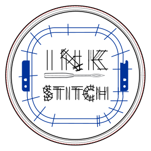
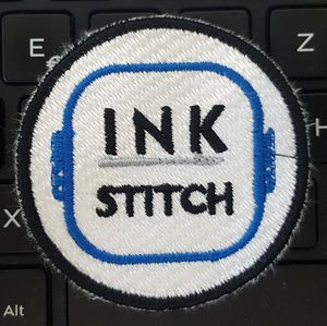
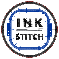
The following design is available from the Ink/Stitch web site. It nearly fits into the rather large 80mm patch. We just reduced it a little bit. We had to modify the design for the smaller 6.15 version, i.e. replace satin stitches in the needles by straight lines and remove some density.
6.15cm Version 1
This design has quite a lot of pull. One probably could make the blue frame a bit smaller and use less density. The border may have to be improved (less underlay) and the placement stitch made a bit bigger. The hooping probably wasn't perfect. We should have used two layers of stabilizer.
6.15cm Version 2
8cm Version 1
Of course, you are not really obliged to use the official colors.
Creating rounded text paths
Inkscape allows to position a text along a patch as explained in several tutorials you can find. E.g. the semi-official Text on Path tutorial or the more detailed NASA mission styled badges with Inkscape tutorial by Nicu. So far (version 1.16, Aug 2018), Inkstitch doesn't have a lettering module. You either can create your own font, or copy/paste letter objects from some font file. See InkStitch - lettering and copy e.g. from InkStitch - Geneva-simple typefaces or Small embroidery font.
Rounded text with a simple fill pattern
Below we shortly explain how to create an embroidery patch using Inkscape fonts. However, since we only provide minimal instructions, please do read NASA mission styled badges with Inkscape first or concurrently ! Use the following as a checklist.
Step 1 Add a circle to guide the text direction for the text on the upper half
- Add the circle (hold down the CTRL key)
- Center the circle with the align tool
- Remove fill and set the stroke to something small, e.g. 0.5mm
Step 2 Enter the text
To use a font with a simple tatami fill pattern:
- Use a bold font size that is neither to big (it must fit within the patch) and neither to small. E.g. for an 8x8cm patch you could start with size=27 (about 7.2mm)
- Copy/paste the text (as backup)
Step 3 Align the text.
- Select the text and the path of the circle
- Menu Text -> Put on Path
- You could adjust spacing between letters or words (but this is not strictly necessary)
- Click twice on the circle, then rotate using the controls in the corners.
Step 4 Translate text to path
- If you are happy with the result..
- Translate the font to path: Select the text, then Menu Path -> Object to Path
- Remove the stroke and set a fill color.
Step 5: Add a second circle for the bottom text
- It should be as large as the prior circle (above) plus the text
- Insert a text
- Add to to path, using this second circle
- Rotate the text on top
- Flip vertically
- Space out the letters a bit: Double click to select all the letters, then add spacing between letters, e.g. 5px
- Re-adjust rotation: Select the circle (click twice) and rotate.
- Translate to path and set the fill color.
Step 6:
- Remove the circles
- Add other content, e.g. we used fist roots from the noun project made by corpus delicti
Result:
The font will not look very good and should be replaced a satin stitched font. But this is more complicated.
Template for download
The following template for a 8cm patch includes the two circles plus some dummy SVG text that you can replace by yours. Before you engage in this, recall that digitized letters as areas look rather ugly...
- Click twice on the picture to get the SVG, then "save page as" in your browser window
- Change the text on top and bottom
- Rotate. Click on the circles (and not the text) to do so. To rotate an object in InkScape click on it twice. After the second time rotation handles will appear in the corners.
- Finally, translate the text to paths for embroidery, as described above.
Rounded text with embroidery font objects
This works for fonts where each letter is a single path. If not, see the next section.
There are InkScape extensions that allow spreading an object(s) along paths. To use a digitized embroidery font, follow the following procedure. Read Generate from path (semi-official manual)
As of Aug 2018, InkScape will crash with Inkscape 0.92.3 under Ubuntu 18. It works fine under Windows 10.
Step 1: Create the texts
- Copy / paste letters to create a phrase, e.g. from the Geneva simple fonts.
- Use the align and Distribute tool (bottom align for capitals and make gaps equal) to fix the positioning
- Adjust the size, e.g. h=7mm
- Group each phrase that will be aligned with a circle, e.g. "EMBROIDERY" and "FOR CHANGE"
- Copy/Paste the result (for backup purposes)
Step 2: Pattern along Path (text on top)
The extension requires the user to select two objects: Firstly either a simple object or a group. Second, a path.
- Create two circles, one smaller for the text on top and one bigger for the text at the bottom (as explained above). Transform the circles to path (!)
- Select the group of letters to be on top plus the circle that must be a path object. So, you got two and only two selected objects.
- Extensions -> Generate from Path -> Pattern along Path
- Tick the Snake deformation type
- If necessary, adjust the offset (e.g. for our 7mm letters, we picked 3.5)
- Rotate and place the text (unlike text along path, you cannot rotate the path itself)
Step 3: Text at the bottom
For the second object to be placed at the bottom, it is crucial to change the direction of the circle-
To see path directions, set Show path direction direction on outline in Edit -> Preferences -> Tools -> Node, then select the select the circle and hit F2 to verify.
- Select the circle
- Menu: Path -> Reverse
- Verify in the Edit path tool (F2) that the arrows go counter-clock wise.
At the end, remove the two circles.
Example:
Inkstitch lettering
To bend inkstitch lettering into a position, use a similar strategy as above. Take the same template as above with the two circles. You won't need these circles but they help positioning.
Step 1: Create the text
- Read InkStitch - lettering if needed
- Reduce the create text to a right size, e.g. for a typical patch, reduce to 40, 45 or 50%.
- Position the text roughly in the right area.
Step 2: Bend
- Select the group of letters inside a Ink/Stitch Lettering group (you can remove the outer group)
- Menu
Path -> Path Effects - In the popup menu, add
BendPath effet - Then click on the
Edit-on-canvasbutton (looks like the Edit Path Icon) - Push the green line in the middle of the text upwards or downwards. Then use both curve control handles that will appear to do the "real" work.
Step 3: Verify
- The letters do in principle have the right parametrization
- However, due to the bending or positioning, something may go wrong, i.e. as of June 2019 I had trouble with the "1" and "0" and replaced them by "I" and "O".
Copyright modification
Contents of this page including pictures and SVG files are also available under the GNU Free Documentation License and the Attribution 4.0 International (CC BY 4.0) license.
The Inkstitch project can use any element (text fragments, SVG files, pictures) for the project's official docs without giving attribution (just copy and paste).


