InkStitch - Geneva-simple typefaces
This page describes how we created simple typefaces based on a Hershey font.
Creation of a rounded satin font
Creating an embroidery font by hand is a fairly complex endeavour. However, starting from so-called Hershey font is much simpler since they are made of strokes.
In InkScape, Hershey fonts are available through the Extensions -> Render menu. We will use the simple Sans 1-stroke font.
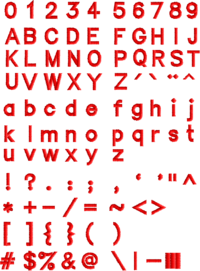
The result of our work are two tables with typefaces. We renamed these to "Geneva-simple" (see below), since the fonts are not hershey fonts anymore, i.e. include some bezier curves.
Configure a 1 stroke font
Create a Hershey glyph table
- Menu Extensions -> Render -> Hershey Text
- Change Action to "Write glyph table"
- Font face: Sans 1-stroke
Adjust the size and arrangement
- Select all
- Set total width to 210mm. This creates glyphs that are about 8mm high, i.e. good fonts to use with embroidery patches.
- Delete all the doubles
- Arrange the glyphs in the table

Change stroke width and type
- Select All
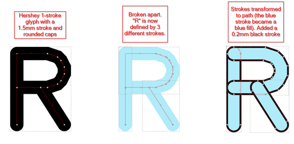
- Set Stroke Width to 1.5mm
- Set Cap to round (easier to deal with than rectangular strokes)
- Verify shapes, smooth some (I fixed $, @, &, 0, O, Q4 and make strokes smaller ($, @). However, not not use "Simplify" (CTRL-L) to smooth since it will displace nodes in random ways.

Transform the stroke-based fonts into path
Break glyphs into several path
- Select all
- Change the stroke color to light blue (because this way you can more easily see what is going on in the next steps)
- Menu Path -> Break apart
Some letters are now composed of several path
Transform the strokes to paths
- Select all
- Menu Path -> Stroke to Path
You now should have Glyphs with Paths. These for the moment just have fills.
- Select all
- Add a black stroke, make it about 0.2mm
Create embroidery glyphs
Now to create a font, there will be three major tasks for almost each glyph
- Remove excessive overlaps
- Make sure that each sub-object is made of two subpath
- Fix direction lines and add rungs
You can do this task by task (next three sections) or letter by letter.
Clean up the table
Removing small tiny paths
- Some glyphs include junk that you can fairly easily identify
- Select all tiny paths and union them together with the "real paths"
- Menu Path-> Union (CTRL-+), not CTRL-K !
- You may have to break apart (CTRL-SHIFT-K) again before being able to "union" (CTRL-+)
You can recombine some path. E.g. one could argue that letters like "W" and "M" do not need to split into different path.
Remove overlap
We now will delete segments of overlapping path for each letter that has major overlaps between the path that define it.
- Optionally, give different colors to different path
- Select the letter dragging a rectangle over the area
- Hit F2 (Edit Path tool)
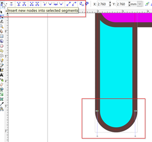
- Select segments in the tips of some path and kill them. You may have to add nodes or move nodes to do that
- Shorten some lines.
Transform all paths to have two sub path
As explained in InkStitch - satin columns, satin columns are defined by two borders, i.e. two poly-lines within a path.
In our case, we most often just may have to split the end of some "lines". In the previous step we already did split some path into two subpath by removing a segment.
During this step, you also can recombine some path. E.g. one could argue that letters like "W" and "M" do not need to split into different path.
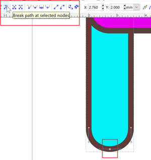
- Create two subpath by either
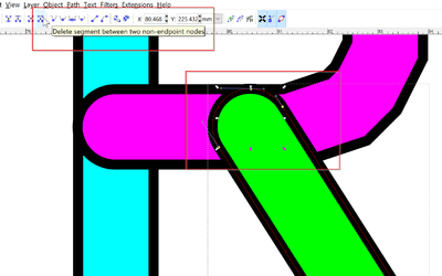
break path at select nodesor (as above) bydelete segment between two non-endpoint nodes - Turn snap off
- Move the nodes a bit after breaking a path. This way you can make sure that you really did it.
Prepare for satin
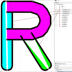
- Verify directions of the sub paths
- Add either rungs or make the number of nodes even
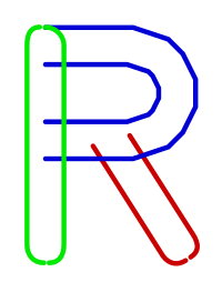
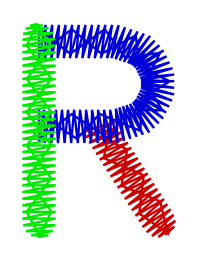
Example - R
The following screenshots and SVG visualize important stages as described above.
 |
 |
 |
 |
 |
 |
Finish
- Group all objects of a glyph and name them (A, B, C, ...)
- Select all
- Remove Fill
- Set Stroke Paint (optional)
- Set Stroke Width to 0.1mm
Creating a sans typeface with rectangular caps
Creating a simple "sans" font with squared "endings" was not very difficult, but again somewhat time consuming (about a day's work) starting from the rounded version.
Take each letter
- Kill rounded segments at the end of the "limbs"
- Straighten the lines
- Fix overlaps
- Find a strategy to manage direction of stitches. So far, we did it without rungs, but a more professional version will need some.
Also: copy/paste as much as you can. Many parts of the Glyphs are the same, i.e vertical and horizontal bars, "c"-like structures, etc.
Using Illustrator
One could import the SVG file to illustrator. Its pathfinder tool can remove all major overlaps (or is there a way to do it in Inkscape ?). Save as SVG in Illustrator and reopen it in InkScape
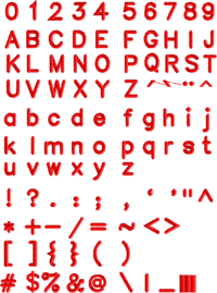
Geneva-simple typefaces for download
Since other folks also will create fonts, we gave our typefaces a name: Geneva simple (because I work in Geneva)
As of July 7 2018, these fonts are drafts and probably do require adjustments. However they are usable for any project since you can adapt the glyphs ;)
You can adjust trim, density, underlay, etc. for both fonts.
Parameters uses:
- ZigZag spacing = 0.4 (default). This could be made smaller (i.e. denser) for large fonts and bigger (i.e. less dense) for very small letters.
- Running stitch length = 1.5mm
- TRIM = yes
- Underlay = ZigZag (default config.). We suggest changing this to simple lines for smaller letters.
 |
 |
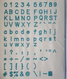 |
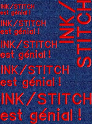
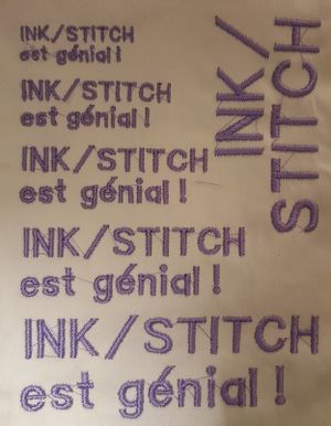
First tests show that this type of font is fairly scalable. The 6mm version is too ugly and some types do need some extra work. Maybe density should be a bit lower for smaller fonts.
 |
 |
Usage:
- Download an SVG file with the fonts
- Make a copy of the file
- Create your embroidery design with the same file
- Copy/paste glyphs (line by line)
- Use align/distribute tools
- Change the size
- Adjust density and underlay (less for small letters and more for bigger ones)
- ...
Geneva-simple-sans-rounded embroidery typeface
The Geneva-simple-sans-rounded is a font designed for small lettering, e.g. on patches. It should work fine from 8mm to 15mm fonts. However, for optimal results you may have to adjust the drawings.
Click twice to display the SVG, then "save the page as in your browser"

Geneva-simple-sans embroidery typeface
The Geneva-simple-sans is a font designed for small lettering, e.g. on patches. It should work fine from 6mm to 15mm fonts.
This font was derived from Geneva-simple-sans-rounded and looks more like a typical embroidery font. This design seems to be somewhat better than the rounded version presented above.
Click twice to display the SVG, then "save the page as in your browser".

To do
(in a next version)
- Create custom underlay for each letter
- Verify stitching order
- improve some overlaps
- Fix some direction lines (rungs)
- Add serifs (in a new font version)
Simple typefaces
A simple fill typeface
Typefaces with fills can be used for very large fonts (i.e. bigger than 20 or 30 mm). However, they will probably be fairly ugly. Try yourself. After the first step explained in the first chapter, simply create a path (before breaking up the glyphs !)
- Break apart symbols that have unconnected polygones, e.g. !, ? ;
- Menu Path: Stroke to path
- Set the fill
- Remove the stroke
In Extensions -> Ink/Stitch -> English -> Params
- Augment the density, e.g 0.2
- Add an underlay
We had to fix some caracters, i.g. remove or union some little garbage and also give some special treatment to the $ and & signs.
You can download the following SVG file (click until you get the SVG then save the page as). Open the file in InkScape and copy/paste the fonts. Make sure to hide the embroidery layer, and to "rectangle" select since we did not do any grouping...
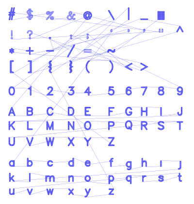
Simple lines
Fonts made of simple lines tend to be rather ugly, however it is possible to stitch tight and small letters easily.
- CTRL-A
- Set stroke to dotted
Embroidery -> Param -> Stroke tab -> Satin stitches along paths (needs to remain ticked if you plan to change parameters)

Simple zigzag
This typeface was made from the above's simple line design
- CTRL-A
- Set stroke to 1mm
- Embroidery -> Param -> Stroke tab -> Satin stitches along paths

Alternatives
- Small Embroidery font. This font was designed by the creator of Ink/Stitch. You may use this font for free in any embroidery project, including in designs that you intend to sell or sew out and sell. There is no limitation on the number of designs or items you may sell. Underlays of letters are manually made (i.e. with lines), something we also should consider .....