Physical visualization
Introduction
This articles summarizes some ideas and examples about physical visualization, in particular with respect to project management and related areas. It is linked to our interest for 3D printers in education.
See also:
Examples
Thesis project board
See lego-compatible thesis project board (a project we initiated in Nov 2012).
Lego-powered time-tracking
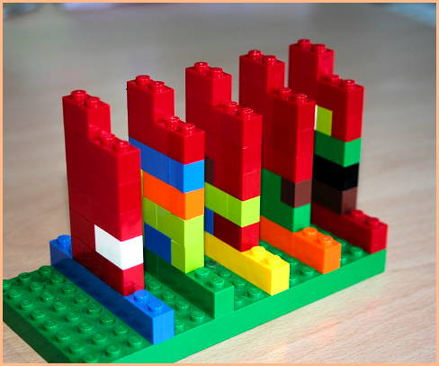
“an alternative way to represent time schedule tracking by stacking different lengths of Lego blocks as a way to convey different sequential time periods. stacking hourly rows on top of each other builds up the whole day, while color represents the different projects at hand. a whole week of time tracking is created by setting up a series of rainbow-colored days.” (Lego-based time-tracking, retrieved nov 22, 2012)
Michal Hunger, in his On LEGO Powered Time-Tracking blog post describes how he uses it.
“I made up a single width column as ruler for the work hours (from at around 10 am up to 6 pm). So I can easily see whats missing and at what time I did something. For the days of the workweek I chose the rainbow color scheme (red, orange, yellow, green, blue – Monday to Friday) for the longer base row that I stack my hours on. So I can gather a whole week of time tracking until I have to enter them in some time sheet (software). I put the columns of a whole week on top of a green building plate to fix them.”

Benefits:
- it works (for about 4 months now)
- I have something to play with while pondering stuff
- it looks great
- it’s incredibly fast with no overhead
- planning is possible
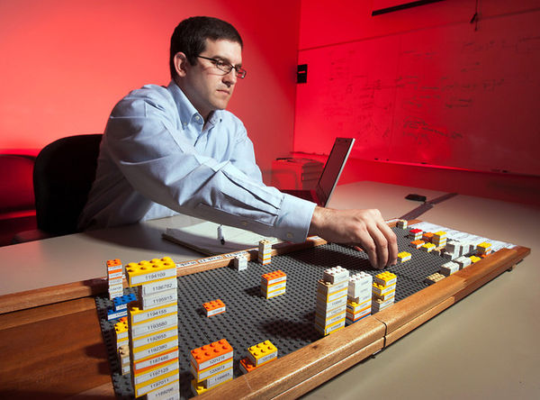
Yvonne Jansen et al. Empirical Investigation of Physical Visualizations
(An Empirical Investigation of Physical Visualizations, retrieved nov 22, 2012)
Wable
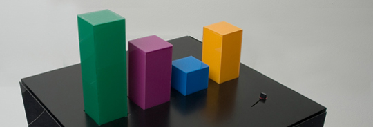
“The personal feeds from webapplications like Plazes, Flickr, and Last.fm tell much about the activity of an individual on the internet. In this project we aim to explore how you can visualize the changes of your web identity over time and create a physical link between your virtual and real identity. The interface consists of both a physical table and a web application. This direct feedback from your web identity is customizable and can be connected to any RSS feed.” (Wable, retrieved nov 22, 2012).
3D Infographic Maps Built with Lego
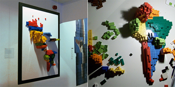
“Samuel Granados has discovered an efficient way to display geographical data in 3D physical reality. Just use Lego [samuelgranados.es]. One side of the map reveals the emigrants of each zone, the opposite shows the immigrants (both represented by the volume of the pieces).” (3D Infographic Maps Built with Lego, retrieved nov. 22 2012)
Lego for visualizing production problems and health care management
“Now GM is using Legos for problem resolution tracking. If a transmission block breaks during durability testing, they’ll file a traditional paper report, but the case will also be added to a Lego board. Legos in various colors denote the area of the vehicle, and the block size denotes the severity of the problem.” (How GM Is Saving Cash Using Legos As A Data Viz Tool. retrieved nov. 21, 2012)

“WellStar is using the boards to track on-time starts at the doctor’s office, and even manage its physician-payee relationships--which has led to a series of fixes projected to save the company $1 million.” (dito)
Links
Indexes
- List of passive physical visualizations (2012, Aviz, visual analytics project)
- List of active physical visualizations (2012, Aviz)
Research groups and people
- Aviz is a multidisciplinary team of INRIA aiming at improving the analysis and visualization of large and complex datasets by combining analysis methods with interactive visualizations
Bibliography
- Yvonne Jansen, Pierre Dragicevic, and Jean-Daniel Fekete (2012) Investigating Physical Visualizations (Poster). IEEE VisWeek 2012 Electronic Conference Proceedings, Oct 2012, Seattle, Washington, USA, United States. In press.
Acknowledgement
Initial sample examples were found through http://www.aviz.fr/Research/PassivePhysicalVisualizations (Yvonne Jansen, Pierre Dragicevic, and Jean-Daniel Fekete)

