Animate CC 2018 - Interactive animated web sites
This article or section is currently under construction
In principle, someone is working on it and there should be a better version in a not so distant future.
If you want to modify this page, please discuss it with the person working on it (see the "history")
(a first version will be completed until April 25 2018).
Introduction
This is a quickly made tutorial about creating a simple menu-based HTML5 Canevas web site with Adobe Animate CC.
The Animate CC environment
As of 2018, Adobe uses the same kind of user environment across most of its products. The Interface of Animate CC did not change much since Flash CS4, i.e. users familiar with Flash Professional versions of the last 10 years will not feel lost.
After launching the software:
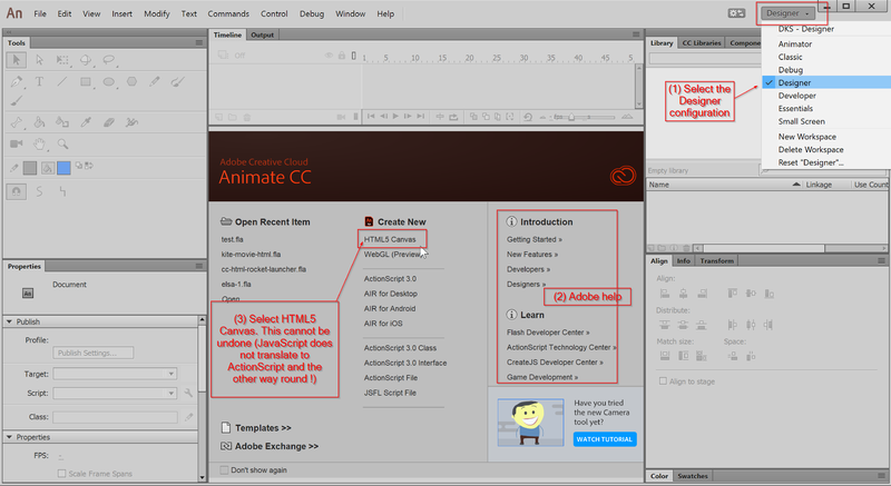
- We suggest putting the interface into
Designerlayout. You can change that later though and even create your own favorite configuration. Read theFlash CS6 desktop tutorial for some information about docking panels. - Make sure to select
HTML 5 Canvas. If you don't you will have to exit Animate CC and start over again.
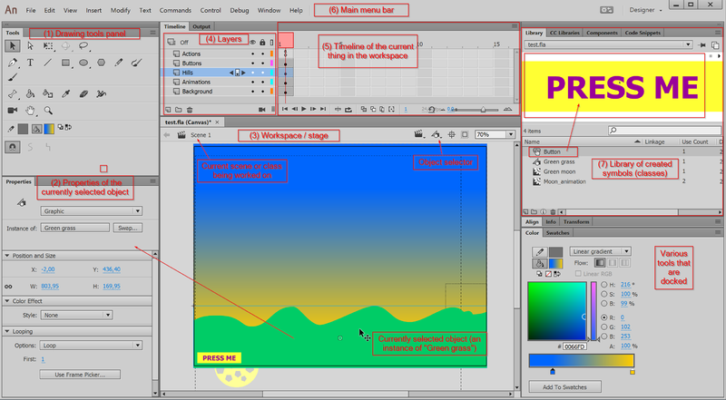
Most important elements
HTML5 Canvas site template - Layer and frame structure
Animate CC will create code for HTML5 Canvas, i.e. will not create code that interacts with the rest of the HTML page. Think of it as "Flash" made with JavaScript code. The "application" we will create will sit inside an HTML page. Depending on its purpose you will have to make it big enough. By default the canvas is set to 550 x 400. We rather suggest using at least 800x600 pixels for creating interactive animations. Click somewhere in the workspace and adjust the size in the properties panel to the left.
- Size: W: 800 and H:600 px
You can make this size responsive, e.g. have it adapt to the size of a small HTML page. In the Publish settings -> Basic, see Make responsive
In order to create a menu-based side we will use the main timeline. Instead of using the frames for creating animations (as typical banner designers) do, we use the timeline to represent various contents (pages). Many game developers also use this strategy. You can ignore what that means precisely for now.
In the first steps, we will create various drawing layers in order to make editing more simple and more safe. Unlike other drawing programs (e.g. Illustrator or Inkscape), drawings can change over time in Animate CC. Each step in time is called a frame. Layers have at least one frame. Frames can be either empty (include nothing) or include something, e.g. drawings, JavaScript code, or so-called movie clips.
Create a few layers and give them a useful name
Each "page" will have the same several layers. These will include:
- A global
Global menuwith buttons - A global
Actionslayer that includes the menu code - A
Backgroundslayer with some (optional) drawing objects - An
Animationslayer that includes so-called movie clips (animation objects) - A
Foregroundslayer with some (optional) drawing objects (animations objects will run behind these)
Please create five layers now (you always can add/remove or change these.
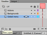
- In order to create a layer, click on the
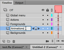
new layerbutton. Do that five times. - Name each created layer double clicking on its name
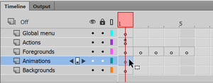
- Sort the layer like in the following picture. You can drag them up and down. By default, the last layer will be drawn in the back and the layer on top in front.
- Save your file now !
Lock all layers by clicking on the lock symbol.
Create five new blank key frames in the animations layers
Since we plan to put different contents in each frame, we now must create blank keyframes for the three layers that will be different, i.e. foregrounds, animations and backgrounds. For each of these layers:
- Unlock the layer, by clicking on the layer's lock symbol
- Click in frame 1
- Hit F7 (or FN-F7 on some machines) or right-click (Insert blank keyframe) five times
- Lock the layer again.
You are done when each frame of these layers includes a empty little circle.
Contents of these layers should be identical in all pages. We therefore just extend frame 1:
- Unlock the Global menu layer
- Select layer Global menu and click in frame #5
- Hit either F5 or right-click and select Insert frame.
Now if you want to "see" something in the workspace.
- Select frame 1 of the global menu layer
- Insert some text with the
T(text) tool in the drawing panel to the left, e.g. menu.
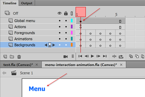
The result should look like the following screenshot. As you can see, there is a black dot in frame 1 of the Global menu layer. It tells that there is some content inside, e.g. the word "menu" in our case.
Source code (in case you missed something):
Create buttons
Creating a button is fairly simple, since as in HTML (and Flash too) anything can be a button. However, usually a button includes some animation, i.e. the user should notice when he or she moves the cursor over a button or presses down.
Unfortunately, modern editions of Animate CC do not include pre-built buttons. You can buy some, copy from Flash CS6 or create your own. Let's create a simple model that we will then copy.
Create a button symbol
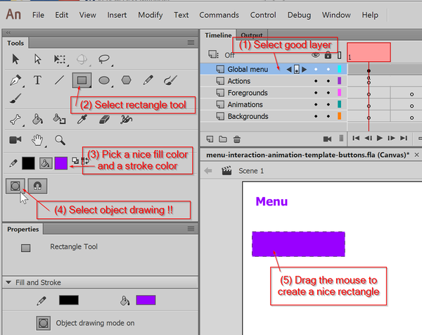
Step 1: Draw a simple shape
- Unlock and select the global menu layer (drawings will go there)
- In the tools panel to the left, select the rectangle tool and also tick the object draw icon (or you will regret later).
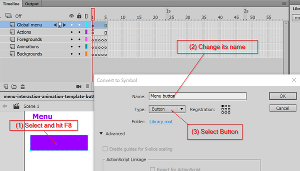
Step 2: Transform the rectangle into a button symbol
- Click on the selection tool (black arrow) in the Tools panel
- Select the rectangle on the stage
- Hit
F8or right click and selectConvert to Symbol
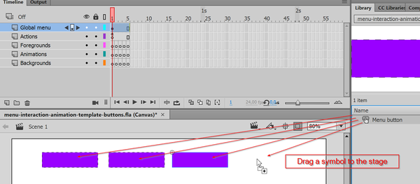
You now will see a so-called Symbol in the library panel to the right. Drag the symbol from the library to the scene and find a new instance. You can delete all instances (drawings in the workspace) and the symbol will survive in the library.
The goal now is to create a moderately looking, but working button as you could see in this HTML page.
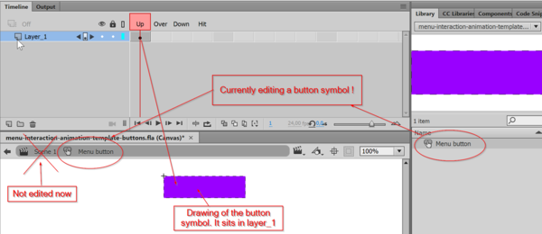
You will first learn how to edit a Symbol. A symbol represents a class, i.e. a kind of blueprint that you could reuse several times. A Button symbol is a special kind of class that allows creating any sort of animated button. To do so, double click on the symbol in the library panel. You also double click on an instance in the workspace, but then you also will see the other objects in the workspace which might be confusing.
Now, double click on the symbol in the library that we called "Button menu". You are now editing just a symbol, i.e. a class. As you can notice, the workspace looks differently, i.e. you only see a drawing of a rectangle. Make very sure to remember that you can edit things at various levels, i.e. the main scene (also called main time line) or various things like buttons or animation clips that you will create. These classes themselves can contain other objects. Beginners are very often confused about this and do not pay attention to what they really edit.
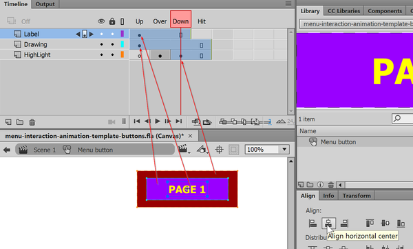
A button symbol is an Animate CC class that predefines 4 animation frames:
- Up
- Drawing that appears "as is" when the button is displayed in a frame of your animation.
- Over
- The button graphics as it appears when the user moves the mouse over it. E.g. it defines highlighting.
- Down
- The button as it appears when the user presses the mouse (just during the time the mouse button is held). It shows the pressing down effect.
- Hit
- This frame allows to define the sensible area (usually the complete button) with a graphic. Its contents will not be shown.
Let's now add some simple extra stuff to the button:
- Rename Layer_1 to Drawing
- Create a layer called "Label"
- Click in frame 1 i.e. Up
- Add some text with the text tool: Select the "T" from the tools panel, select a color, put the cursor on top of the rectangle. You can reposition both with the align tool (Menu Window->Align)
You also might extend the graphic to all frames
- Click in frame 3, i.e. Down (of the same "Label" layer) and hit F5 (this way the same text will be shown in frames 1,2 and 3
- Select the Drawing layer and hit F5 in frame 4 (Hit).
Add some highlighting hints
- Create a new layer and call it Highlight. Drag the layer all the way down.
- Select frame 2 in this layer and hit F7
- Draw a larger rectangle in this frame #2 (Over). This will show when user mouses over the button.
- Now do the same for the Down frame. Select the it and draw some rectangle, e.g. some kind of red. This will show when the use holds the mouse down.
Buttons that you can find online are of various complexity. Most have several layers and include several graphic objects. Layers contain drawings for these four button frames. The Flash engine will then select the appropriate frame for display according to user action (mouse over, mouse down, etc.).
With the 3rd frame selected, you now should see something like this:
Let us test this button now in the HTML browser.
- Use menu
Control -> Test Movie -> In Browser - Move the mouse over the buttons and click on the buttons. You now should see some animations.
Source code, if you are in a hurry.
Create five buttons
- If you already done so, go back to the scene
- Firstly make sure that five buttons fit on either the top or another margin of the scene. If they don't make them a bit smaller: Edit the Menu Button symbol (object in the library again) and reduce the three rectangles drawings.
- Remove all buttons from the science (select and delete). Do not worry, the button symbol in the library is safe (unless you kill it which you should not)
We could reuse five times the same button for our application. However, the text would be same for each. In order to get buttons with different texts we have to copy/paste the symbol, i.e. the class and change the text of each object.
- Go to the library panel. If it disappeared, repair the layout by selecting "Designer" from the pull-down menu on top right.
- Select Menu Button (or whatever you called it)
- Right click and select
Duplicate - In the popup menu give a good name, e.g. Menu Button 1
- Repeat that five times.
[[File:Adobe Animate CC 2018-Button Symbol-4.png|thumb|600px|none|Duplicate buttons]
You now should have six buttons.
- Edit each of these to fit your (provisional) needs. For now, we suggest just using something like this:
- Menu Button 1 = Menu
- Menu Button 2 = Page 2
- Menu Button 3 = Page 3
- etc.
