Stitch Era - digitizing complex vector images
<pageby nominor="false" comments="false"/>
Introduction
This is a beginner's tutorial for the Stitch Era embroidery software. It explains how to go from imported more difficult bitmaps and vector images to embroidery.
Prerequisites:
If you are new to Stitch Era, read
- Stitch Era - simple digitizing
- Stitch Era - vector graphics
- Stitch Era - interface features for working with a design
- Stitch Era - adjusting stitch sections (most concepts are explained again in this piece)
You will need all three, in particular some knowledge about vector drawing and how you can look a stitch objects.
We will improve this over time and add more stuff, in particular more semi-manual digitizing - DKS.
Introductory example - getting the message accross
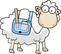
We shall try to improve our digitized LAMS logo that we presented in the Stitch Era - simple digitizing article. The result was printable and not even too ugly. However it had one big major flaw. By looking at the stitched logo, it was impossible to understand that the sheep had an iPod and probably listened to some podcast about embroidery on wool.
So let's formulate some design goals:
- The stitched result should not respect the finer details of the bitmap logo, but rather represent its spirit, i.e. convey somehow the idea of an sheep that uses some tools for learning...
- The embroidery should not be too stiff, after all we plan to use our designs for real once we get it done right.
Tutorial goals:
- Learn some more bitmap tracing tricks
- Learn some vector manipulation and vector drawing techniques
- Learn more about stitch section configuration, e.g. converting areas, using programmable stitches, and changing stitch directions.
Bringing out bitmap colors
Let's discuss a slightly different bitmap tracing procedure since we found that prior manipulation of image parameters would improve the process.
Preliminary steps
- Load the bitmap
- Keep its size, since making it bigger won't help the process in our opinion
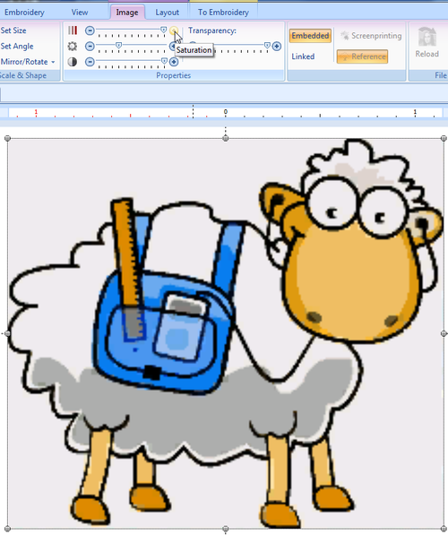
Before we vectorize the initial picture we transformed its colors:
- Max saturation: to bring out colors
- Max contrast: to distinguish colors
- Darken a bit: to see the result :)
Transform to vector
Preliminary steps
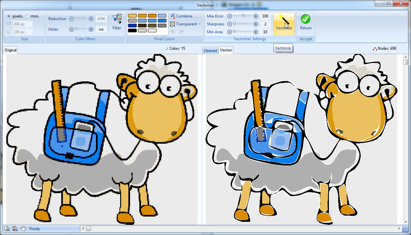
- Open the Vectorizer tool, i.e. click on the Layout Tab -> Convert to Vector
The "mangled" bitmap doesn't need any color reduction in the vectorizer panel as you shall see.
- Click on Filter
- Set Transparent to "no color".
We now have 15 colors and can vectorize
Vectorizer settings:
- Sharpness and min area = minimum since we don't want to loose an information at this point
- Max error to 100, i.e. a compromise that will smooth some curves, i.e. create less control points, but not too few.
Simplifying vectors
The result could be translated more or less as is to embroidery, but we would like to create something that is a bit more professional.
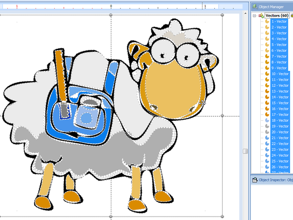
The vectorized sheep now includes about 60 vectors that need cleaning up. To do so we have to do the following:
- Remove large light-grey areas around the sheep (easy: click and kill)
- Enlarge the vector image to the right size.
- Kill small useless vectors that are too small to be stitched
- Kill vectors that are badly rendered and redraw these with the vector drawing tool
- Fill holes
- Join vectors that should go together, e.g. the black outline.
- Reshape some vectors, e.g. increase the size of some "fill objects".
Below is a picture of the vectorized sheep after removing the background grey areas.
Enlarge
- Select all: CTRL-A
- Then enlarge and position. If you need a precise size, e.g. 6cm in with, use the Layout tool.
Getting rid of small vectors and ugly vectors and fill holes
To do so, you may have to zoom in first. Since we have 1900x1200 laptop, we used 400% for our 60mm X 54mm sheep.
- Click on each vector object that you want to remove and press CTRL-X (or DEL)
- Some are so small that they are difficult to select without zooming lot. After removing the easy ones, we clicked on each remaining vector in the object manager and if it was too small we hit CTRL-X (kill).
- When you notice a hole, you also can kill it. In the Reshape ribbon panel on top, click on remove holes. Verify the result and hit CTRL-Z if needed in order to backtrack.
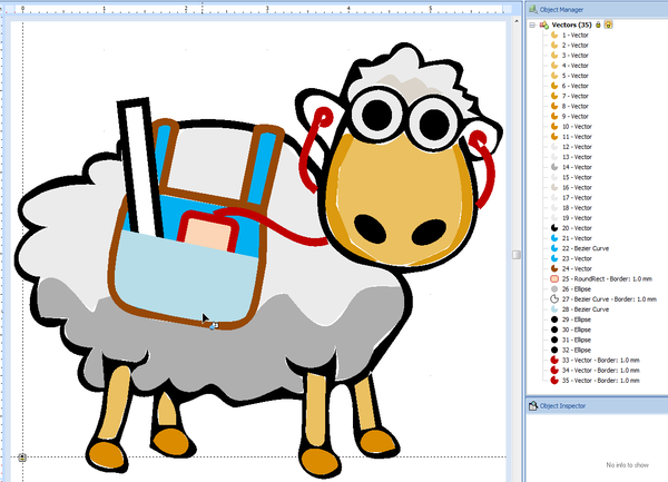
After this operation we are down to 35 vectors, but the most difficult part remains. The problem is the big black vector that includes most of the outline, plus the bag, plus the ipod cable, plus the ruler. In order to reconstitute these as individual objects to be reshaped or killed, we now must do some vector surgery.
- Select the black outline
- Select Split vectors in the Reshape Panel.
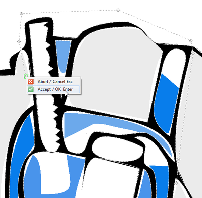
- Zoom in as much as you can, as shown in the screen capture below
- Then (and this is very tricky) draw a path that will completely section one section from another.
Redrawing the bag and stuff
We then selected the (now separated) bag area and made it red. We now have two options. Either kill it and redraw or repair. We chose to kill it (not yet) and redraw everything. We took the additional decision to get rid of some details since they won't stitch well probably.
- The bag could be drawn with either the freehand or the Bezier tool (read Stitch Era - vector graphics).
- We used the bezier tool (since we didn't have a drawing tablet),
- Settings: vectors only outline, thickness = 1 mm, curve and normal node
- Some nodes were then transformed to Corner nodes
- We added two little lines and then added these to the bag outline with the combine vectors tool.
The iPod outline was made with the Closed shape tool, i.e. the rounded rectangle, and rotated a bit (select the object and hold down the CTRL key). We also added a filled grey circle.
We replaced the blue backgrounds and also added a light blue rectangle on top of the iPod. We will make this "transparent" later.
We finally added red cables for the iPod. Otherwise they can't be seen. Black cables don't really stand out enough.
Cleaning up other vectors
- A lot of (pretty quick and dirty) cleaning was done for the black outline. We probably would have been more efficient just redrawing it.
- We also simplified some light grey backgrounds of the sheep fills and joined some of these areas. Often, we also did an add vector operation or simply killed a smaller section and then reshaped a larger one.
The final result looks like this. Vectors are order according to stitch order. First ones should be embroidered first.
Digitizing take 1
The cleaned up vector drawing was then auto-digitized with the idea to reconfigure stitch sections manually.
- CTRL-A to select all
- Convert to Embroidery
- Art to Stitch (Intelligent)
Parameters used:
- Density = 4 lines / mm
- Pattern type = PTM-0159 (looks messy like a sheep)
- Running Stitch length = 1.5mm
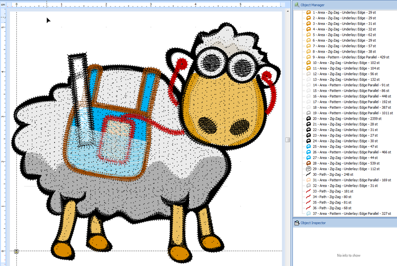
A first result looks like this:
We have no idea how well this would render, but we will try some modifications
- Use another pattern for the saddle bad (blue) and the face
- Make the lower part of the saddle bad transparent
To do so we select each of these stitch sections in the Object Manager and adjust.
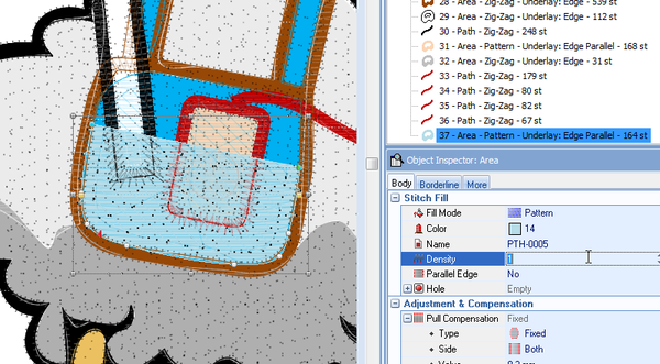
E.g. below is a screen capture that shows the idea for the lower saddle bad part
We also suspect that we should have done some more overlapping in order to avoid creation of hard stitches. I always worry about creating design that are not comfortable to wear. However, this should be done at the vector level we believe.
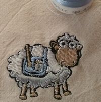
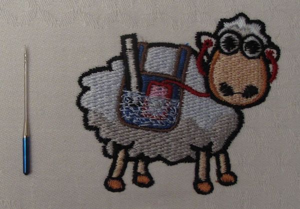
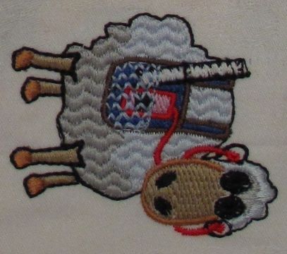
Here is result of take 1. Visually speaking, the result is quite ok, except for the eyes. But the embroidery is indeed too hard to be stitched on a light fabric.
What we should improve in take 2
- Eyes are ugly
- Lower density of some areas
- Simplify some areas, i.e. don't use more than 2 layers of full density stitches
- Remove underlay stitches of areas that are stitched on top of others
- Do something about the hard black Zigzag stitches, e.g. convert to running stitches ?
Digitizing take 2
The goals of the second attempt were the following:
- Create nicer eyes
- Make the design a bit more light-weight
The eyes were redesigned with vector graphics as circles with a wide border and no fill in order to force round Zigzag stitches. That worked fairly well.
The head was made lighter by punching the nose hole through the underlying face. We selected nose hole + face and then used the CSG Combine Vectors -> Simplify procedure. In the saddle bag area we did the same with the iPod.
The hardest work was to replace the larger black ZigZag stitches by running stitches. At the same time we also killed some paths with running stitches. We did this at the embroidery level:
- Open the Object Manager
- Hide Vectors by clicking on the vector button (top right). This is a safety measure.
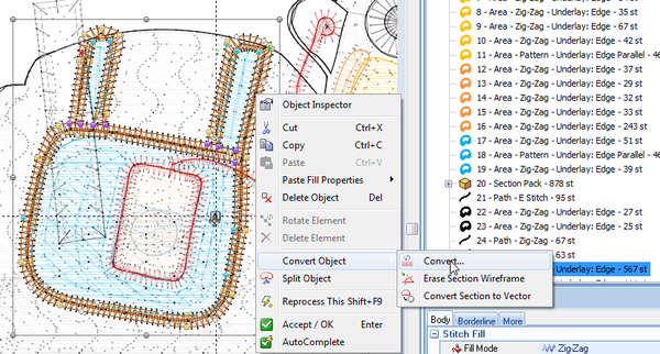
In order to convert a Zigzag stitch to running stitches, the stitch section must be converted. Click on the section object (or select it in the object manager). Then, use the right-click (context menu) like this:
You see potential conversion of the saddle bag outline here, we forgot to take a screen show when we converted the black outline ...
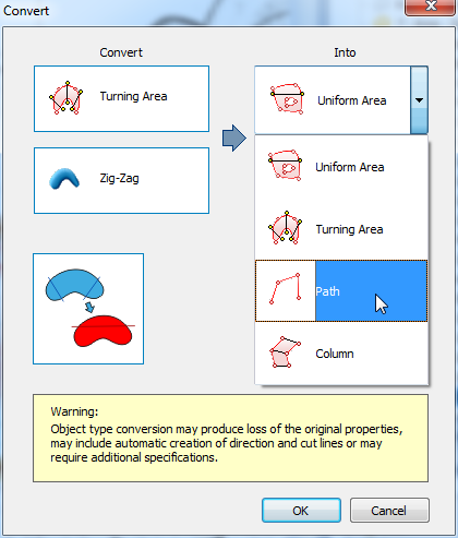
Anyhow, you then get the convert panel (that can be raised in other ways) and you can convert the ZigZag section to a Path. Select center line if you want a line. Else you will get two, one for each side.
The result will be a path that you can edit in the same way as vector paths. We indeed had to adjust nodes and curves. With respect to vector graphics editing (here we are editing stitch paths) there some differences with respect to nodes (there are more), but otherwise the principle is exactly the same. More one that in some other tutorial (some day).
One important thing was to figure out how to cut a path... and we can't remember how we managed. Split object is only available in the commercial version. Of course, only always could back-translate a stitch path to a vector, then split the vector and digitize again.
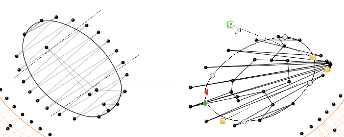
We changed the direction of the stitches in the nose holes by 90 degrees. To do so, grab the yellow handles of the direction lines and put them in different places as shown in the next screen capture.
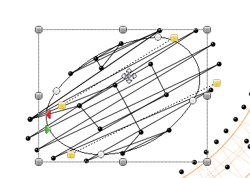
In the nose hole to the left you can see two dotted black direction lines that represent stitch directions of take 1. The picture below shows the changed directions.
Changing stitch directions seems to be a quite a powerful design tool and we will have to try it more ...
We finally also changed the fill pattern of the larger areas to something that may or may not be more sheep like, i.e. PTM-0076.
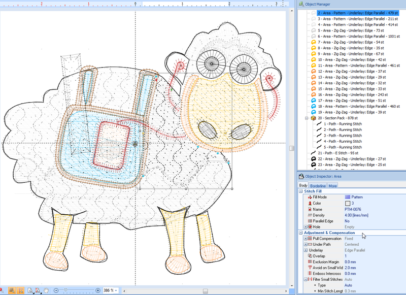
The outside transparent pocket of the saddle bad was redesigned with a programmed stitch (as opposed to lowering fill density of a fill pattern we used in take 1). To do so we simply had to change the fill pattern in the Object Inspector:
The next screen capture shows the final stitch sections. Of course, we also had to move these up/down in the object manager in order to get the print priorities right.
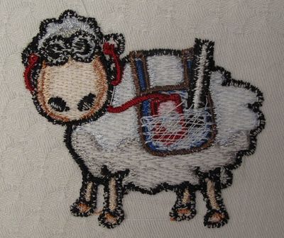
The result is shown in the picture below taken with a cell phone. The eyes look better but are a bit too large now. It's a more light-weight design which was an important aim. The running stitches are tripled and that technique seems to work ok.
The saddle bag area is still too heavy though ....
Summary: Redesign the vector art if the original message doesn't get across !
Designs made of lines
Personally, I am quite interested in designs that use academic materials, such as diagrams and concept maps. These may contain a lot of lines, so the question is how to digitize such things with the following design goals:
- Lines should be readable
- Tissue should not plucker
- Embroidery should be nice to wear
Depending on whether your designs are large or small and how detailed the curves must be rendered, digitizing will be different.
Small designs with tiny lines
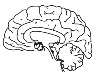
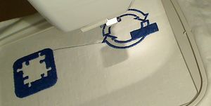
We found a nice and fairly simple brain clipart on Openclipart. We imported it via Illustrator -> Corel Draw and only removed a tiny vector. Otherwise we left the vector graphics "as is".
We tried out various combinations of running stitches for this design. Generation of running stitches can be configured with the following parameters:
- Stitch Length
- Repetition
- Small steps
- Fit on Path
- Adapt to Curve
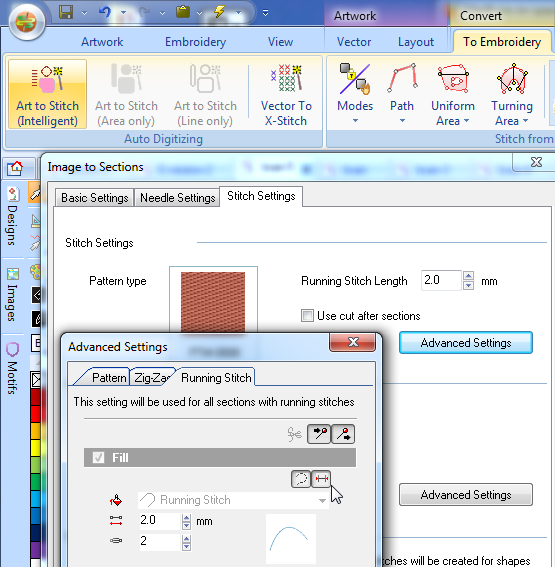
If you use full auto-digitizing, i.e. Art to Stitch (Intelligent) then you can adjust parameters under the stitch settings tab:
- Click on Advanced Settings
- Change Stitch length and repetition
- Press the two buttons for small steps and fit on curve
Tip: Move the mouse over these areas in order to get a tool tip (small popup explaining what the button / icon is good for ...)
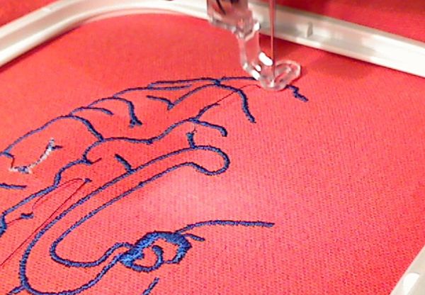
The picture to the right was made with the following parameters
- Stitch length = 0.8
- Repetition = 3
- Small steps = off (useless in this case, since they are very small already)
- Fit on curve = off (same reason as above)
The design looked ok, but added too much tension to the tissue. Also it felt a bit "hard".
A better result was obtained like this
- Stitch length = 2mm
- Repetition = 2
- Small steps = on
- Fit on curve = on
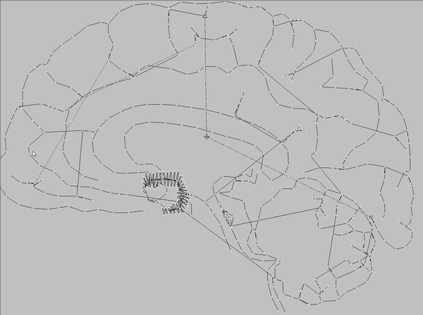
As you can see in the picture below, Stitch era creates shorter stitches than the default (2mm in our case) when needed and it will place extra stitches in the curves when needed. Disclaimer we don't truly understand the stitch engine, since we also can observe different stitch lengths with small steps = off. However the above option produced a better result :)
You also can see that we should go over the vector design and eliminate the double lines. We also might change stitching order etc. But that's not our problem here. We only wish to know how to generate stitches for a design that has lots of little curving lines ...
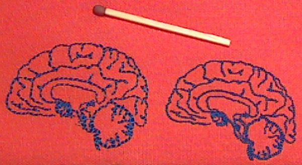
The next pictures compares the 2mm design to the left and the "harder" 0.8mm design to the right. Other, less good 2mm designs are not shown.
Medium designs with lines
Let's now quickly make a large brain, i.e. one that fits into my Elna 12.6 x 11 cm A Hoop.
Since we shall use ZigZag stitches, we have to make sure to minimize stiching columns (zigzag lines) on top of each other and to repair some really ugly vectors
Unify vectors
- Select All
- Combine Vectors -> Addition. We also might have used Simplify, but then we'd probably have to remove more jump stitches
Remove holes
- Select vectors with strange holes
- Click on Remove holes in the main menu bar.
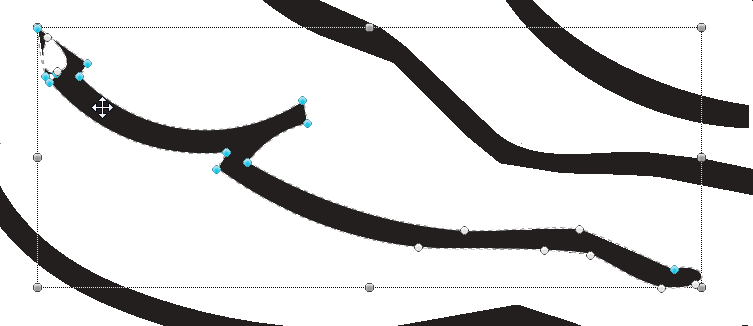
We then removed a few really superfluous nodes with the context menu. If you do so make sure that your really selected the node and not just the vector. If you can see curve controls, you are ok. In the following picture you can see an example where we have to remove two times two nodes.
We finally adjusted a few curves a bit. However, we didn't spend much time on improving this, since - again - our purpose is to find out how to print lines, not brain science. Read Stitch Era - vector graphics if you need some help killing nodes and adjusting curves.
Since we almost only have lines to stitch, we directly tell Stitch Era to produce zigzag stitches
- CTRL-A to select all
- To Embroidery -> Turning Area -> Area with Zigzag
You won't be asked for any options, it's just done. Therefore we will have to edit the stitch sections in order to change parameters.
- Hide Vectors
- Select A to select all embroidery sections
- Open the Object Manager (if not already done so)
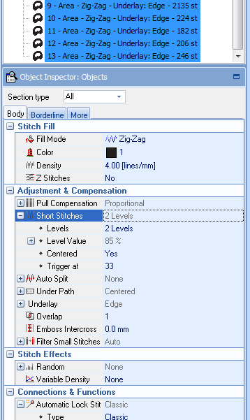
We then changed two parameters in the Object Inspector
- Density = 4 lines/mm
- Short Stitches = 2 Levels (to see if this produces nicer sharp curves)
We verified the Underlay. Type edge with a single step is fine, i.e. basically it will stitch two lines along the path.
We also could change the larger spot to a fill pattern, but we didn't since it is not that big, i.e. the largest stiches are about 4mm wide. That information can be obtained for example in the stitch editor that you enter by hitting F12 or via the Designs panel on top left.
We worry actually much more about the narrowness of the columns and the pull effect that lots of small zigzag stitches will create.
The result looked ok, but I am not very happy with the thickness of the lines. Also the thread broke twice, maybe because some thread was stuck in in the upper part of the machine, but I don't know. Anyhow after removing it, I didn't see neither columns with white bobbin threads nor did I encounter broken threads. Question of tension I believe. It's probably good policy to raise the pressure foot before changing threads ...
Summary: Fairly tiny lines can be stitched with double running stitches, Thin lines (0.8 and up to 4mm) can be stitched with Zigzag.
Both designs are probably not too nice to wear :)
Outlook: a still larger brain
We now could make a still larger brain. This requires us to go back to the vector drawing board.
So let's make a "light-weight" brain for the B hoop. First thing to do is:
- Save the design as something new, e.g. brain-large-2.dsg
- Kill all the stitch sections. In the object manager click on Sections and CTRL-X.
- Then change the hoop. Click on Embroidery in the main menu bar and click on Hoops
- I selected the 14x20 cm B Hoop for the Elna
Next step is to turn the design (since the hoop is vertical, i.e. larger than wide.
- Select all (e.g. by clicking on Vectors in the object manager
- Click on the layout tab and in the Mirror/Rotate pull-down menu, rotate 90 or 270 degrees. You also could do this through the context menu -> Transform.
- Still select all (!)
- Make it as big as you can without going over the borders of the hoop size. Btw. there is a little Show hoop button at the bottom of the Stitch Era Window. It always should be on.
- In the Align panel (top menu) you then can in the To Design pull down menu, align the whole thing to center.
Now let's digitize. This time Zigzag stitches should print just fine and still are the most appropriate choice.
However, we could try so-called programmable stitches. Remember that I am in the search of "light"...
- To Embroidery -> Turning Area
- Select Area with Programmable Stitch. This produced a software error and Stitch Era had to killed with the Windows task manager and restarted.
- I tried again, and then got Invalid main reference errors, not good.
While Stitch Era shouldn't produce run time errors, there is an explanation. Programmable stitches need larger areas than our fill columns. Also, the design as whole may not be considered as a turning area.
Anyhow, if the program is still running you could play a bit:
- Select all and play with various fill modes in the object manager, otherwise restart digitizing.
- Yop may turn off automatic generate in the lightning menu on the quick access bar (top of the top of the Stitch Era Window). This will inhibit Stitch Era from generating new stitches after each change you make. Don't forget to manually reprocess all or to turn it back on later.
Pattern fills do work technically speaking and density can be lowered. However, we believe that pattern fills then would need running stitches as borders. That can be easily achieved by clicking on the Borders tab. However, some of our design actually has big holes meaning that the borders only will be stitched on one side of a line. Therefore we give up, but recalling that zigzag stitches would be OK.
Summary: Large brain designs should start with a different kind of vector design and we may do this in a future addition.
Digitizing powerpoints
One of my pet projects will be walking posters
Since I got many PPT slides, I wondered how difficult it would be to render some of the drawings as embroidery. This section is written as "experience", i.e. during my attempts. This may not be optimal for folks who are looking for the optional solution, but then they may also learn from my mistakes....
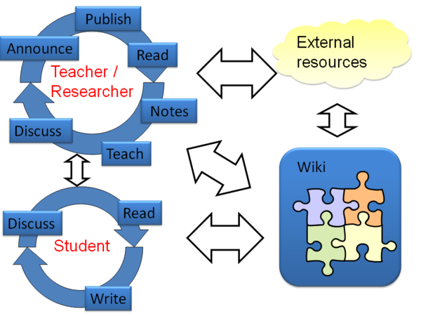
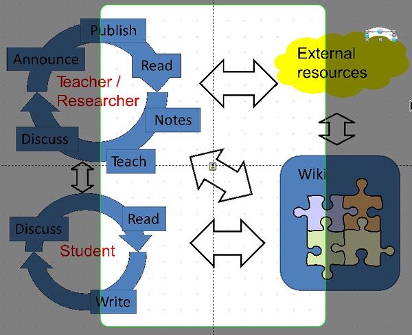
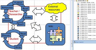
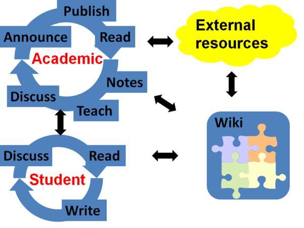
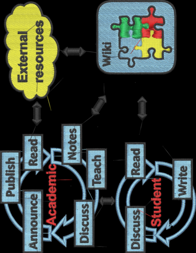
Example case: A simple slide with a figure that includes filled shapes, empty shapes and text. Some of these are stacked:
Import PPT as vector graphic
Since vector graphics is always better to have than bitmap files, we tried out exporting a PPT slide to *.emf and *.wmf and then to import it.
Importing the contents via Illustrator and Corel
- In PowerPoint: Remove the bevels (i.e. use simple fills, the 3D effects are not needed an cause problems)
- In PowerPoint: Export from *.pptx to either *.emf (enhanced Windows Metafile) format or *.wmf (Windows Metafile). Start using EMF, it's a better format.
- Open in Illustrator and save as *.ai
- Open the *.ai in Corel Draw
- In Stitch Era: Get from Application
Import of a design that had Bevels (3D effects) didn't work that well since the blue "buttons" were lost, but not their text. Therefore we restarted (as in the instructions above).
Import takes a while and retrieved all the shapes.
- Total of 109 vectors, some of which useless (e.g. the yellow cloud had some white surroundings)
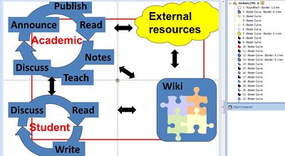
- A big white rectangle sat on top (easy to remove) and the result then looked like this. In the background the 14x20cm B Hoop.
Importing contents via Corel
- Importing *.emf gave bad results, since items are stacked in a strange way. After deleting some useless large squares on top (probably the PPT background), elements were found ...
- Importing *.wmf was ok, the elements were just misplaced a bit.
Since *.emf is a bit newer and can do a much better job with curves and some text (we believe), it is better to go through Illustrator first.
Importing EMF and WMF directly
- In Stitch Era: Open file, select the *.emf
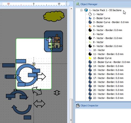
- Direct import of an *.emf file was lossy. We got 55 vectors. All shapes were imported, but not in good position, text was lost as you can see in the picture below. We got the warning "Metafile contain unknown functions"
- Direct import of *.wmf gave similar results, except that the 55 vectors were in the right position, but as we said above, *.emf is produces much better curves than *.wmf !
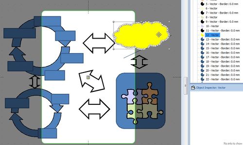
In the picture below you see the *.wmf import. Notice the yellow cloud and its many nodes ...
Direct import is an acceptable method for folks who don't own Corel (and Illustrator). Text can be re-created or even re-imported (probably), but we did not try.
From imported EMF to a vector design - the procedure
We pick up again the slide imported through EMF / Illustrator / Corel
Cleaning up
- We removed vectors that made up borders. We don't vectors for borders since Stitch Era can produce a border for a shape easily enough if we want one.
- 33 vectors for the cloud
- 8 + 4vectors for the wiki shape
These vectors are really easy to spot. In the object manager just look for white vectors with borders. But don't kill all such vectors, i.e. we left the double arrows (4 vectors) alive.
- Hold down the control key and select all of these and hit CTRL-X
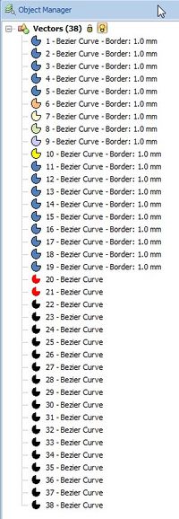
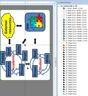
- We are now down to 38 from over 100. That's a more manageable design.
However, borders a probably nice to have for this type of embroidery. Only stitching actually can tell, so let's turn all the shapes without border into areas with a border. That's also very easy.
- Click on all the shapes in the object manager that are not black. Black represents the text.
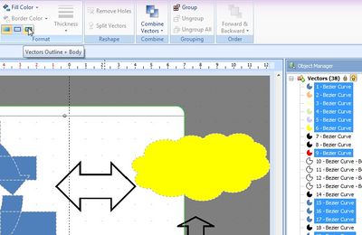
- Then make them into bordered shapes using the Vectors Outline + Body button in the Format ribbon panel in the menu (as shown below).
- You also can set a size, e.g. 1mm for these borders. Use the thickness pull-down menu.
- Verify the result in the object manager. E.g. we found that we added borders to the red texts and therefore removed it again...
Fitting the design into the B hoop
Now comes the more tricky part, fitting a drawing into the B hoop. A simple solution would be to make it smaller and then turn it 90 degrees.
However, we would like to use the full area. Nevertheless, at some point the design should be turned, but before doing so, let's cheat a little bit and lie to Stitch Era about the hoop.
We could try the following:
- Click on Embroidery
- Select Hoops -> Hoops
- Get a horizontal hoop that has the same dimensions as the vertical hoop.
We used the rectangle method:
- We just added a 20 x 14 rectangle without fill that we later will remove. Click on Artwork and insert a closed shape. Then with the Layout tool make it 200 x 140. Read Stitch Era - vector graphics if you need help with vector drawing.
- Then in the bottom bar, we unticked Show Hoop (last button in the second row of icons). We now have a white workspace. Can't work on grey.
As you can see the design doesn't fit into the dimensions of the B hoop
Make the whole thing small is quite trivial, i.e. select corners and drag. However we will have to stitch the letters. For now their size is about 6.5mm which is already limits! I'd rather have 8mm letters.
- If you want to know the size of an object, select the vector and open the layout panel in the top menu bar. Stitch Era should actually display dimensions of select objects.
One way to deal with it is going back to the drawing board, i.e. reduce the PPT graphic by about 20% keeping the size of letters of course. We also could just resize everything in Stitch Era. But since we know the procedure we did everything again.
From a embroidery enhanced PPT to a vector design
Back to the drawing board (PPT)
Redesigning the PPT we discussed just above took no more than 5 minutes.
Here are the PPT changes and parameters to remember. You can set these globally, i.e. by selecting all objects with CTRL-A
- Font Size = 36 bold ... keeping the Calibri font, which is a nice and easy modern font. We now believe that 36pt is the minimal font size one should use for a full PPT slide !
- We also selected all objects and removed all the shape outlines in PTT (these are not needed, since Stitch Era can generate better borders from shapes that include borders.
- Reshape everything a bit to fit. Simplify wherever you can !
The resulting PPT doesn't look as good, but we don't care. All we need is something that is embroidable. We also simplified some text.
Using a good PPT design, i.e. no borders, big fonts, no bevels and other fancy filters, makes importing an *.emf to Stitch Era went much faster ! Most of time it took, was actually just spent waiting for Stitch Era to process the Corel Draw input.
So here is a picture of the imported vector art:
As you can see, we only got 40 vectors (in the picture the big white rectangle for the PTT background was removed)
Now we reduce the whole thing to Hoop B size:
- CTRL-A, then CTRL-click on the red rectangle to keep it.
- Use the layout tab to set height to 140. Make sure that the dimension lock is on !
- Then also in the Layout tab, click on To Design->Center at Origin
Almost done !
- We then transformed some border-less shapes into shapes with borders (as explained above). Basically all the blue ones, the yellow cloud and the puzzle.
- Ungroup the puzzle (It got grouped)
- Adjust here and there some stuff. In order to move around an object by tiny steps: Hold down the CTRL key and use the arrow keys
- Check font size. It's 6.5mm which is still a bit small, but we aimed for that.
- Move all the black and red vectors to the end (to prepare for stitching in the right order.
- Move all the background shapes on top and leave the "button" shapes in the middle.
The result should look a bit like this:
We now can position the thing
- Turn the hoop view back on (little button on bottom bar)
- CTRL-A
- Select Layout Tab
- Mirror / Rotate -> 90 degrees
Embroidery strategy
We now could auto-digitize the thing as is, but probably it's a good idea to think first how we want it rendered.
- The design should be readable. That could mean killing the button fills and the yellow cloud, but that't too radical for a first attempt.
- However, the puzzle could be stitched in one layer.
- Also we need a strategy to deal with the blue arrows that would be stitched under the button shapes.
Simplification of the puzzle
Please, read this through, before you try ...
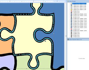
Embroidering puzzle elements on a large blue area is probably not a good idea, i.e. want the blue area to be stiched around. Simplifing the puzzle was hard. We started with the obvious method. We selected the four puzzle elements plus the blue rectangle and Vector->Combine Vectors->Simplify. However, this made Stitch Era freeze, i.e. Thread 6468 was waiting for some I/O process to end :(
Zooming in a lot we can see that the puzzle elements are way to complex. Back to the drawing board again :( Since neither PPT nor Stitch Era can simplify vectors, we do this in Illustrator. In believe that the only way to reduce vectors in Stitch Era is to kill points individually, that's not for me !
In Illustrator:
- We ungroup the imported PPT, then kill all the objects, except for the four puzzle objects.
- Ungroup again if needed
- Select all
- Menu Object->Path->Simplify. Select 90%
- Save as tmp.ai
- If Corel Draw is open, then you directly can import an *.ai file like this: Artwork, Open file, select tmp.ai. This works because Stitch Era can talk to Corel and ask it to transform the Illustrator *.ai file.
Folks who don't own either Illustrator or Corel have another option. Have a look at the built-in Closed shapes. There are puzzle elements. In principle, one also could trim shapes in Stitch Era. If you select more than one there is an option in the Combine Vectors menu. But that made it freeze too.
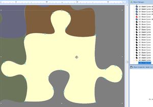
In the following table you see the newly imported puzzle to the right and the old one to he left. Makes a difference huh ?
| Before | After |
|---|---|
Result: Stitch Era freezes again. Conclusion: Stitch Era does not like puzzles :(
We found the following works (but it is clumsy)
- Select the four puzzle objects and make a copy. Hit CTRL-C and CTRL-V in succession. Move the copied objects away, you will these later.
- Select the four originals again and add: Combine vectors -> Add
- Remove holes.
- You now should see a single shape instead of four puzzle pieces
- Select the shape and then the blue area
- Combine Vectors -> Trim shapes
- Combine Vectors -> Exclusion
- Kill the shape we use to punch a hole.
- Move back the saved vectors.
Anyhow, the conclusion is the following:
- After importing the EMF to Illustrator or Corel Draw, it's always a good idea to simplify. That's fairly easy. On the other hand, we believe that this kind of situation where EMF export from PPT creates idiotic shapes, is probably not too common.
- Save your work before you attempt any operation on complex vector objects !
Reducing colors'
The puzzle has its own colors, but since changing threads is pain, we decided to use some colors that we already use in other parts. Since yellow and red is strong, we also changed the remaining two colors to something that is strong.
Make simple arrows
In order to get a soft result, we either could embroider the arrows with a light programmable stitch or redesign the arrows. We did the latter, i.e. changed these to vectors with borders only. We made the borders fatter, i.e. 2mm.
Finally, we wound up with this vector design. It doesn't look that good though.
To embroidery - take 1
We used the following procedure:
- To Embroidery, Art To Stitch Intelligent
- We used just the defaults, except for the running stitch (see above)
Result looked rather fine, but we had more than 40'000 Stitches, i.e. 43198. Actually, at the time of writing, a placed an order to get the full version.
Looking at the stitch count in the Object manager, we can easily see where we can reduce a lot.
- The yellow area
- The blue buttons.
In other words, all the area patterns
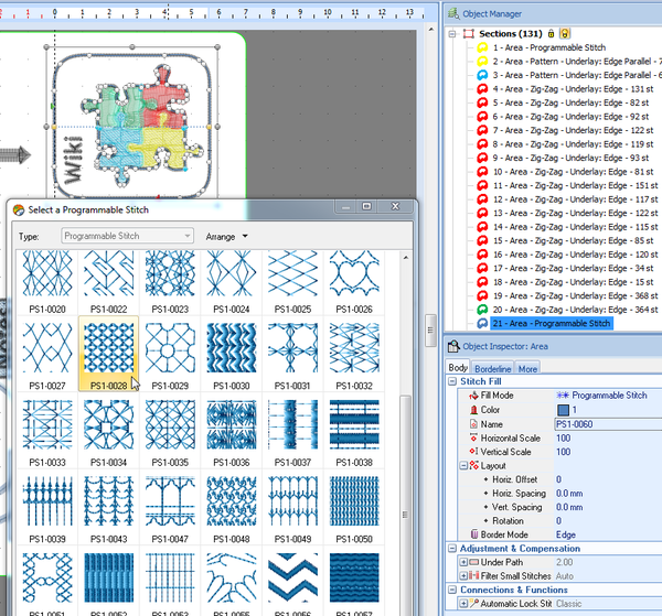
We select them all and reduced density to 4 lines/mm, something we planned anyhow. We are down to 40565. So let's be more radical. Both the yellow cloud and the puzzle rectangle actually could be stitched with holes, i.e. with a nice programmable stitch.
- Again, in the Object inspector we changed the fill pattern.
- We augmented its fill density by setting scales to 70
- The result is an absolute bummer: We are up to 46940. So, actually these patterns use more stitches :(
- Back to Patterns. We took PTM-0008 for those two large areas. It produces less stitches. Down to 38409 !
- We finally also reduced the zigzags to 4.2 lines /mm
According to MyEdit the result would look like this:
Looking at this we realize that we also should have simplified the areas where arrows meet boxes. This will be difficult to stitch, and actually it was.
The embroidered result, on a napkin without stabilizer looks like this and is not too bad. However we can improve
So let's see what we should redesign
- We have to simplify combined ZigZag button areas. Not only do we overprint 2 x 4 lines/mm, but in addition the area fills have an underlay and the pattern itself is fairly heavy.
- Generally speaking, area fills may need redesign. e.g. kill some, find a fill pattern with holes, etc.
- In addition, rethink the colors. Probably it would be better to print yellow on blue, or use a lighter blue. Anyhow during the test print, I used light grey instead of black
- Arrows touch each other, they should not
- Red and green puzzle pieces turned/are by mistake into a Zizag pattern
- The other two puzzle pieces use another pattern design which is either too much or not enough of a style break.
- Borders are pretty, but take a lot of time to print (and like always) make the design harder.
- There was a rendering problem in one circle arrows (probably due to the tip design. May I'll have to go down to stitch level editing to fix this.
- Elna made a mess of the write button (maybe some thread stuck underneath ...)
To embroidery - take 2
(later, this took me several hours, even embroidery went on for almost two hours .... and I am tired)
Digitizing photographs
(... needs to be written )
