Physical visualization: Difference between revisions
| Line 110: | Line 110: | ||
This design is driven by the following design criteria: | This design is driven by the following design criteria: | ||
{{quotationbox| | {{quotationbox| | ||
DC1 - ''Abstract representations'' are more efficient than typical barchart-like visualizations for self-reflecting on personal data | DC1 - ''Abstract representations'' are more efficient than typical barchart-like visualizations for self-reflecting on personal data. | ||
DC2 - Aesthetic, playful, and pleasurable representations engage people with everyday data and trigger emotions | DC2 - Aesthetic, playful, and pleasurable representations engage people with everyday data and trigger emotions | ||
Revision as of 13:34, 7 July 2016
Introduction
This articles summarizes some ideas and examples about physical visualization, in particular with respect to project management and related areas. It is linked to our interest for 3D printers in education.
The absolute best resource page is physical visualization made by the Aviz project. In this page, we just focus on Lego visualizations that are weakly or strongly related to management of projects.
See also:
Token-based constructive visualization
Huron (2014b) [1] “asked people to create, update and explain their own information visualizations using simple materials such as tangible building blocks. We learned that all participants, most of whom had no experience in visualization, were readily able to create and talk about their own visualizations.” (Overview, retrieved July 2016). Based on a close observation on how people did build representations with tokens - for more information, consult the project website - the authors define a "token-based" visualization method, that they describe as follows:
To construct a visualization the necessary components are:
- A set of basic units or tokens, which can be mapped to data,
- A token grammar, which declares how the attributes of the tokens can signify data,
- An environment in which the tokens can be placed,
- An assembly model, which describes the constraints and freedom with which the tokens can be assembled.
(Huron 2014b)[1]
Made with Lego and compatabiles
This section summarizes some visualizations made with LEGO bricks.
Thesis project board
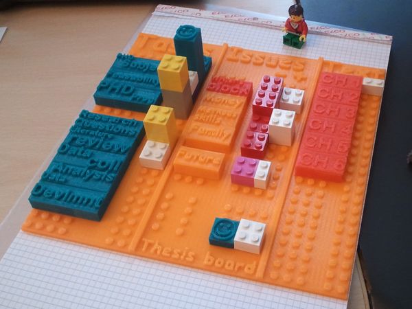
See lego-compatible thesis project board (a project we initiated in Nov 2012).
Lego-powered time-tracking
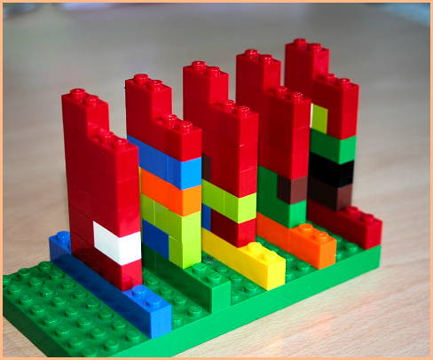
“an alternative way to represent time schedule tracking by stacking different lengths of Lego blocks as a way to convey different sequential time periods. stacking hourly rows on top of each other builds up the whole day, while color represents the different projects at hand. a whole week of time tracking is created by setting up a series of rainbow-colored days.” (Lego-based time-tracking, retrieved nov 22, 2012)
Michal Hunger, in his On LEGO Powered Time-Tracking blog post describes how he uses it.
“I made up a single width column as ruler for the work hours (from at around 10 am up to 6 pm). So I can easily see whats missing and at what time I did something. For the days of the workweek I chose the rainbow color scheme (red, orange, yellow, green, blue – Monday to Friday) for the longer base row that I stack my hours on. So I can gather a whole week of time tracking until I have to enter them in some time sheet (software). I put the columns of a whole week on top of a green building plate to fix them.”
Benefits:
- it works (for about 4 months now)
- I have something to play with while pondering stuff
- it looks great
- it’s incredibly fast with no overhead
- planning is possible
Yvonne Jansen et al. Empirical Investigation of Physical Visualizations
(An Empirical Investigation of Physical Visualizations, retrieved nov 22, 2012)
Tangible Bug Tracking using LEGO bricks
The Tangible Bug Tracking project “is a practice to build a tiny structure which is representation of a software bug. Those are build with LEGO blocks and placed in the team’s workspace. LEGO bricks are represented as the priority, dependency, difficulty of software bugs by developer. It is a kind of information radiator.”. According to the author, Takeshi Kakeda, BUG-LEGO has three benefits:
- Intuitive visualization of the quantity of software bugs for everyone.
- Changing mindset of developer from negative to positive against software bugs.
- Providing the physical constraint of the building plate.
The system uses the following representational elements:
- Each bug is represented by a a Lego structure. A ticket ID is stuck on it with a PostIt
- After a bug is fixed, the structure is destroyed.
- Priorities are expressed with font/back positions
- Severity and difficulty are expressed through the size and complexity of the Lego structure
- Dependencies are also written on a PostIT that refers to the ID of the other bug.
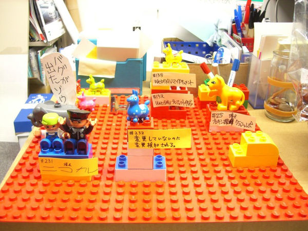
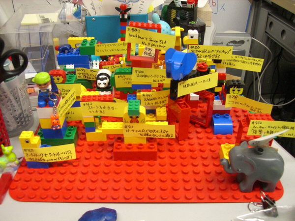
Wable
“The personal feeds from webapplications like Plazes, Flickr, and Last.fm tell much about the activity of an individual on the internet. In this project we aim to explore how you can visualize the changes of your web identity over time and create a physical link between your virtual and real identity. The interface consists of both a physical table and a web application. This direct feedback from your web identity is customizable and can be connected to any RSS feed.” (Wable, retrieved nov 22, 2012).
3D Infographic Maps Built with Lego
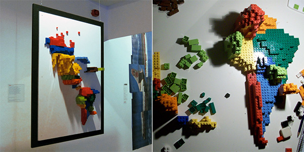
“Samuel Granados has discovered an efficient way to display geographical data in 3D physical reality. Just use Lego [samuelgranados.es]. One side of the map reveals the emigrants of each zone, the opposite shows the immigrants (both represented by the volume of the pieces).” (3D Infographic Maps Built with Lego, retrieved nov. 22 2012)
Lego for visualizing production problems and health care management
“Now GM is using Legos for problem resolution tracking. If a transmission block breaks during durability testing, they’ll file a traditional paper report, but the case will also be added to a Lego board. Legos in various colors denote the area of the vehicle, and the block size denotes the severity of the problem.” (How GM Is Saving Cash Using Legos As A Data Viz Tool. retrieved nov. 21, 2012)

“WellStar is using the boards to track on-time starts at the doctor’s office, and even manage its physician-payee relationships--which has led to a series of fixes projected to save the company $1 million.” (dito)
Lego Fight club move narrative
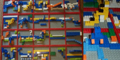
"Red = Chapter divisions, Blue = Narrator, White = Tyler Durden, Yellow = Marla Singer, Orange = Violence/Fight Club, Cornflower Blue = Bosses/Work/The Huddled Masses of the World, Green = Big Bob/Support Groups, Light Green = Space Monkeys/Project Mayhem, Black = Death/Mortality & height = intensity of course!" (Notation vs BINKY vs visualisation, retrieved nov 23 2012)
Visualizations made with other materials
Data as wood sculptures
- Behavioral Landscapes (summary at dataphys.org)
- Behavioral Landscapes and Change in Behavioral Landscapes: A Multiple Time-Scale Density Distribution Approach by Nilam Ram, Michael Coccia, David Conroy, Amy Lorek, Brian Orland, Aaron Pincus, Martin Sliwinski, and Denis Gerstorf (2013)
- Behavioral Landscapes. Pictures of the CNC milling.
Go and grow (plants)
Botros et al. (2016). [2] investigate “how a plant—a living visualization—whose health relies on the plant owner’s level of activity, can engage people in tracking and self-reflecting on their fitness data.”
This design is driven by the following design criteria:
DC1 - Abstract representations are more efficient than typical barchart-like visualizations for self-reflecting on personal data.
DC2 - Aesthetic, playful, and pleasurable representations engage people with everyday data and trigger emotions
DC3 - Goals that affect the representation leverage successful cognitive behavioural strategies
DC4 - Representations that can be shared leverage the benefits of the social context on engagement
DC5 - Representations that trigger emotional commitment favor both short-term and long-term engagement
DC6 - Non-virtual living representations leverage both physical metaphors and living plant metaphors, as well as the sustainable interest for living things(preprint, page 2)
Results show that, “Overall, participants increased their awareness of their activity level. During the three weeks of the study, participants also changed their habits towards a more active lifestyle.” (p. 4)
Links
Indexes
- List of passive physical visualizations (2012, Aviz, visual analytics project)
- List of active physical visualizations (2012, Aviz)
- "physical visualization" (Google images)
- physical visualization LEGO (google images)
Various
- Lego reflections by By Sarah, March 7, 2009
- Why is the LEGO® SERIOUS PLAY® Method effective? by Robert Rasmussen, Feb 2012.
- Notation vs BINKY vs visualisation Nov 1 2010.
- The Amazing and Versatile Multipurpose Innovation Tool (some sort of kit for gaming)
- Project management classes taught at HES Yverdon (need a paper here).
- How GM Is Saving Cash Using Legos As A Data Viz Tool by Mark Wilson (undated, retrieved oct 2012). See also the comments that people added...
- Why physical card walls are important? April 27, 2011
A very different perspective is to use lego building as substrate for team building, management, etc. E.g.:
- McCrindle, R., 2010. Software engineering –engagement through innovative and interaction. Higher Education Academy, Engineering Subject Centre, Teaching Award 2010
Research groups and people
- Aviz is a multidisciplinary team of INRIA aiming at improving the analysis and visualization of large and complex datasets by combining analysis methods with interactive visualizations
- socialbits.org is an international research group based in Linz (Austria), New York (USA), Vancouver (Canada), Melbourne (Australia) and Tokyo (Japan) focusing on the artistic output of social interactions in real world locations; specifically in urban environments, public spaces and unique architectural complexes. For example, “Urbansphere Wearables aims to reflect the daily keywords of the city by utilizing the data streams of social networks as a source of fashion design. The project initiates “social sensors” (special filters and data gathering scripts that follows Twitter) in order to collect information on social networks created by different inhabitants of the same city. The data gathered is then visualized and turned into a pattern for wearables that represent the recent topics and discussions of urban people. In the exhibition, visitors will see a set of unique wearables that contains data from İstanbul.” (retrieved nov 23, 2012)
- Physical Visualization Sub-League, part of a roboCup competition.
Examples
See also the other links above and the example we discuss.
- The Real World: Data Visualization using glasses filled with water.
Bibliography
Cited with footnotes
- ↑ 1.0 1.1 Huron, Samuel; Yvonne Jansen, Sheelagh Carpendale (2014) Constructing Visual Representations: Investigating the Use of Tangible Tokens. IEEE Transactions on Visualization and Computer Graphics, Institute of Electrical and Electronics Engineers, 2014, Transactions on Visualization and Computer Graphics, 20 (12), pp.1. DOI: 10.1109/TVCG.2014.2346292, https://hal.archives-ouvertes.fr/hal-01024053/document
- ↑ Botros, Fady; Charles Perin, Bon Adriel Aseniero and Sheelagh Carpendale (2016). Go and Grow: Mapping Personal Data to a Living Plant. AVI 2016 - Proceedings of the Working Conference on Advanced Visual Interfaces. ACM, 2016. Preprint
Other
- Eisenberg Michael and Ann Nishioka (1997). Orihedra: Mathematical sculptures in paper, International Journal of Computers for Mathematical Learning, 1996/1997, Volume 1, Issue 3, pp 225-261 Abstract PDF (Access restricted)
- Eisenberg, M. and DiBiase, J. (1996). Mathematical manipulatives as designed artifacts: The cognitive, affective, and technological dimensions. Proceedings of the International Conference on the Learning Sciences, pp. 44–51.
- Huron, S.; Jansen, Y.; Carpendale, S. (2014). "Constructing Visual Representations: Investigating the Use of Tangible Tokens," Visualization and Computer Graphics, IEEE Transactions on , vol.20, no.12, pp.2102,2111, Dec. 31 2014, doi:10.1109/TVCG.2014.2346292
- Huron, Samuel; Sheelagh Carpendale, Alice Thudt, Anthony Tang, Michael Mauerer (2014). Constructive Visualization. ACM. ACM conference on Designing Interactive Systems in 2014, Jun 2014, Vancouver, Canada. ACM. <hal-00978437v2> https://hal.inria.fr/hal-00978437v2/document
- Huron, Samuel; Yvonne Jansen, Sheelagh Carpendale (2014) Constructing Visual Representations: Investigating the Use of Tangible Tokens. IEEE Transactions on Visualization and Computer Graphics, Institute of Electrical and Electronics Engineers, 2014, Transactions on Visualization and Computer Graphics, 20 (12), pp.1. DOI: 10.1109/TVCG.2014.2346292, https://hal.archives-ouvertes.fr/hal-01024053/document
- Jansen, Yvonne, Physical and Tangible Information Visualization. Human-Computer Interaction. Université Paris Sud - Paris XI. https://tel.archives-ouvertes.fr/tel-00981521/
- Jansen, Yvonne, Pierre Dragicevic, and Jean-Daniel Fekete (2012) Investigating Physical Visualizations (Poster). IEEE VisWeek 2012 Electronic Conference Proceedings, Oct 2012, Seattle, Washington, USA, United States. In press.
- Yvonne Jansen, Pierre Dragicevic, Petra Isenberg, Jason Alexander, Abhijit Karnik, et al.. Opportunities and Challenges for Data Physicalization. Proceedings of the ACM Conference on Human Factors in Computing Systems (CHI), Apr 2015, New York, NY, United States. 2015, https://hal.inria.fr/hal-01120152/document
- Resnick, M. (1993). Behavior construction kits. Communications of the ACM 36(7): 64–71
- Vande Moere, Andrew and Stephanie Patel (2010). The Physical Visualization of Information: Designing Data Sculptures in an Educational Context, Visual Information Communication, 1-23 Abstract
- Zhao, Jack and Andrew V. Moere (2008). DIMEA '08: Proceedings of the 3rd international conference on Digital Interactive Media in Entertainment and Arts (2008), pp. 343-350, doi:10.1145/1413634.1413696, http://dl.acm.org/citation.cfm?id=1413634.1413696
Acknowledgement
Initial sample examples were found through http://www.aviz.fr/Research/PassivePhysicalVisualizations (Yvonne Jansen, Pierre Dragicevic, and Jean-Daniel Fekete)
