InkStitch - data visualization: Difference between revisions
mNo edit summary |
|||
| Line 97: | Line 97: | ||
bubble: {minSize:"5%", maxSize:"25%"} | bubble: {minSize:"5%", maxSize:"25%"} | ||
The resulting SVG still needs hand editing and regrouping of objects, but requires much less work. | The resulting SVG still needs hand editing and regrouping of objects, but requires much less work. Read aboves. In short: | ||
* Regroup similar objects in a same group, then ungroup all the objects in the group | |||
* Remove stroke from all objects | |||
* Transform text and rectangles to object | |||
* Parameterize for embroidery. | |||
== Links == | == Links == | ||
Revision as of 17:01, 20 August 2018
.... under construction
Data visualization embroidery
Various types of charts have the potential for embroidery. We will explore this a bit over the next few weeks and months.
Creating charts with Highcharts
Highcharts is a JavaScript library to create various types of charts. [Quote]: “Highcharts is a SVG-based, multi-platform charting library that has been actively developed since 2009. It makes it easy to add interactive, mobile-optimized charts to your web and mobile projects. It features robust documentation, advanced responsiveness and industry-leading accessibility support.” (Highcharts, Aug 2018). It is free for non-commercial use. There is an export function to SVG.
To create SVG for embroidery there are two strategies that should be combined:
- Adapt the source
- Edit the resulting SVG
It probably is best to start from a demo
Creating a bubble chart without editing JavaScript
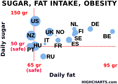
We exported the SVG from the high charts demo. Please do not reuse this data without crediting highcharts and do not use it for commercial purposes.
We did the following.
- Delete all the elements we did not want, in particular grids.
- Simplify x/y and global labels and put all of these into a single group. Within this group ungroup all subgroups.
- Remove strokes from labels and add fill
- Set font size to 24 pt or bigger (that will create 6mm fonts for Capitals). To me it is not clear if there is a standard size for "pt". I assume that 1pt = 0.35mm. Font size is probably bigger than Capital letters, else this does not work. (0.92.3/Ubuntu 18).
- Adjust size and layout for your favorite hoop, e.g. 180 X 13cm for a Brother PRH180.
- Convert all text objects to paths after that.
- Make sure that all the bubbles are in the same group, set fill and remove stroke.
- Make all lines dotted (for Ink/Stitch to create lines)
- Order the groups. Text should be on top. Strokes at the bottom, followed by bubbles.
- Verify the colors ! (initially, the SVG below has too many which is a problem on a single needle machine)
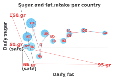
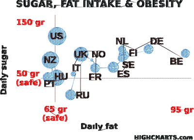
Parameterize most objects for a simple fill, rotate fills for the bubbles, dotted lines can be stitched with a bean stitch.
The design takes a fairly long time to process. To speed up computing you could select individual letters (one by one) and simplify (CTRL-L).
The result could be improved in several ways (most of this is done in the SVG for download above).
- Better tissue and stabilizer. I used a cheap napkin with a tear-off stabilizer.
- Replacement of fill fonts with digitized satin fonts, but that is too much work at this stage of exploration.
- Making the title and labels a bit bigger
- Rotate stitch direction of bubble fills
- Line underlay for labels (cannot be done)
Tuning with JavaScript
Instead of editing the SVG, you also could generate a modified version. Open the Demo in CodePen.io. If you want to play with the bubble chart, you can also start from our modified version:
- https://codepen.io/danielkschneider/pen/NBQjGg
- A probably older version of the code is available in InkStitch - data visualization/highcharts-bubble-js-code
Firstly, have a look at the API. It defines all the parameters that can be set in the JSON structure defining the chart.
Below are a few of the changes we made:
Setting the size:
- Modify the HTML code. E.g. for a 18cm x 13cm hoop, use:
<div id="container" style="height: 128mm; width: 178mm"></div>
- Modify also the SVG code (but you only can enter pixel and % values)
   width: 670, //pixels only. That will be DPI dependant.
   height: "72%"
Change fontSize, fontWeight and color. In this version one cannot use CSS styles in a simple way. Instead, I used JavaScript CSS styling. E.g.
 title: {
      text: 'DAILY FAT',
      style: {"fontSize":"25pt", "fontWeight":"bold", "color": "#000000"}
    },
Shorten phrases and words and capitalize all text. E.g. "G" instead of "gr".
Changed axis "ticks" (four for both axes)
Augment the size of the bubbles a bit in the plotOptions:
bubble: {minSize:"5%", maxSize:"25%"}
The resulting SVG still needs hand editing and regrouping of objects, but requires much less work. Read aboves. In short:
- Regroup similar objects in a same group, then ungroup all the objects in the group
- Remove stroke from all objects
- Transform text and rectangles to object
- Parameterize for embroidery.
Links
Ignore these for the moment. We are just in the process of finding a suitable way to create SVG files. - Daniel K. Schneider (talk).
D3
D3 is a JavaScript library for programmers that can generate SVG
- Getting Started with Data Visualization — Build Your First Chart With D3.js
- VEGA is a visualization grammar built on top.
- Vega-Lite is a high-level grammar of interactive graphics. It provides a concise JSON syntax for rapidly generating visualizations to support analysis
RawGraphs
RAWGraphs is an online application that can generate visualizations from tabular data (e.g. spreadsheets).
The generated SVG requires some work that should be done partly with a programming editor.
- Remove grid lines (optional)
- Make some labels bigger, and remove some
- Translate all text to path
- Remove opacity (alpha values to 100%)
Google charts
High charts
- https://www.highcharts.com/ (commercial, but free for non-commercial use)
So far, the most convenient SVG output to deal with. In the bubble and line charts, data (bubbles or lines), data labels, and other information are in different groups and therefore not too difficult to manipulate.


