InkStitch - data visualization: Difference between revisions
m (→High charts) |
|||
| Line 58: | Line 58: | ||
So far, the most convenient SVG output to deal with. In the bubble and line charts, data (bubbles or lines), data labels, and other information are in different groups and therefore not too difficult to manipulate. | So far, the most convenient SVG output to deal with. In the bubble and line charts, data (bubbles or lines), data labels, and other information are in different groups and therefore not too difficult to manipulate. | ||
* https://www.highcharts.com/demo/bubble | * https://www.highcharts.com/demo/bubble | ||
=== Data collections === | === Data collections === | ||
Revision as of 11:24, 17 August 2018
.... under construction
Data visualization embroidery
Various types of charts have the potential for embroidery. We will explore this a bit over the next few weeks and months.
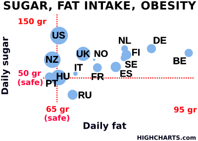
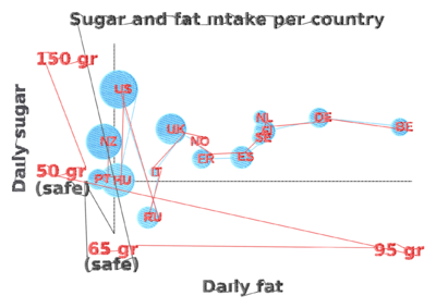
The following was made from a high charts demo. Please do not reuse this data without crediting highcharts and do not use it for commercial purposes. It took a fairly long time to process.
To do:
- Add x/y axis
- Replace the dots by a dotted line.
- Check if the letters a big enough
Links
Ignore these for the moment. We are just in the process of finding a suitable way to create SVG files. - Daniel K. Schneider (talk).
D3
D3 is a JavaScript library for programmers that can generate SVG
- Getting Started with Data Visualization — Build Your First Chart With D3.js
- VEGA is a visualization grammar built on top.
- Vega-Lite is a high-level grammar of interactive graphics. It provides a concise JSON syntax for rapidly generating visualizations to support analysis
RawGraphs
RAWGraphs is an online application that can generate visualizations from tabular data (e.g. spreadsheets).
The generated SVG requires some work that should be done partly with a programming editor.
- Remove grid lines (optional)
- Make some labels bigger, and remove some
- Translate all text to path
- Remove opacity (alpha values to 100%)
Google charts
High charts
- https://www.highcharts.com/ (commercial, but free for non-commercial use)
So far, the most convenient SVG output to deal with. In the bubble and line charts, data (bubbles or lines), data labels, and other information are in different groups and therefore not too difficult to manipulate.

